Individual glacier surface velocity analysis#
This notebook will build upon the data access and inspection steps in the earlier notebooks and demonstrate basic data analysis and visualization of surface velocity data at the scale of an individual glacier using xarray.
Learning goals#
Concepts#
Visualizing statistical distributions
Vectorized calculation of summary statistics over large dimensions
Working with velocity component vectors
Calculating magnitude of displacement from velocity component vectors
Techniques#
Using
xr.reduce()to apply scipy statistical functions designed to ingest numpy arrays to Xarray objectsRe-organize Xarray objects using
xr.sortby()Temporal resampling using
xr.resample()Vectorized computation and reductions using
xr.groupby()andxr.map()Visualization using
FacetGridobjects
Other useful resources#
These are resources that contain additional examples and discussion of the content in this notebook and more.
How do I… this is very helpful!
Xarray High-level computational patterns discussion of concepts and associated code examples
Parallel computing with dask Xarray tutorial demonstrating wrapping of dask arrays
Software + Setup#
%xmode minimal
Exception reporting mode: Minimal
import os
import json
import urllib.request
import numpy as np
import xarray as xr
import rioxarray as rxr
import geopandas as gpd
import pandas as pd
import scipy

import matplotlib.pyplot as plt

from shapely.geometry import Polygon
from shapely.geometry import Point


import flox

%config InlineBackend.figure_format='retina'
Read in clipped glacier velocity object from previous notebook#
In the last notebook, we used the storemagic ipython extension to store the object we created. We’ll read it in here rather than go through the steps of creating it again. Now that we have the velocity data clipped to a single glacier, let’s explore the clipped dataset.
%store -r sample_glacier_raster
sample_glacier_raster
<xarray.Dataset>
Dimensions:                     (mid_date: 3974, y: 37, x: 40)
Coordinates:
  * mid_date                    (mid_date) datetime64[ns] 2018-04-14T04:18:49...
  * x                           (x) float64 7.843e+05 7.844e+05 ... 7.889e+05
  * y                           (y) float64 3.316e+06 3.316e+06 ... 3.311e+06
    mapping                     int64 0
Data variables: (12/60)
    M11                         (mid_date, y, x) float32 nan nan nan ... nan nan
    M11_dr_to_vr_factor         (mid_date) float32 nan nan nan ... nan nan nan
    M12                         (mid_date, y, x) float32 nan nan nan ... nan nan
    M12_dr_to_vr_factor         (mid_date) float32 nan nan nan ... nan nan nan
    acquisition_date_img1       (mid_date) datetime64[ns] 2017-12-20T04:21:49...
    acquisition_date_img2       (mid_date) datetime64[ns] 2018-08-07T04:15:49...
    ...                          ...
    vy_error_slow               (mid_date) float32 8.0 1.7 1.2 ... 9.7 11.3 25.4
    vy_error_stationary         (mid_date) float32 8.0 1.7 1.2 ... 9.7 11.3 25.4
    vy_stable_shift             (mid_date) float32 8.9 -4.9 -0.7 ... -3.6 -10.8
    vy_stable_shift_slow        (mid_date) float32 8.9 -4.9 -0.7 ... -3.6 -10.7
    vy_stable_shift_stationary  (mid_date) float32 8.9 -4.9 -0.7 ... -3.6 -10.8
    cov                         (mid_date) float64 0.3522 0.0 0.0 ... 0.0 0.0
Attributes: (12/19)
    Conventions:                CF-1.8
    GDAL_AREA_OR_POINT:         Area
    author:                     ITS_LIVE, a NASA MEaSUREs project (its-live.j...
    autoRIFT_parameter_file:    http://its-live-data.s3.amazonaws.com/autorif...
    datacube_software_version:  1.0
    date_created:               25-Sep-2023 22:00:23
    ...                         ...
    s3:                         s3://its-live-data/datacubes/v2/N30E090/ITS_L...
    skipped_granules:           s3://its-live-data/datacubes/v2/N30E090/ITS_L...
    time_standard_img1:         UTC
    time_standard_img2:         UTC
    title:                      ITS_LIVE datacube of image pair velocities
url: https://its-live-data.s3.amazonaws.com/datacu...- mid_date: 3974
- y: 37
- x: 40
- mid_date(mid_date)datetime64[ns]2018-04-14T04:18:49.171219968 .....
- description :
- midpoint of image 1 and image 2 acquisition date and time with granule's centroid longitude and latitude as microseconds
- standard_name :
- image_pair_center_date_with_time_separation
array(['2018-04-14T04:18:49.171219968', '2017-02-10T16:15:50.660901120', '2019-03-15T04:15:44.180925952', ..., '2018-06-11T04:10:57.953189888', '2017-05-27T04:10:08.145324032', '2017-05-07T04:11:30.865388288'], dtype='datetime64[ns]') - x(x)float647.843e+05 7.844e+05 ... 7.889e+05
- description :
- x coordinate of projection
- standard_name :
- projection_x_coordinate
- axis :
- X
- long_name :
- x coordinate of projection
- units :
- metre
array([784252.5, 784372.5, 784492.5, 784612.5, 784732.5, 784852.5, 784972.5, 785092.5, 785212.5, 785332.5, 785452.5, 785572.5, 785692.5, 785812.5, 785932.5, 786052.5, 786172.5, 786292.5, 786412.5, 786532.5, 786652.5, 786772.5, 786892.5, 787012.5, 787132.5, 787252.5, 787372.5, 787492.5, 787612.5, 787732.5, 787852.5, 787972.5, 788092.5, 788212.5, 788332.5, 788452.5, 788572.5, 788692.5, 788812.5, 788932.5]) - y(y)float643.316e+06 3.316e+06 ... 3.311e+06
- description :
- y coordinate of projection
- standard_name :
- projection_y_coordinate
- axis :
- Y
- long_name :
- y coordinate of projection
- units :
- metre
array([3315787.5, 3315667.5, 3315547.5, 3315427.5, 3315307.5, 3315187.5, 3315067.5, 3314947.5, 3314827.5, 3314707.5, 3314587.5, 3314467.5, 3314347.5, 3314227.5, 3314107.5, 3313987.5, 3313867.5, 3313747.5, 3313627.5, 3313507.5, 3313387.5, 3313267.5, 3313147.5, 3313027.5, 3312907.5, 3312787.5, 3312667.5, 3312547.5, 3312427.5, 3312307.5, 3312187.5, 3312067.5, 3311947.5, 3311827.5, 3311707.5, 3311587.5, 3311467.5]) - mapping()int640
- crs_wkt :
- PROJCS["WGS 84 / UTM zone 46N",GEOGCS["WGS 84",DATUM["WGS_1984",SPHEROID["WGS 84",6378137,298.257223563,AUTHORITY["EPSG","7030"]],AUTHORITY["EPSG","6326"]],PRIMEM["Greenwich",0,AUTHORITY["EPSG","8901"]],UNIT["degree",0.0174532925199433,AUTHORITY["EPSG","9122"]],AUTHORITY["EPSG","4326"]],PROJECTION["Transverse_Mercator"],PARAMETER["latitude_of_origin",0],PARAMETER["central_meridian",93],PARAMETER["scale_factor",0.9996],PARAMETER["false_easting",500000],PARAMETER["false_northing",0],UNIT["metre",1,AUTHORITY["EPSG","9001"]],AXIS["Easting",EAST],AXIS["Northing",NORTH],AUTHORITY["EPSG","32646"]]
- semi_major_axis :
- 6378137.0
- semi_minor_axis :
- 6356752.314245179
- inverse_flattening :
- 298.257223563
- reference_ellipsoid_name :
- WGS 84
- longitude_of_prime_meridian :
- 0.0
- prime_meridian_name :
- Greenwich
- geographic_crs_name :
- WGS 84
- horizontal_datum_name :
- World Geodetic System 1984
- projected_crs_name :
- WGS 84 / UTM zone 46N
- grid_mapping_name :
- transverse_mercator
- latitude_of_projection_origin :
- 0.0
- longitude_of_central_meridian :
- 93.0
- false_easting :
- 500000.0
- false_northing :
- 0.0
- scale_factor_at_central_meridian :
- 0.9996
- spatial_ref :
- PROJCS["WGS 84 / UTM zone 46N",GEOGCS["WGS 84",DATUM["WGS_1984",SPHEROID["WGS 84",6378137,298.257223563,AUTHORITY["EPSG","7030"]],AUTHORITY["EPSG","6326"]],PRIMEM["Greenwich",0,AUTHORITY["EPSG","8901"]],UNIT["degree",0.0174532925199433,AUTHORITY["EPSG","9122"]],AUTHORITY["EPSG","4326"]],PROJECTION["Transverse_Mercator"],PARAMETER["latitude_of_origin",0],PARAMETER["central_meridian",93],PARAMETER["scale_factor",0.9996],PARAMETER["false_easting",500000],PARAMETER["false_northing",0],UNIT["metre",1,AUTHORITY["EPSG","9001"]],AXIS["Easting",EAST],AXIS["Northing",NORTH],AUTHORITY["EPSG","32646"]]
- GeoTransform :
- 784192.5 120.0 0.0 3315847.5 0.0 -120.0
array(0)
- M11(mid_date, y, x)float32nan nan nan nan ... nan nan nan nan
- description :
- conversion matrix element (1st row, 1st column) that can be multiplied with vx to give range pixel displacement dr (see Eq. A18 in https://www.mdpi.com/2072-4292/13/4/749)
- grid_mapping :
- mapping
- standard_name :
- conversion_matrix_element_11
- units :
- pixel/(meter/year)
array([[[nan, nan, nan, ..., nan, nan, nan], [nan, nan, nan, ..., nan, nan, nan], [nan, nan, nan, ..., nan, nan, nan], ..., [nan, nan, nan, ..., nan, nan, nan], [nan, nan, nan, ..., nan, nan, nan], [nan, nan, nan, ..., nan, nan, nan]], [[nan, nan, nan, ..., nan, nan, nan], [nan, nan, nan, ..., nan, nan, nan], [nan, nan, nan, ..., nan, nan, nan], ..., [nan, nan, nan, ..., nan, nan, nan], [nan, nan, nan, ..., nan, nan, nan], [nan, nan, nan, ..., nan, nan, nan]], [[nan, nan, nan, ..., nan, nan, nan], [nan, nan, nan, ..., nan, nan, nan], [nan, nan, nan, ..., nan, nan, nan], ..., ... ..., [nan, nan, nan, ..., nan, nan, nan], [nan, nan, nan, ..., nan, nan, nan], [nan, nan, nan, ..., nan, nan, nan]], [[nan, nan, nan, ..., nan, nan, nan], [nan, nan, nan, ..., nan, nan, nan], [nan, nan, nan, ..., nan, nan, nan], ..., [nan, nan, nan, ..., nan, nan, nan], [nan, nan, nan, ..., nan, nan, nan], [nan, nan, nan, ..., nan, nan, nan]], [[nan, nan, nan, ..., nan, nan, nan], [nan, nan, nan, ..., nan, nan, nan], [nan, nan, nan, ..., nan, nan, nan], ..., [nan, nan, nan, ..., nan, nan, nan], [nan, nan, nan, ..., nan, nan, nan], [nan, nan, nan, ..., nan, nan, nan]]], dtype=float32) - M11_dr_to_vr_factor(mid_date)float32nan nan nan nan ... nan nan nan nan
- description :
- multiplicative factor that converts slant range pixel displacement dr to slant range velocity vr
- standard_name :
- M11_dr_to_vr_factor
- units :
- meter/(year*pixel)
array([nan, nan, nan, ..., nan, nan, nan], dtype=float32)
- M12(mid_date, y, x)float32nan nan nan nan ... nan nan nan nan
- description :
- conversion matrix element (1st row, 2nd column) that can be multiplied with vy to give range pixel displacement dr (see Eq. A18 in https://www.mdpi.com/2072-4292/13/4/749)
- grid_mapping :
- mapping
- standard_name :
- conversion_matrix_element_12
- units :
- pixel/(meter/year)
array([[[nan, nan, nan, ..., nan, nan, nan], [nan, nan, nan, ..., nan, nan, nan], [nan, nan, nan, ..., nan, nan, nan], ..., [nan, nan, nan, ..., nan, nan, nan], [nan, nan, nan, ..., nan, nan, nan], [nan, nan, nan, ..., nan, nan, nan]], [[nan, nan, nan, ..., nan, nan, nan], [nan, nan, nan, ..., nan, nan, nan], [nan, nan, nan, ..., nan, nan, nan], ..., [nan, nan, nan, ..., nan, nan, nan], [nan, nan, nan, ..., nan, nan, nan], [nan, nan, nan, ..., nan, nan, nan]], [[nan, nan, nan, ..., nan, nan, nan], [nan, nan, nan, ..., nan, nan, nan], [nan, nan, nan, ..., nan, nan, nan], ..., ... ..., [nan, nan, nan, ..., nan, nan, nan], [nan, nan, nan, ..., nan, nan, nan], [nan, nan, nan, ..., nan, nan, nan]], [[nan, nan, nan, ..., nan, nan, nan], [nan, nan, nan, ..., nan, nan, nan], [nan, nan, nan, ..., nan, nan, nan], ..., [nan, nan, nan, ..., nan, nan, nan], [nan, nan, nan, ..., nan, nan, nan], [nan, nan, nan, ..., nan, nan, nan]], [[nan, nan, nan, ..., nan, nan, nan], [nan, nan, nan, ..., nan, nan, nan], [nan, nan, nan, ..., nan, nan, nan], ..., [nan, nan, nan, ..., nan, nan, nan], [nan, nan, nan, ..., nan, nan, nan], [nan, nan, nan, ..., nan, nan, nan]]], dtype=float32) - M12_dr_to_vr_factor(mid_date)float32nan nan nan nan ... nan nan nan nan
- description :
- multiplicative factor that converts slant range pixel displacement dr to slant range velocity vr
- standard_name :
- M12_dr_to_vr_factor
- units :
- meter/(year*pixel)
array([nan, nan, nan, ..., nan, nan, nan], dtype=float32)
- acquisition_date_img1(mid_date)datetime64[ns]2017-12-20T04:21:49 ... 2017-04-...
- description :
- acquisition date and time of image 1
- standard_name :
- image1_acquition_date
array(['2017-12-20T04:21:49.000000000', '2016-09-01T04:15:52.000000000', '2018-09-26T04:15:39.000000000', ..., '2018-03-03T04:11:49.197383936', '2017-04-09T04:09:59.003422976', '2017-04-09T04:09:59.003422976'], dtype='datetime64[ns]') - acquisition_date_img2(mid_date)datetime64[ns]2018-08-07T04:15:49 ... 2017-06-...
- description :
- acquisition date and time of image 2
- standard_name :
- image2_acquition_date
array(['2018-08-07T04:15:49.000000000', '2017-07-23T04:15:49.000000000', '2019-09-01T04:15:49.000000000', ..., '2018-09-19T04:10:06.348390144', '2017-07-14T04:10:16.946407936', '2017-06-04T04:13:02.386535936'], dtype='datetime64[ns]') - autoRIFT_software_version(mid_date)object'1.5.0' '1.5.0' ... '1.5.0' '1.5.0'
- description :
- version of autoRIFT software
- standard_name :
- autoRIFT_software_version
array(['1.5.0', '1.5.0', '1.5.0', ..., '1.5.0', '1.5.0', '1.5.0'], dtype=object) - chip_size_height(mid_date, y, x)float32nan nan nan nan ... nan nan nan nan
- chip_size_coordinates :
- Optical data: chip_size_coordinates = 'image projection geometry: width = x, height = y'. Radar data: chip_size_coordinates = 'radar geometry: width = range, height = azimuth'
- description :
- height of search template (chip)
- grid_mapping :
- mapping
- standard_name :
- chip_size_height
- units :
- m
- y_pixel_size :
- 10.0
array([[[nan, nan, nan, ..., nan, nan, nan], [nan, nan, nan, ..., nan, nan, nan], [nan, nan, nan, ..., nan, nan, nan], ..., [nan, nan, nan, ..., nan, nan, nan], [nan, nan, nan, ..., nan, nan, nan], [nan, nan, nan, ..., nan, nan, nan]], [[nan, nan, nan, ..., nan, nan, nan], [nan, nan, nan, ..., nan, nan, nan], [nan, nan, nan, ..., nan, nan, nan], ..., [nan, nan, nan, ..., nan, nan, nan], [nan, nan, nan, ..., nan, nan, nan], [nan, nan, nan, ..., nan, nan, nan]], [[nan, nan, nan, ..., nan, nan, nan], [nan, nan, nan, ..., nan, nan, nan], [nan, nan, nan, ..., nan, nan, nan], ..., ... ..., [nan, nan, nan, ..., nan, nan, nan], [nan, nan, nan, ..., nan, nan, nan], [nan, nan, nan, ..., nan, nan, nan]], [[nan, nan, nan, ..., nan, nan, nan], [nan, nan, nan, ..., nan, nan, nan], [nan, nan, nan, ..., nan, nan, nan], ..., [nan, nan, nan, ..., nan, nan, nan], [nan, nan, nan, ..., nan, nan, nan], [nan, nan, nan, ..., nan, nan, nan]], [[nan, nan, nan, ..., nan, nan, nan], [nan, nan, nan, ..., nan, nan, nan], [nan, nan, nan, ..., nan, nan, nan], ..., [nan, nan, nan, ..., nan, nan, nan], [nan, nan, nan, ..., nan, nan, nan], [nan, nan, nan, ..., nan, nan, nan]]], dtype=float32) - chip_size_width(mid_date, y, x)float32nan nan nan nan ... nan nan nan nan
- chip_size_coordinates :
- Optical data: chip_size_coordinates = 'image projection geometry: width = x, height = y'. Radar data: chip_size_coordinates = 'radar geometry: width = range, height = azimuth'
- description :
- width of search template (chip)
- grid_mapping :
- mapping
- standard_name :
- chip_size_width
- units :
- m
- x_pixel_size :
- 10.0
array([[[nan, nan, nan, ..., nan, nan, nan], [nan, nan, nan, ..., nan, nan, nan], [nan, nan, nan, ..., nan, nan, nan], ..., [nan, nan, nan, ..., nan, nan, nan], [nan, nan, nan, ..., nan, nan, nan], [nan, nan, nan, ..., nan, nan, nan]], [[nan, nan, nan, ..., nan, nan, nan], [nan, nan, nan, ..., nan, nan, nan], [nan, nan, nan, ..., nan, nan, nan], ..., [nan, nan, nan, ..., nan, nan, nan], [nan, nan, nan, ..., nan, nan, nan], [nan, nan, nan, ..., nan, nan, nan]], [[nan, nan, nan, ..., nan, nan, nan], [nan, nan, nan, ..., nan, nan, nan], [nan, nan, nan, ..., nan, nan, nan], ..., ... ..., [nan, nan, nan, ..., nan, nan, nan], [nan, nan, nan, ..., nan, nan, nan], [nan, nan, nan, ..., nan, nan, nan]], [[nan, nan, nan, ..., nan, nan, nan], [nan, nan, nan, ..., nan, nan, nan], [nan, nan, nan, ..., nan, nan, nan], ..., [nan, nan, nan, ..., nan, nan, nan], [nan, nan, nan, ..., nan, nan, nan], [nan, nan, nan, ..., nan, nan, nan]], [[nan, nan, nan, ..., nan, nan, nan], [nan, nan, nan, ..., nan, nan, nan], [nan, nan, nan, ..., nan, nan, nan], ..., [nan, nan, nan, ..., nan, nan, nan], [nan, nan, nan, ..., nan, nan, nan], [nan, nan, nan, ..., nan, nan, nan]]], dtype=float32) - date_center(mid_date)datetime64[ns]2018-04-14T04:18:49 ... 2017-05-...
- description :
- midpoint of image 1 and image 2 acquisition date
- standard_name :
- image_pair_center_date
array(['2018-04-14T04:18:49.000000000', '2017-02-10T16:15:50.500000000', '2019-03-15T04:15:44.000000000', ..., '2018-06-11T04:10:57.772887040', '2017-05-27T04:10:07.974915072', '2017-05-07T04:11:30.694979072'], dtype='datetime64[ns]') - date_dt(mid_date)timedelta64[ns]229 days 23:54:00.087890621 ... ...
- description :
- time separation between acquisition of image 1 and image 2
- standard_name :
- image_pair_time_separation
array([19871640087890621, 28079997363281252, 29376010546875000, ..., 17279897167968747, 8294417797851558, 4838583251953126], dtype='timedelta64[ns]') - floatingice(y, x, mid_date)float32nan nan nan nan ... nan nan nan nan
- description :
- floating ice mask, 0 = non-floating-ice, 1 = floating-ice
- flag_meanings :
- non-ice ice
- flag_values :
- [0, 1]
- grid_mapping :
- mapping
- standard_name :
- floating ice mask
- url :
- https://its-live-data.s3.amazonaws.com/autorift_parameters/v001/N46_0120m_floatingice.tif
array([[[nan, nan, nan, ..., nan, nan, nan], [nan, nan, nan, ..., nan, nan, nan], [nan, nan, nan, ..., nan, nan, nan], ..., [ 0., 0., 0., ..., 0., 0., 0.], [nan, nan, nan, ..., nan, nan, nan], [nan, nan, nan, ..., nan, nan, nan]], [[nan, nan, nan, ..., nan, nan, nan], [nan, nan, nan, ..., nan, nan, nan], [nan, nan, nan, ..., nan, nan, nan], ..., [ 0., 0., 0., ..., 0., 0., 0.], [ 0., 0., 0., ..., 0., 0., 0.], [nan, nan, nan, ..., nan, nan, nan]], [[nan, nan, nan, ..., nan, nan, nan], [nan, nan, nan, ..., nan, nan, nan], [nan, nan, nan, ..., nan, nan, nan], ..., ... ..., [nan, nan, nan, ..., nan, nan, nan], [nan, nan, nan, ..., nan, nan, nan], [nan, nan, nan, ..., nan, nan, nan]], [[nan, nan, nan, ..., nan, nan, nan], [nan, nan, nan, ..., nan, nan, nan], [nan, nan, nan, ..., nan, nan, nan], ..., [nan, nan, nan, ..., nan, nan, nan], [nan, nan, nan, ..., nan, nan, nan], [nan, nan, nan, ..., nan, nan, nan]], [[nan, nan, nan, ..., nan, nan, nan], [nan, nan, nan, ..., nan, nan, nan], [nan, nan, nan, ..., nan, nan, nan], ..., [nan, nan, nan, ..., nan, nan, nan], [nan, nan, nan, ..., nan, nan, nan], [nan, nan, nan, ..., nan, nan, nan]]], dtype=float32) - granule_url(mid_date)object'https://its-live-data.s3.amazon...
- description :
- original granule URL
- standard_name :
- granule_url
array(['https://its-live-data.s3.amazonaws.com/velocity_image_pair/sentinel2/v02/N30E090/S2B_MSIL1C_20171220T042149_N0206_R090_T46RGU_20171220T071238_X_S2B_MSIL1C_20180807T041549_N0206_R090_T46RGU_20180807T080037_G0120V02_P017.nc', 'https://its-live-data.s3.amazonaws.com/velocity_image_pair/sentinel2/v02/N30E090/S2A_MSIL1C_20160901T041552_N0204_R090_T46RGV_20160901T042146_X_S2B_MSIL1C_20170723T041549_N0205_R090_T46RGV_20170723T042211_G0120V02_P011.nc', 'https://its-live-data.s3.amazonaws.com/velocity_image_pair/sentinel2/v02/N30E090/S2B_MSIL1C_20180926T041539_N0206_R090_T46RFV_20180926T085405_X_S2B_MSIL1C_20190901T041549_N0208_R090_T46RFV_20190901T084626_G0120V02_P051.nc', ..., 'https://its-live-data.s3.amazonaws.com/velocity_image_pair/landsatOLI/v02/N30E090/LE07_L1TP_135039_20180303_20200829_02_T1_X_LC08_L1TP_135039_20180919_20200830_02_T1_G0120V02_P004.nc', 'https://its-live-data.s3.amazonaws.com/velocity_image_pair/landsatOLI/v02/N30E090/LC08_L1TP_135039_20170409_20200904_02_T1_X_LC08_L1TP_135039_20170714_20200903_02_T1_G0120V02_P003.nc', 'https://its-live-data.s3.amazonaws.com/velocity_image_pair/landsatOLI/v02/N30E090/LC08_L1TP_135039_20170409_20200904_02_T1_X_LE07_L1TP_135039_20170604_20200831_02_T1_G0120V02_P002.nc'], dtype=object) - interp_mask(mid_date, y, x)float32nan nan nan nan ... nan nan nan nan
- description :
- light interpolation mask
- flag_meanings :
- measured interpolated
- flag_values :
- [0, 1]
- grid_mapping :
- mapping
- standard_name :
- interpolated_value_mask
array([[[nan, nan, nan, ..., nan, nan, nan], [nan, nan, nan, ..., nan, nan, nan], [nan, nan, nan, ..., nan, nan, nan], ..., [nan, nan, nan, ..., nan, nan, nan], [nan, nan, nan, ..., nan, nan, nan], [nan, nan, nan, ..., nan, nan, nan]], [[nan, nan, nan, ..., nan, nan, nan], [nan, nan, nan, ..., nan, nan, nan], [nan, nan, nan, ..., nan, nan, nan], ..., [nan, nan, nan, ..., nan, nan, nan], [nan, nan, nan, ..., nan, nan, nan], [nan, nan, nan, ..., nan, nan, nan]], [[nan, nan, nan, ..., nan, nan, nan], [nan, nan, nan, ..., nan, nan, nan], [nan, nan, nan, ..., nan, nan, nan], ..., ... ..., [nan, nan, nan, ..., nan, nan, nan], [nan, nan, nan, ..., nan, nan, nan], [nan, nan, nan, ..., nan, nan, nan]], [[nan, nan, nan, ..., nan, nan, nan], [nan, nan, nan, ..., nan, nan, nan], [nan, nan, nan, ..., nan, nan, nan], ..., [nan, nan, nan, ..., nan, nan, nan], [nan, nan, nan, ..., nan, nan, nan], [nan, nan, nan, ..., nan, nan, nan]], [[nan, nan, nan, ..., nan, nan, nan], [nan, nan, nan, ..., nan, nan, nan], [nan, nan, nan, ..., nan, nan, nan], ..., [nan, nan, nan, ..., nan, nan, nan], [nan, nan, nan, ..., nan, nan, nan], [nan, nan, nan, ..., nan, nan, nan]]], dtype=float32) - landice(y, x, mid_date)float32nan nan nan nan ... nan nan nan nan
- description :
- land ice mask, 0 = non-land-ice, 1 = land-ice
- flag_meanings :
- non-ice ice
- flag_values :
- [0, 1]
- grid_mapping :
- mapping
- standard_name :
- land ice mask
- url :
- https://its-live-data.s3.amazonaws.com/autorift_parameters/v001/N46_0120m_landice.tif
array([[[nan, nan, nan, ..., nan, nan, nan], [nan, nan, nan, ..., nan, nan, nan], [nan, nan, nan, ..., nan, nan, nan], ..., [ 1., 1., 1., ..., 1., 1., 1.], [nan, nan, nan, ..., nan, nan, nan], [nan, nan, nan, ..., nan, nan, nan]], [[nan, nan, nan, ..., nan, nan, nan], [nan, nan, nan, ..., nan, nan, nan], [nan, nan, nan, ..., nan, nan, nan], ..., [ 1., 1., 1., ..., 1., 1., 1.], [ 1., 1., 1., ..., 1., 1., 1.], [nan, nan, nan, ..., nan, nan, nan]], [[nan, nan, nan, ..., nan, nan, nan], [nan, nan, nan, ..., nan, nan, nan], [nan, nan, nan, ..., nan, nan, nan], ..., ... ..., [nan, nan, nan, ..., nan, nan, nan], [nan, nan, nan, ..., nan, nan, nan], [nan, nan, nan, ..., nan, nan, nan]], [[nan, nan, nan, ..., nan, nan, nan], [nan, nan, nan, ..., nan, nan, nan], [nan, nan, nan, ..., nan, nan, nan], ..., [nan, nan, nan, ..., nan, nan, nan], [nan, nan, nan, ..., nan, nan, nan], [nan, nan, nan, ..., nan, nan, nan]], [[nan, nan, nan, ..., nan, nan, nan], [nan, nan, nan, ..., nan, nan, nan], [nan, nan, nan, ..., nan, nan, nan], ..., [nan, nan, nan, ..., nan, nan, nan], [nan, nan, nan, ..., nan, nan, nan], [nan, nan, nan, ..., nan, nan, nan]]], dtype=float32) - mission_img1(mid_date)object'S' 'S' 'S' 'S' ... 'L' 'L' 'L' 'L'
- description :
- id of the mission that acquired image 1
- standard_name :
- image1_mission
array(['S', 'S', 'S', ..., 'L', 'L', 'L'], dtype=object)
- mission_img2(mid_date)object'S' 'S' 'S' 'S' ... 'L' 'L' 'L' 'L'
- description :
- id of the mission that acquired image 2
- standard_name :
- image2_mission
array(['S', 'S', 'S', ..., 'L', 'L', 'L'], dtype=object)
- roi_valid_percentage(mid_date)float3217.8 11.1 51.2 27.2 ... 4.0 3.2 2.0
- description :
- percentage of pixels with a valid velocity estimate determined for the intersection of the full image pair footprint and the region of interest (roi) that defines where autoRIFT tried to estimate a velocity
- standard_name :
- region_of_interest_valid_pixel_percentage
array([17.8, 11.1, 51.2, ..., 4. , 3.2, 2. ], dtype=float32)
- satellite_img1(mid_date)object'2B' '2A' '2B' '2B' ... '7' '8' '8'
- description :
- id of the satellite that acquired image 1
- standard_name :
- image1_satellite
array(['2B', '2A', '2B', ..., '7', '8', '8'], dtype=object)
- satellite_img2(mid_date)object'2B' '2B' '2B' '2A' ... '8' '8' '7'
- description :
- id of the satellite that acquired image 2
- standard_name :
- image2_satellite
array(['2B', '2B', '2B', ..., '8', '8', '7'], dtype=object)
- sensor_img1(mid_date)object'MSI' 'MSI' 'MSI' ... 'E' 'C' 'C'
- description :
- id of the sensor that acquired image 1
- standard_name :
- image1_sensor
array(['MSI', 'MSI', 'MSI', ..., 'E', 'C', 'C'], dtype=object)
- sensor_img2(mid_date)object'MSI' 'MSI' 'MSI' ... 'C' 'C' 'E'
- description :
- id of the sensor that acquired image 2
- standard_name :
- image2_sensor
array(['MSI', 'MSI', 'MSI', ..., 'C', 'C', 'E'], dtype=object)
- stable_count_slow(mid_date)float648.941e+03 3.531e+04 ... 3.688e+04
- description :
- number of valid pixels over slowest 25% of ice
- standard_name :
- stable_count_slow
- units :
- count
array([ 8941., 35311., 35175., ..., 6346., 741., 36880.])
- stable_count_stationary(mid_date)float648.446e+03 3.529e+04 ... 3.666e+04
- description :
- number of valid pixels over stationary or slow-flowing surfaces
- standard_name :
- stable_count_stationary
- units :
- count
array([ 8446., 35290., 34638., ..., 6286., 64491., 36655.])
- stable_shift_flag(mid_date)float641.0 1.0 1.0 1.0 ... 1.0 1.0 1.0 1.0
- description :
- flag for applying velocity bias correction: 0 = no correction; 1 = correction from overlapping stable surface mask (stationary or slow-flowing surfaces with velocity < 15 m/yr)(top priority); 2 = correction from slowest 25% of overlapping velocities (second priority)
- standard_name :
- stable_shift_flag
array([1., 1., 1., ..., 1., 1., 1.])
- v(mid_date, y, x)float32nan nan nan nan ... nan nan nan nan
- description :
- velocity magnitude
- grid_mapping :
- mapping
- standard_name :
- land_ice_surface_velocity
- units :
- meter/year
array([[[nan, nan, nan, ..., nan, nan, nan], [nan, nan, nan, ..., nan, nan, nan], [nan, nan, nan, ..., nan, nan, nan], ..., [nan, nan, nan, ..., nan, nan, nan], [nan, nan, nan, ..., nan, nan, nan], [nan, nan, nan, ..., nan, nan, nan]], [[nan, nan, nan, ..., nan, nan, nan], [nan, nan, nan, ..., nan, nan, nan], [nan, nan, nan, ..., nan, nan, nan], ..., [nan, nan, nan, ..., nan, nan, nan], [nan, nan, nan, ..., nan, nan, nan], [nan, nan, nan, ..., nan, nan, nan]], [[nan, nan, nan, ..., nan, nan, nan], [nan, nan, nan, ..., nan, nan, nan], [nan, nan, nan, ..., nan, nan, nan], ..., ... ..., [nan, nan, nan, ..., nan, nan, nan], [nan, nan, nan, ..., nan, nan, nan], [nan, nan, nan, ..., nan, nan, nan]], [[nan, nan, nan, ..., nan, nan, nan], [nan, nan, nan, ..., nan, nan, nan], [nan, nan, nan, ..., nan, nan, nan], ..., [nan, nan, nan, ..., nan, nan, nan], [nan, nan, nan, ..., nan, nan, nan], [nan, nan, nan, ..., nan, nan, nan]], [[nan, nan, nan, ..., nan, nan, nan], [nan, nan, nan, ..., nan, nan, nan], [nan, nan, nan, ..., nan, nan, nan], ..., [nan, nan, nan, ..., nan, nan, nan], [nan, nan, nan, ..., nan, nan, nan], [nan, nan, nan, ..., nan, nan, nan]]], dtype=float32) - v_error(mid_date, y, x)float32nan nan nan nan ... nan nan nan nan
- description :
- velocity magnitude error
- grid_mapping :
- mapping
- standard_name :
- velocity_error
- units :
- meter/year
array([[[nan, nan, nan, ..., nan, nan, nan], [nan, nan, nan, ..., nan, nan, nan], [nan, nan, nan, ..., nan, nan, nan], ..., [nan, nan, nan, ..., nan, nan, nan], [nan, nan, nan, ..., nan, nan, nan], [nan, nan, nan, ..., nan, nan, nan]], [[nan, nan, nan, ..., nan, nan, nan], [nan, nan, nan, ..., nan, nan, nan], [nan, nan, nan, ..., nan, nan, nan], ..., [nan, nan, nan, ..., nan, nan, nan], [nan, nan, nan, ..., nan, nan, nan], [nan, nan, nan, ..., nan, nan, nan]], [[nan, nan, nan, ..., nan, nan, nan], [nan, nan, nan, ..., nan, nan, nan], [nan, nan, nan, ..., nan, nan, nan], ..., ... ..., [nan, nan, nan, ..., nan, nan, nan], [nan, nan, nan, ..., nan, nan, nan], [nan, nan, nan, ..., nan, nan, nan]], [[nan, nan, nan, ..., nan, nan, nan], [nan, nan, nan, ..., nan, nan, nan], [nan, nan, nan, ..., nan, nan, nan], ..., [nan, nan, nan, ..., nan, nan, nan], [nan, nan, nan, ..., nan, nan, nan], [nan, nan, nan, ..., nan, nan, nan]], [[nan, nan, nan, ..., nan, nan, nan], [nan, nan, nan, ..., nan, nan, nan], [nan, nan, nan, ..., nan, nan, nan], ..., [nan, nan, nan, ..., nan, nan, nan], [nan, nan, nan, ..., nan, nan, nan], [nan, nan, nan, ..., nan, nan, nan]]], dtype=float32) - va(mid_date, y, x)float32nan nan nan nan ... nan nan nan nan
- description :
- velocity in radar azimuth direction
- grid_mapping :
- mapping
array([[[nan, nan, nan, ..., nan, nan, nan], [nan, nan, nan, ..., nan, nan, nan], [nan, nan, nan, ..., nan, nan, nan], ..., [nan, nan, nan, ..., nan, nan, nan], [nan, nan, nan, ..., nan, nan, nan], [nan, nan, nan, ..., nan, nan, nan]], [[nan, nan, nan, ..., nan, nan, nan], [nan, nan, nan, ..., nan, nan, nan], [nan, nan, nan, ..., nan, nan, nan], ..., [nan, nan, nan, ..., nan, nan, nan], [nan, nan, nan, ..., nan, nan, nan], [nan, nan, nan, ..., nan, nan, nan]], [[nan, nan, nan, ..., nan, nan, nan], [nan, nan, nan, ..., nan, nan, nan], [nan, nan, nan, ..., nan, nan, nan], ..., ... ..., [nan, nan, nan, ..., nan, nan, nan], [nan, nan, nan, ..., nan, nan, nan], [nan, nan, nan, ..., nan, nan, nan]], [[nan, nan, nan, ..., nan, nan, nan], [nan, nan, nan, ..., nan, nan, nan], [nan, nan, nan, ..., nan, nan, nan], ..., [nan, nan, nan, ..., nan, nan, nan], [nan, nan, nan, ..., nan, nan, nan], [nan, nan, nan, ..., nan, nan, nan]], [[nan, nan, nan, ..., nan, nan, nan], [nan, nan, nan, ..., nan, nan, nan], [nan, nan, nan, ..., nan, nan, nan], ..., [nan, nan, nan, ..., nan, nan, nan], [nan, nan, nan, ..., nan, nan, nan], [nan, nan, nan, ..., nan, nan, nan]]], dtype=float32) - va_error(mid_date)float32nan nan nan nan ... nan nan nan nan
- description :
- error for velocity in radar azimuth direction
- standard_name :
- va_error
- units :
- meter/year
array([nan, nan, nan, ..., nan, nan, nan], dtype=float32)
- va_error_modeled(mid_date)float32nan nan nan nan ... nan nan nan nan
- description :
- 1-sigma error calculated using a modeled error-dt relationship
- standard_name :
- va_error_modeled
- units :
- meter/year
array([nan, nan, nan, ..., nan, nan, nan], dtype=float32)
- va_error_slow(mid_date)float32nan nan nan nan ... nan nan nan nan
- description :
- RMSE over slowest 25% of retrieved velocities
- standard_name :
- va_error_slow
- units :
- meter/year
array([nan, nan, nan, ..., nan, nan, nan], dtype=float32)
- va_error_stationary(mid_date)float32nan nan nan nan ... nan nan nan nan
- description :
- RMSE over stable surfaces, stationary or slow-flowing surfaces with velocity < 15 m/yr identified from an external mask
- standard_name :
- va_error_stationary
- units :
- meter/year
array([nan, nan, nan, ..., nan, nan, nan], dtype=float32)
- va_stable_shift(mid_date)float32nan nan nan nan ... nan nan nan nan
- description :
- applied va shift calibrated using pixels over stable or slow surfaces
- standard_name :
- va_stable_shift
- units :
- meter/year
array([nan, nan, nan, ..., nan, nan, nan], dtype=float32)
- va_stable_shift_slow(mid_date)float32nan nan nan nan ... nan nan nan nan
- description :
- va shift calibrated using valid pixels over slowest 25% of retrieved velocities
- standard_name :
- va_stable_shift_slow
- units :
- meter/year
array([nan, nan, nan, ..., nan, nan, nan], dtype=float32)
- va_stable_shift_stationary(mid_date)float32nan nan nan nan ... nan nan nan nan
- description :
- va shift calibrated using valid pixels over stable surfaces, stationary or slow-flowing surfaces with velocity < 15 m/yr identified from an external mask
- standard_name :
- va_stable_shift_stationary
- units :
- meter/year
array([nan, nan, nan, ..., nan, nan, nan], dtype=float32)
- vr(mid_date, y, x)float32nan nan nan nan ... nan nan nan nan
- description :
- velocity in radar range direction
- grid_mapping :
- mapping
array([[[nan, nan, nan, ..., nan, nan, nan], [nan, nan, nan, ..., nan, nan, nan], [nan, nan, nan, ..., nan, nan, nan], ..., [nan, nan, nan, ..., nan, nan, nan], [nan, nan, nan, ..., nan, nan, nan], [nan, nan, nan, ..., nan, nan, nan]], [[nan, nan, nan, ..., nan, nan, nan], [nan, nan, nan, ..., nan, nan, nan], [nan, nan, nan, ..., nan, nan, nan], ..., [nan, nan, nan, ..., nan, nan, nan], [nan, nan, nan, ..., nan, nan, nan], [nan, nan, nan, ..., nan, nan, nan]], [[nan, nan, nan, ..., nan, nan, nan], [nan, nan, nan, ..., nan, nan, nan], [nan, nan, nan, ..., nan, nan, nan], ..., ... ..., [nan, nan, nan, ..., nan, nan, nan], [nan, nan, nan, ..., nan, nan, nan], [nan, nan, nan, ..., nan, nan, nan]], [[nan, nan, nan, ..., nan, nan, nan], [nan, nan, nan, ..., nan, nan, nan], [nan, nan, nan, ..., nan, nan, nan], ..., [nan, nan, nan, ..., nan, nan, nan], [nan, nan, nan, ..., nan, nan, nan], [nan, nan, nan, ..., nan, nan, nan]], [[nan, nan, nan, ..., nan, nan, nan], [nan, nan, nan, ..., nan, nan, nan], [nan, nan, nan, ..., nan, nan, nan], ..., [nan, nan, nan, ..., nan, nan, nan], [nan, nan, nan, ..., nan, nan, nan], [nan, nan, nan, ..., nan, nan, nan]]], dtype=float32) - vr_error(mid_date)float32nan nan nan nan ... nan nan nan nan
- description :
- error for velocity in radar range direction
- standard_name :
- vr_error
- units :
- meter/year
array([nan, nan, nan, ..., nan, nan, nan], dtype=float32)
- vr_error_modeled(mid_date)float32nan nan nan nan ... nan nan nan nan
- description :
- 1-sigma error calculated using a modeled error-dt relationship
- standard_name :
- vr_error_modeled
- units :
- meter/year
array([nan, nan, nan, ..., nan, nan, nan], dtype=float32)
- vr_error_slow(mid_date)float32nan nan nan nan ... nan nan nan nan
- description :
- RMSE over slowest 25% of retrieved velocities
- standard_name :
- vr_error_slow
- units :
- meter/year
array([nan, nan, nan, ..., nan, nan, nan], dtype=float32)
- vr_error_stationary(mid_date)float32nan nan nan nan ... nan nan nan nan
- description :
- RMSE over stable surfaces, stationary or slow-flowing surfaces with velocity < 15 m/yr identified from an external mask
- standard_name :
- vr_error_stationary
- units :
- meter/year
array([nan, nan, nan, ..., nan, nan, nan], dtype=float32)
- vr_stable_shift(mid_date)float32nan nan nan nan ... nan nan nan nan
- description :
- applied vr shift calibrated using pixels over stable or slow surfaces
- standard_name :
- vr_stable_shift
- units :
- meter/year
array([nan, nan, nan, ..., nan, nan, nan], dtype=float32)
- vr_stable_shift_slow(mid_date)float32nan nan nan nan ... nan nan nan nan
- description :
- vr shift calibrated using valid pixels over slowest 25% of retrieved velocities
- standard_name :
- vr_stable_shift_slow
- units :
- meter/year
array([nan, nan, nan, ..., nan, nan, nan], dtype=float32)
- vr_stable_shift_stationary(mid_date)float32nan nan nan nan ... nan nan nan nan
- description :
- vr shift calibrated using valid pixels over stable surfaces, stationary or slow-flowing surfaces with velocity < 15 m/yr identified from an external mask
- standard_name :
- vr_stable_shift_stationary
- units :
- meter/year
array([nan, nan, nan, ..., nan, nan, nan], dtype=float32)
- vx(mid_date, y, x)float32nan nan nan nan ... nan nan nan nan
- description :
- velocity component in x direction
- grid_mapping :
- mapping
- standard_name :
- land_ice_surface_x_velocity
- units :
- meter/year
array([[[nan, nan, nan, ..., nan, nan, nan], [nan, nan, nan, ..., nan, nan, nan], [nan, nan, nan, ..., nan, nan, nan], ..., [nan, nan, nan, ..., nan, nan, nan], [nan, nan, nan, ..., nan, nan, nan], [nan, nan, nan, ..., nan, nan, nan]], [[nan, nan, nan, ..., nan, nan, nan], [nan, nan, nan, ..., nan, nan, nan], [nan, nan, nan, ..., nan, nan, nan], ..., [nan, nan, nan, ..., nan, nan, nan], [nan, nan, nan, ..., nan, nan, nan], [nan, nan, nan, ..., nan, nan, nan]], [[nan, nan, nan, ..., nan, nan, nan], [nan, nan, nan, ..., nan, nan, nan], [nan, nan, nan, ..., nan, nan, nan], ..., ... ..., [nan, nan, nan, ..., nan, nan, nan], [nan, nan, nan, ..., nan, nan, nan], [nan, nan, nan, ..., nan, nan, nan]], [[nan, nan, nan, ..., nan, nan, nan], [nan, nan, nan, ..., nan, nan, nan], [nan, nan, nan, ..., nan, nan, nan], ..., [nan, nan, nan, ..., nan, nan, nan], [nan, nan, nan, ..., nan, nan, nan], [nan, nan, nan, ..., nan, nan, nan]], [[nan, nan, nan, ..., nan, nan, nan], [nan, nan, nan, ..., nan, nan, nan], [nan, nan, nan, ..., nan, nan, nan], ..., [nan, nan, nan, ..., nan, nan, nan], [nan, nan, nan, ..., nan, nan, nan], [nan, nan, nan, ..., nan, nan, nan]]], dtype=float32) - vx_error(mid_date)float323.3 1.3 1.2 4.9 ... 11.7 11.3 51.0
- description :
- best estimate of x_velocity error: vx_error is populated according to the approach used for the velocity bias correction as indicated in "stable_shift_flag"
- standard_name :
- vx_error
- units :
- meter/year
array([ 3.3, 1.3, 1.2, ..., 11.7, 11.3, 51. ], dtype=float32)
- vx_error_modeled(mid_date)float3240.5 28.6 27.4 ... 46.5 97.0 166.2
- description :
- 1-sigma error calculated using a modeled error-dt relationship
- standard_name :
- vx_error_modeled
- units :
- meter/year
array([ 40.5, 28.6, 27.4, ..., 46.5, 97. , 166.2], dtype=float32)
- vx_error_slow(mid_date)float323.3 1.3 1.2 4.9 ... 11.6 11.2 50.9
- description :
- RMSE over slowest 25% of retrieved velocities
- standard_name :
- vx_error_slow
- units :
- meter/year
array([ 3.3, 1.3, 1.2, ..., 11.6, 11.2, 50.9], dtype=float32)
- vx_error_stationary(mid_date)float323.3 1.3 1.2 4.9 ... 11.7 11.3 51.0
- description :
- RMSE over stable surfaces, stationary or slow-flowing surfaces with velocity < 15 meter/year identified from an external mask
- standard_name :
- vx_error_stationary
- units :
- meter/year
array([ 3.3, 1.3, 1.2, ..., 11.7, 11.3, 51. ], dtype=float32)
- vx_stable_shift(mid_date)float32-1.0 -2.1 5.9 4.8 ... -0.3 3.6 30.8
- description :
- applied vx shift calibrated using pixels over stable or slow surfaces
- standard_name :
- vx_stable_shift
- units :
- meter/year
array([-1. , -2.1, 5.9, ..., -0.3, 3.6, 30.8], dtype=float32)
- vx_stable_shift_slow(mid_date)float32-1.0 -2.1 5.9 4.8 ... -0.2 3.6 30.5
- description :
- vx shift calibrated using valid pixels over slowest 25% of retrieved velocities
- standard_name :
- vx_stable_shift_slow
- units :
- meter/year
array([-1. , -2.1, 5.9, ..., -0.2, 3.6, 30.5], dtype=float32)
- vx_stable_shift_stationary(mid_date)float32-1.0 -2.1 5.9 4.8 ... -0.3 3.6 30.8
- description :
- vx shift calibrated using valid pixels over stable surfaces, stationary or slow-flowing surfaces with velocity < 15 m/yr identified from an external mask
- standard_name :
- vx_stable_shift_stationary
- units :
- meter/year
array([-1. , -2.1, 5.9, ..., -0.3, 3.6, 30.8], dtype=float32)
- vy(mid_date, y, x)float32nan nan nan nan ... nan nan nan nan
- description :
- velocity component in y direction
- grid_mapping :
- mapping
- standard_name :
- land_ice_surface_y_velocity
- units :
- meter/year
array([[[nan, nan, nan, ..., nan, nan, nan], [nan, nan, nan, ..., nan, nan, nan], [nan, nan, nan, ..., nan, nan, nan], ..., [nan, nan, nan, ..., nan, nan, nan], [nan, nan, nan, ..., nan, nan, nan], [nan, nan, nan, ..., nan, nan, nan]], [[nan, nan, nan, ..., nan, nan, nan], [nan, nan, nan, ..., nan, nan, nan], [nan, nan, nan, ..., nan, nan, nan], ..., [nan, nan, nan, ..., nan, nan, nan], [nan, nan, nan, ..., nan, nan, nan], [nan, nan, nan, ..., nan, nan, nan]], [[nan, nan, nan, ..., nan, nan, nan], [nan, nan, nan, ..., nan, nan, nan], [nan, nan, nan, ..., nan, nan, nan], ..., ... ..., [nan, nan, nan, ..., nan, nan, nan], [nan, nan, nan, ..., nan, nan, nan], [nan, nan, nan, ..., nan, nan, nan]], [[nan, nan, nan, ..., nan, nan, nan], [nan, nan, nan, ..., nan, nan, nan], [nan, nan, nan, ..., nan, nan, nan], ..., [nan, nan, nan, ..., nan, nan, nan], [nan, nan, nan, ..., nan, nan, nan], [nan, nan, nan, ..., nan, nan, nan]], [[nan, nan, nan, ..., nan, nan, nan], [nan, nan, nan, ..., nan, nan, nan], [nan, nan, nan, ..., nan, nan, nan], ..., [nan, nan, nan, ..., nan, nan, nan], [nan, nan, nan, ..., nan, nan, nan], [nan, nan, nan, ..., nan, nan, nan]]], dtype=float32) - vy_error(mid_date)float328.0 1.7 1.2 7.4 ... 9.7 11.3 25.4
- description :
- best estimate of y_velocity error: vy_error is populated according to the approach used for the velocity bias correction as indicated in "stable_shift_flag"
- standard_name :
- vy_error
- units :
- meter/year
array([ 8. , 1.7, 1.2, ..., 9.7, 11.3, 25.4], dtype=float32)
- vy_error_modeled(mid_date)float3240.5 28.6 27.4 ... 46.5 97.0 166.2
- description :
- 1-sigma error calculated using a modeled error-dt relationship
- standard_name :
- vy_error_modeled
- units :
- meter/year
array([ 40.5, 28.6, 27.4, ..., 46.5, 97. , 166.2], dtype=float32)
- vy_error_slow(mid_date)float328.0 1.7 1.2 7.4 ... 9.7 11.3 25.4
- description :
- RMSE over slowest 25% of retrieved velocities
- standard_name :
- vy_error_slow
- units :
- meter/year
array([ 8. , 1.7, 1.2, ..., 9.7, 11.3, 25.4], dtype=float32)
- vy_error_stationary(mid_date)float328.0 1.7 1.2 7.4 ... 9.7 11.3 25.4
- description :
- RMSE over stable surfaces, stationary or slow-flowing surfaces with velocity < 15 meter/year identified from an external mask
- standard_name :
- vy_error_stationary
- units :
- meter/year
array([ 8. , 1.7, 1.2, ..., 9.7, 11.3, 25.4], dtype=float32)
- vy_stable_shift(mid_date)float328.9 -4.9 -0.7 ... 3.4 -3.6 -10.8
- description :
- applied vy shift calibrated using pixels over stable or slow surfaces
- standard_name :
- vy_stable_shift
- units :
- meter/year
array([ 8.9, -4.9, -0.7, ..., 3.4, -3.6, -10.8], dtype=float32)
- vy_stable_shift_slow(mid_date)float328.9 -4.9 -0.7 ... 3.4 -3.6 -10.7
- description :
- vy shift calibrated using valid pixels over slowest 25% of retrieved velocities
- standard_name :
- vy_stable_shift_slow
- units :
- meter/year
array([ 8.9, -4.9, -0.7, ..., 3.4, -3.6, -10.7], dtype=float32)
- vy_stable_shift_stationary(mid_date)float328.9 -4.9 -0.7 ... 3.4 -3.6 -10.8
- description :
- vy shift calibrated using valid pixels over stable surfaces, stationary or slow-flowing surfaces with velocity < 15 m/yr identified from an external mask
- standard_name :
- vy_stable_shift_stationary
- units :
- meter/year
array([ 8.9, -4.9, -0.7, ..., 3.4, -3.6, -10.8], dtype=float32)
- cov(mid_date)float640.3522 0.0 0.0 0.0 ... 0.0 0.0 0.0
array([0.35219236, 0.        , 0.        , ..., 0.        , 0.        ,
       0.        ])
- mid_datePandasIndex
PandasIndex(DatetimeIndex(['2018-04-14 04:18:49.171219968', '2017-02-10 16:15:50.660901120', '2019-03-15 04:15:44.180925952', '2019-07-20 16:15:55.190603008', '2018-01-31 16:15:50.170811904', '2017-12-17 16:15:50.170508800', '2017-10-16 04:18:49.170811904', '2017-11-27 16:20:45.171105024', '2017-10-08 16:17:55.170906112', '2019-10-23 16:18:15.191001088', ... '2017-10-06 04:11:40.987761920', '2018-03-31 04:10:01.464065024', '2018-06-11 04:09:32.921265664', '2017-07-26 04:11:49.029760256', '2017-04-21 04:11:32.560144896', '2017-09-12 04:11:46.053865984', '2017-06-24 04:11:18.708142080', '2018-06-11 04:10:57.953189888', '2017-05-27 04:10:08.145324032', '2017-05-07 04:11:30.865388288'], dtype='datetime64[ns]', name='mid_date', length=3974, freq=None)) - xPandasIndex
PandasIndex(Index([784252.5, 784372.5, 784492.5, 784612.5, 784732.5, 784852.5, 784972.5, 785092.5, 785212.5, 785332.5, 785452.5, 785572.5, 785692.5, 785812.5, 785932.5, 786052.5, 786172.5, 786292.5, 786412.5, 786532.5, 786652.5, 786772.5, 786892.5, 787012.5, 787132.5, 787252.5, 787372.5, 787492.5, 787612.5, 787732.5, 787852.5, 787972.5, 788092.5, 788212.5, 788332.5, 788452.5, 788572.5, 788692.5, 788812.5, 788932.5], dtype='float64', name='x')) - yPandasIndex
PandasIndex(Index([3315787.5, 3315667.5, 3315547.5, 3315427.5, 3315307.5, 3315187.5,
       3315067.5, 3314947.5, 3314827.5, 3314707.5, 3314587.5, 3314467.5,
       3314347.5, 3314227.5, 3314107.5, 3313987.5, 3313867.5, 3313747.5,
       3313627.5, 3313507.5, 3313387.5, 3313267.5, 3313147.5, 3313027.5,
       3312907.5, 3312787.5, 3312667.5, 3312547.5, 3312427.5, 3312307.5,
       3312187.5, 3312067.5, 3311947.5, 3311827.5, 3311707.5, 3311587.5,
       3311467.5],
      dtype='float64', name='y'))
- Conventions :
- CF-1.8
- GDAL_AREA_OR_POINT :
- Area
- author :
- ITS_LIVE, a NASA MEaSUREs project (its-live.jpl.nasa.gov)
- autoRIFT_parameter_file :
- http://its-live-data.s3.amazonaws.com/autorift_parameters/v001/autorift_landice_0120m.shp
- datacube_software_version :
- 1.0
- date_created :
- 25-Sep-2023 22:00:23
- date_updated :
- 25-Sep-2023 22:00:23
- geo_polygon :
- [[95.06959008486952, 29.814255053135895], [95.32812062059084, 29.809951334550703], [95.58659184122865, 29.80514261876954], [95.84499718862224, 29.7998293459177], [96.10333011481168, 29.79401200205343], [96.11032804508507, 30.019297601073085], [96.11740568350054, 30.244573983323825], [96.12456379063154, 30.469841094022847], [96.1318031397002, 30.695098878594504], [95.87110827645229, 30.70112924501256], [95.61033817656023, 30.7066371044805], [95.34949964126946, 30.711621947056347], [95.08859948278467, 30.716083310981194], [95.08376623410525, 30.49063893600811], [95.07898726183609, 30.26518607254204], [95.0742620484426, 30.039724763743482], [95.06959008486952, 29.814255053135895]]
- institution :
- NASA Jet Propulsion Laboratory (JPL), California Institute of Technology
- latitude :
- 30.26
- longitude :
- 95.6
- proj_polygon :
- [[700000, 3300000], [725000.0, 3300000.0], [750000.0, 3300000.0], [775000.0, 3300000.0], [800000, 3300000], [800000.0, 3325000.0], [800000.0, 3350000.0], [800000.0, 3375000.0], [800000, 3400000], [775000.0, 3400000.0], [750000.0, 3400000.0], [725000.0, 3400000.0], [700000, 3400000], [700000.0, 3375000.0], [700000.0, 3350000.0], [700000.0, 3325000.0], [700000, 3300000]]
- projection :
- 32646
- s3 :
- s3://its-live-data/datacubes/v2/N30E090/ITS_LIVE_vel_EPSG32646_G0120_X750000_Y3350000.zarr
- skipped_granules :
- s3://its-live-data/datacubes/v2/N30E090/ITS_LIVE_vel_EPSG32646_G0120_X750000_Y3350000.json
- time_standard_img1 :
- UTC
- time_standard_img2 :
- UTC
- title :
- ITS_LIVE datacube of image pair velocities
- url :
- https://its-live-data.s3.amazonaws.com/datacubes/v2/N30E090/ITS_LIVE_vel_EPSG32646_G0120_X750000_Y3350000.zarr
Visualize and examine distributions of different variables#
Let’s first take a look at the velocity components and magnitude of velocity. Plotting a histogram of vx, vy, and v we see that they both have Gaussian distributions. In contrast, magnitude of velocity is positively skewed. The distribution of magnitude of velocity follows a Rician distribution. Because magnitude of velocity is the norm of the two normally-distributed variables (vx and vy) it follows a Rician distribution. To avoid propagating noise in the dataset, we will work primarily with velocity component variables and calculate the magnitude of velocity after reductions have been performed.
To construct these plots, we use a combination of xarray plotting functionality and matplotlib object-oriented plotting
fig,axs=plt.subplots(ncols=3, figsize=(20,5))
hist_y = sample_glacier_raster.vy.plot.hist(ax=axs[0], bins=100)
cumulative_y = np.cumsum(hist_y[0])
axs[0].plot(hist_y[1][1:], cumulative_y, color='orange', linestyle='-', alpha=0.5)

hist_x = sample_glacier_raster.vx.plot.hist(ax=axs[1], bins=100)
cumulative_x = np.cumsum(hist_x[0])
axs[1].plot(hist_x[1][1:], cumulative_x, color='orange', linestyle='-', alpha=0.5)

hist_v = sample_glacier_raster.v.plot.hist(ax=axs[2], bins=100)
cumulative_v = np.cumsum(hist_v[0])
axs[2].plot(hist_v[1][1:], cumulative_v, color='orange', linestyle='-', alpha=0.5)


axs[0].set_title('VY')
axs[1].set_title('VX')
axs[2].set_title('V (magnitude)')

#axs[0].set_xlim(0,50)
#axs[1].set_xlim(0,400)
axs[0].set_ylabel('# obs')
axs[1].set_ylabel('# obs')
axs[2].set_ylabel('# obs')

axs[0].set_xlabel('magnitude of velocity (m/y)')
axs[1].set_xlabel('magnitude of velocity (m/y)')
axs[2].set_xlabel('magnitude of velocity (m/y)')
fig.suptitle('Histogram (blue) and cumulative distribution function (orange) of velocity components and magnitude');
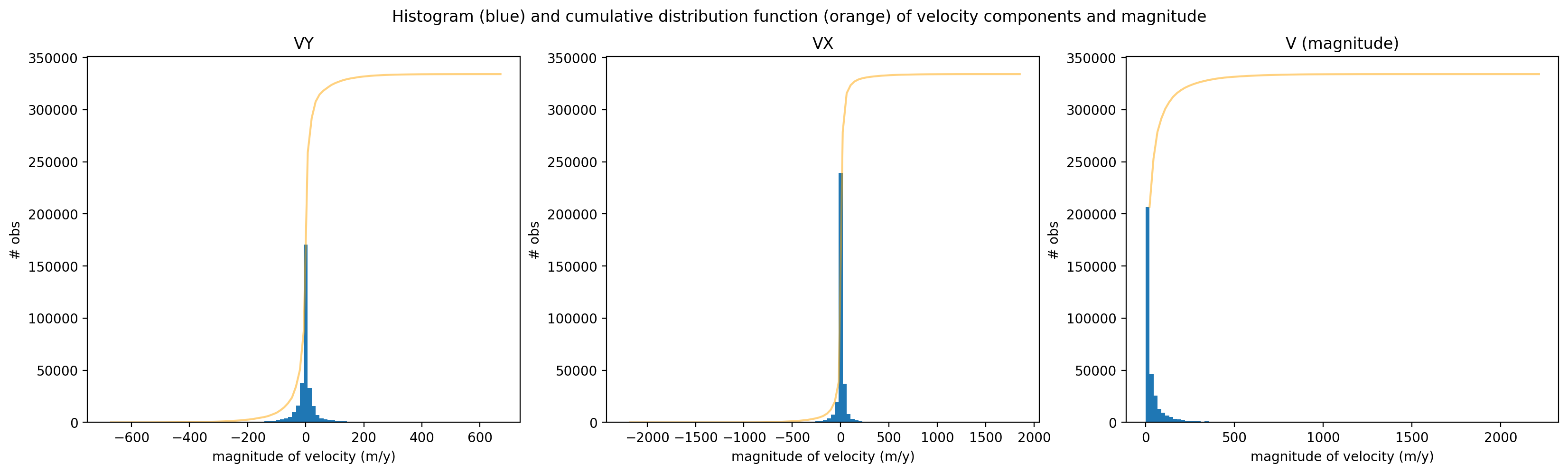
We can also look at the skew of each variable. TO do this, we use xr.reduce() and scipy.stats.skew()
print('Skew of vy: ',sample_glacier_raster.vy.reduce(func=scipy.stats.skew, nan_policy='omit', dim=['x','y','mid_date']).data)
print('Skew of vx: ',sample_glacier_raster.vx.reduce(func=scipy.stats.skew, nan_policy='omit', dim=['x','y','mid_date']).data)
print('Skew of v: ',sample_glacier_raster.v.reduce(func=scipy.stats.skew, nan_policy='omit', dim=['x','y','mid_date']).data)
Skew of vy:  -0.4540084857562447
Skew of vx:  0.19356243875503296
Skew of v:  5.005839671572479
Calculating magnitude of velocity#
We’ll first define a function for calculating magnitude of velocity in two ways. Because we want to calculate the magnitude of the displacement vector after we have already reduced the data along a dimension, we write a function that creates two magnitude of velocity variables, one where magnitude is calculated from the means of the vx and vy vectors in space and one where the magnitude is calculated from the medians of the vx and vy vectors in time. We just need to be careful which variable we use.
def calc_velocity_magnitude(ds):
    #naming convention is the dim that variable still has
    # use mean for reductions of components because components normally distributed
    ds = ds.copy()

    ds['v_mag_time'] = np.sqrt(ds.vx.mean(dim=['x','y'])**2 + ds.vy.mean(dim=['x','y'])**2)

    ds['v_mag_space'] = np.sqrt(ds.vx.mean(dim=['mid_date'])**2 + (ds.vy.mean(dim=['mid_date'])**2))
    return ds
sample_glacier_raster_mag = calc_velocity_magnitude(sample_glacier_raster)
Visualize velocity variability#
Now that we have calculated magnitude of velocity, we will plot the histogram of calculated magnitude of velocity values in space (left) and time (right). Note that the scales of the x-axes of the two plots are different, as are the number of bins used in each. These results indicate that the variability of velocity in time is much greater than the variability of velocity in space.
fig,axs=plt.subplots(ncols=2, figsize=(20,5))
sample_glacier_raster_mag.v_mag_space.plot.hist(ax=axs[0], bins=100)
sample_glacier_raster_mag.v_mag_time.plot.hist(ax=axs[1], bins=500)
axs[0].set_title('space')
axs[1].set_title('time')

#axs[0].set_xlim(0,60)
#axs[1].set_xlim(0,400)

axs[0].set_ylabel('# obs')
axs[1].set_ylabel('# obs')
axs[0].set_xlabel('magnitude of velocity (m/y)')
axs[1].set_xlabel('magnitude of velocity (m/y)')

fig.suptitle('Histogram of magnitude of velocity') ;
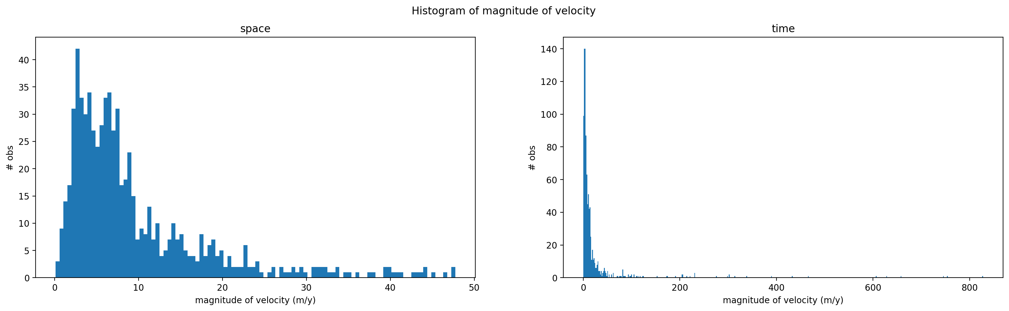
We can look at skewness of the magnitude distributions to better understand how these variables behave in space and time.
print('Skew of vmag reduced along spatial dimensions: ',sample_glacier_raster_mag.v_mag_time.reduce(func=scipy.stats.skew, nan_policy='omit', dim=['mid_date']).data)
print('Skew of vmag reduced along temporal dimension: ',sample_glacier_raster_mag.v_mag_space.reduce(func=scipy.stats.skew, nan_policy='omit', dim=['x','y',]).data)
Skew of vmag reduced along spatial dimensions:  7.368324621443265
Skew of vmag reduced along temporal dimension:  2.0117210137206567
Both v_mag_time (reduced along spatial dimensions, exists along temporal dimension) and v_mag_space (reduced along temporal dimension, exists along spatial dimensions) are positively skewed. We also see that the skewness v_mag_time is much greater than v_mag_space, suggesting that the distribution of magnitude of velocity is much more positively skewed (characterized by large, positive outliers) in time than in space. Physically speaking, magnitude of velocity variability is characterized by more extreme outliers over time than across the surface of the glacier.
Checking coverage#
Now that we’ve reduced the dataset, we can look at the coverage of the magnitude variables using xarray methods.
First, we want to know how many observations (not NaNs) exist along the time dimension of v_mag_time. We can use xr.DataArray.count():
sample_glacier_raster_mag.v_mag_time.count(dim='mid_date').data
array(927)
We can verify that by using isnull(), notnull() and sum():
sample_glacier_raster_mag.v_mag_time.isnull().sum().data
array(3047)
sample_glacier_raster_mag.v_mag_time.notnull().sum().data
array(927)
Great, now look at space:
sample_glacier_raster_mag.v_mag_space.count(dim=['x','y']).data
array(707)
And checking against the sum() methods:
sample_glacier_raster_mag.v_mag_space.isnull().sum().data
array(773)
sample_glacier_raster_mag.v_mag_space.notnull().sum().data
array(707)
Next, we will visualize magnitude of velocity calculated by reducing along the x and y dimensions:
fig, ax= plt.subplots()
sample_glacier_raster_mag['v_mag_time'].plot.scatter(marker='o', alpha=0.9)
ax.set_title('Median magnitude of velocity over x,y dimensions, 2017-2020')
ax.set_ylabel('Magnitude of velocity (m/y)')
ax.set_xlabel('Time');
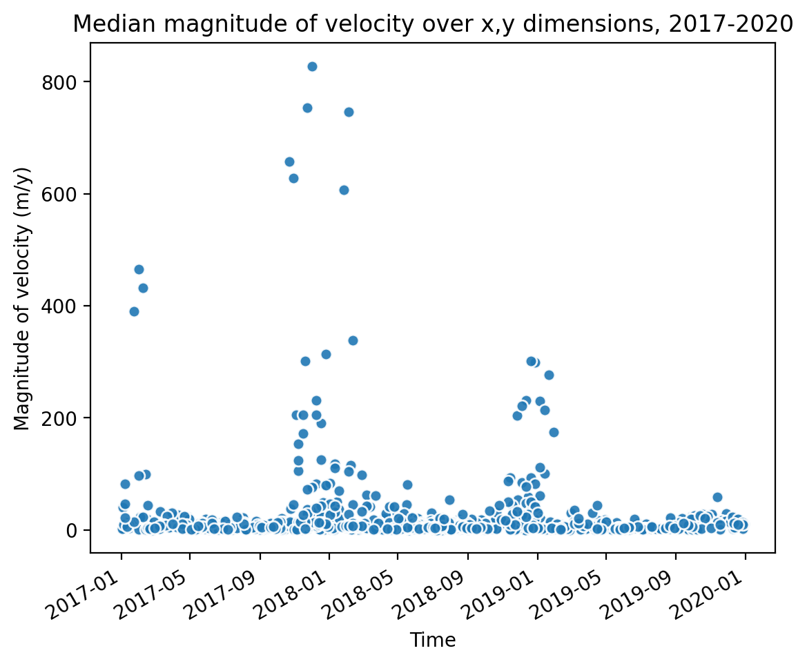
Temporal resampling#
Similar to the histogram, the time series shows a large amount of variability in median velocity over time. Let’s use xarray tools to resample the time dimension.
sample_glacier_raster = sample_glacier_raster.sortby('mid_date')
sample_glacier_raster
<xarray.Dataset>
Dimensions:                     (mid_date: 3974, y: 37, x: 40)
Coordinates:
  * mid_date                    (mid_date) datetime64[ns] 2017-01-01T16:15:50...
  * x                           (x) float64 7.843e+05 7.844e+05 ... 7.889e+05
  * y                           (y) float64 3.316e+06 3.316e+06 ... 3.311e+06
    mapping                     int64 0
Data variables: (12/60)
    M11                         (mid_date, y, x) float32 nan nan nan ... nan nan
    M11_dr_to_vr_factor         (mid_date) float32 nan nan nan ... nan nan nan
    M12                         (mid_date, y, x) float32 nan nan nan ... nan nan
    M12_dr_to_vr_factor         (mid_date) float32 nan nan nan ... nan nan nan
    acquisition_date_img1       (mid_date) datetime64[ns] 2016-05-24T04:15:52...
    acquisition_date_img2       (mid_date) datetime64[ns] 2017-08-12T04:15:49...
    ...                          ...
    vy_error_slow               (mid_date) float32 2.5 2.7 3.1 ... 4.6 1.6 11.3
    vy_error_stationary         (mid_date) float32 2.5 2.7 3.1 ... 4.6 1.6 11.2
    vy_stable_shift             (mid_date) float32 -7.7 -13.0 -2.5 ... 3.3 -7.6
    vy_stable_shift_slow        (mid_date) float32 -7.7 -12.9 -2.5 ... 3.3 -7.6
    vy_stable_shift_stationary  (mid_date) float32 -7.7 -13.0 -2.5 ... 3.3 -7.6
    cov                         (mid_date) float64 0.0 0.0 0.2489 ... 0.0 0.9562
Attributes: (12/19)
    Conventions:                CF-1.8
    GDAL_AREA_OR_POINT:         Area
    author:                     ITS_LIVE, a NASA MEaSUREs project (its-live.j...
    autoRIFT_parameter_file:    http://its-live-data.s3.amazonaws.com/autorif...
    datacube_software_version:  1.0
    date_created:               25-Sep-2023 22:00:23
    ...                         ...
    s3:                         s3://its-live-data/datacubes/v2/N30E090/ITS_L...
    skipped_granules:           s3://its-live-data/datacubes/v2/N30E090/ITS_L...
    time_standard_img1:         UTC
    time_standard_img2:         UTC
    title:                      ITS_LIVE datacube of image pair velocities
url: https://its-live-data.s3.amazonaws.com/datacu...- mid_date: 3974
- y: 37
- x: 40
- mid_date(mid_date)datetime64[ns]2017-01-01T16:15:50.660524032 .....
- description :
- midpoint of image 1 and image 2 acquisition date and time with granule's centroid longitude and latitude as microseconds
- standard_name :
- image_pair_center_date_with_time_separation
array(['2017-01-01T16:15:50.660524032', '2017-01-01T16:15:50.660524032', '2017-01-01T16:15:50.660524032', ..., '2019-12-30T04:15:51.190827008', '2019-12-30T04:15:54.190602752', '2019-12-30T04:19:46.191115008'], dtype='datetime64[ns]') - x(x)float647.843e+05 7.844e+05 ... 7.889e+05
- description :
- x coordinate of projection
- standard_name :
- projection_x_coordinate
- axis :
- X
- long_name :
- x coordinate of projection
- units :
- metre
array([784252.5, 784372.5, 784492.5, 784612.5, 784732.5, 784852.5, 784972.5, 785092.5, 785212.5, 785332.5, 785452.5, 785572.5, 785692.5, 785812.5, 785932.5, 786052.5, 786172.5, 786292.5, 786412.5, 786532.5, 786652.5, 786772.5, 786892.5, 787012.5, 787132.5, 787252.5, 787372.5, 787492.5, 787612.5, 787732.5, 787852.5, 787972.5, 788092.5, 788212.5, 788332.5, 788452.5, 788572.5, 788692.5, 788812.5, 788932.5]) - y(y)float643.316e+06 3.316e+06 ... 3.311e+06
- description :
- y coordinate of projection
- standard_name :
- projection_y_coordinate
- axis :
- Y
- long_name :
- y coordinate of projection
- units :
- metre
array([3315787.5, 3315667.5, 3315547.5, 3315427.5, 3315307.5, 3315187.5, 3315067.5, 3314947.5, 3314827.5, 3314707.5, 3314587.5, 3314467.5, 3314347.5, 3314227.5, 3314107.5, 3313987.5, 3313867.5, 3313747.5, 3313627.5, 3313507.5, 3313387.5, 3313267.5, 3313147.5, 3313027.5, 3312907.5, 3312787.5, 3312667.5, 3312547.5, 3312427.5, 3312307.5, 3312187.5, 3312067.5, 3311947.5, 3311827.5, 3311707.5, 3311587.5, 3311467.5]) - mapping()int640
- crs_wkt :
- PROJCS["WGS 84 / UTM zone 46N",GEOGCS["WGS 84",DATUM["WGS_1984",SPHEROID["WGS 84",6378137,298.257223563,AUTHORITY["EPSG","7030"]],AUTHORITY["EPSG","6326"]],PRIMEM["Greenwich",0,AUTHORITY["EPSG","8901"]],UNIT["degree",0.0174532925199433,AUTHORITY["EPSG","9122"]],AUTHORITY["EPSG","4326"]],PROJECTION["Transverse_Mercator"],PARAMETER["latitude_of_origin",0],PARAMETER["central_meridian",93],PARAMETER["scale_factor",0.9996],PARAMETER["false_easting",500000],PARAMETER["false_northing",0],UNIT["metre",1,AUTHORITY["EPSG","9001"]],AXIS["Easting",EAST],AXIS["Northing",NORTH],AUTHORITY["EPSG","32646"]]
- semi_major_axis :
- 6378137.0
- semi_minor_axis :
- 6356752.314245179
- inverse_flattening :
- 298.257223563
- reference_ellipsoid_name :
- WGS 84
- longitude_of_prime_meridian :
- 0.0
- prime_meridian_name :
- Greenwich
- geographic_crs_name :
- WGS 84
- horizontal_datum_name :
- World Geodetic System 1984
- projected_crs_name :
- WGS 84 / UTM zone 46N
- grid_mapping_name :
- transverse_mercator
- latitude_of_projection_origin :
- 0.0
- longitude_of_central_meridian :
- 93.0
- false_easting :
- 500000.0
- false_northing :
- 0.0
- scale_factor_at_central_meridian :
- 0.9996
- spatial_ref :
- PROJCS["WGS 84 / UTM zone 46N",GEOGCS["WGS 84",DATUM["WGS_1984",SPHEROID["WGS 84",6378137,298.257223563,AUTHORITY["EPSG","7030"]],AUTHORITY["EPSG","6326"]],PRIMEM["Greenwich",0,AUTHORITY["EPSG","8901"]],UNIT["degree",0.0174532925199433,AUTHORITY["EPSG","9122"]],AUTHORITY["EPSG","4326"]],PROJECTION["Transverse_Mercator"],PARAMETER["latitude_of_origin",0],PARAMETER["central_meridian",93],PARAMETER["scale_factor",0.9996],PARAMETER["false_easting",500000],PARAMETER["false_northing",0],UNIT["metre",1,AUTHORITY["EPSG","9001"]],AXIS["Easting",EAST],AXIS["Northing",NORTH],AUTHORITY["EPSG","32646"]]
- GeoTransform :
- 784192.5 120.0 0.0 3315847.5 0.0 -120.0
array(0)
- M11(mid_date, y, x)float32nan nan nan nan ... nan nan nan nan
- description :
- conversion matrix element (1st row, 1st column) that can be multiplied with vx to give range pixel displacement dr (see Eq. A18 in https://www.mdpi.com/2072-4292/13/4/749)
- grid_mapping :
- mapping
- standard_name :
- conversion_matrix_element_11
- units :
- pixel/(meter/year)
array([[[nan, nan, nan, ..., nan, nan, nan], [nan, nan, nan, ..., nan, nan, nan], [nan, nan, nan, ..., nan, nan, nan], ..., [nan, nan, nan, ..., nan, nan, nan], [nan, nan, nan, ..., nan, nan, nan], [nan, nan, nan, ..., nan, nan, nan]], [[nan, nan, nan, ..., nan, nan, nan], [nan, nan, nan, ..., nan, nan, nan], [nan, nan, nan, ..., nan, nan, nan], ..., [nan, nan, nan, ..., nan, nan, nan], [nan, nan, nan, ..., nan, nan, nan], [nan, nan, nan, ..., nan, nan, nan]], [[nan, nan, nan, ..., nan, nan, nan], [nan, nan, nan, ..., nan, nan, nan], [nan, nan, nan, ..., nan, nan, nan], ..., ... ..., [nan, nan, nan, ..., nan, nan, nan], [nan, nan, nan, ..., nan, nan, nan], [nan, nan, nan, ..., nan, nan, nan]], [[nan, nan, nan, ..., nan, nan, nan], [nan, nan, nan, ..., nan, nan, nan], [nan, nan, nan, ..., nan, nan, nan], ..., [nan, nan, nan, ..., nan, nan, nan], [nan, nan, nan, ..., nan, nan, nan], [nan, nan, nan, ..., nan, nan, nan]], [[nan, nan, nan, ..., nan, nan, nan], [nan, nan, nan, ..., nan, nan, nan], [nan, nan, nan, ..., nan, nan, nan], ..., [nan, nan, nan, ..., nan, nan, nan], [nan, nan, nan, ..., nan, nan, nan], [nan, nan, nan, ..., nan, nan, nan]]], dtype=float32) - M11_dr_to_vr_factor(mid_date)float32nan nan nan nan ... nan nan nan nan
- description :
- multiplicative factor that converts slant range pixel displacement dr to slant range velocity vr
- standard_name :
- M11_dr_to_vr_factor
- units :
- meter/(year*pixel)
array([nan, nan, nan, ..., nan, nan, nan], dtype=float32)
- M12(mid_date, y, x)float32nan nan nan nan ... nan nan nan nan
- description :
- conversion matrix element (1st row, 2nd column) that can be multiplied with vy to give range pixel displacement dr (see Eq. A18 in https://www.mdpi.com/2072-4292/13/4/749)
- grid_mapping :
- mapping
- standard_name :
- conversion_matrix_element_12
- units :
- pixel/(meter/year)
array([[[nan, nan, nan, ..., nan, nan, nan], [nan, nan, nan, ..., nan, nan, nan], [nan, nan, nan, ..., nan, nan, nan], ..., [nan, nan, nan, ..., nan, nan, nan], [nan, nan, nan, ..., nan, nan, nan], [nan, nan, nan, ..., nan, nan, nan]], [[nan, nan, nan, ..., nan, nan, nan], [nan, nan, nan, ..., nan, nan, nan], [nan, nan, nan, ..., nan, nan, nan], ..., [nan, nan, nan, ..., nan, nan, nan], [nan, nan, nan, ..., nan, nan, nan], [nan, nan, nan, ..., nan, nan, nan]], [[nan, nan, nan, ..., nan, nan, nan], [nan, nan, nan, ..., nan, nan, nan], [nan, nan, nan, ..., nan, nan, nan], ..., ... ..., [nan, nan, nan, ..., nan, nan, nan], [nan, nan, nan, ..., nan, nan, nan], [nan, nan, nan, ..., nan, nan, nan]], [[nan, nan, nan, ..., nan, nan, nan], [nan, nan, nan, ..., nan, nan, nan], [nan, nan, nan, ..., nan, nan, nan], ..., [nan, nan, nan, ..., nan, nan, nan], [nan, nan, nan, ..., nan, nan, nan], [nan, nan, nan, ..., nan, nan, nan]], [[nan, nan, nan, ..., nan, nan, nan], [nan, nan, nan, ..., nan, nan, nan], [nan, nan, nan, ..., nan, nan, nan], ..., [nan, nan, nan, ..., nan, nan, nan], [nan, nan, nan, ..., nan, nan, nan], [nan, nan, nan, ..., nan, nan, nan]]], dtype=float32) - M12_dr_to_vr_factor(mid_date)float32nan nan nan nan ... nan nan nan nan
- description :
- multiplicative factor that converts slant range pixel displacement dr to slant range velocity vr
- standard_name :
- M12_dr_to_vr_factor
- units :
- meter/(year*pixel)
array([nan, nan, nan, ..., nan, nan, nan], dtype=float32)
- acquisition_date_img1(mid_date)datetime64[ns]2016-05-24T04:15:52 ... 2019-11-...
- description :
- acquisition date and time of image 1
- standard_name :
- image1_acquition_date
array(['2016-05-24T04:15:52.000000000', '2016-05-24T04:15:52.000000000', '2016-05-24T04:15:52.000000000', ..., '2019-08-27T04:15:51.000000000', '2019-06-03T04:15:58.999999744', '2019-11-15T04:20:31.000000000'], dtype='datetime64[ns]') - acquisition_date_img2(mid_date)datetime64[ns]2017-08-12T04:15:49 ... 2020-02-...
- description :
- acquisition date and time of image 2
- standard_name :
- image2_acquition_date
array(['2017-08-12T04:15:49.000000000', '2017-08-12T04:15:49.000000000', '2017-08-12T04:15:49.000000000', ..., '2020-05-03T04:15:51.000000000', '2020-07-27T04:15:49.000000000', '2020-02-13T04:19:01.000000000'], dtype='datetime64[ns]') - autoRIFT_software_version(mid_date)object'1.5.0' '1.5.0' ... '1.5.0' '1.5.0'
- description :
- version of autoRIFT software
- standard_name :
- autoRIFT_software_version
array(['1.5.0', '1.5.0', '1.5.0', ..., '1.5.0', '1.5.0', '1.5.0'], dtype=object) - chip_size_height(mid_date, y, x)float32nan nan nan nan ... nan nan nan nan
- chip_size_coordinates :
- Optical data: chip_size_coordinates = 'image projection geometry: width = x, height = y'. Radar data: chip_size_coordinates = 'radar geometry: width = range, height = azimuth'
- description :
- height of search template (chip)
- grid_mapping :
- mapping
- standard_name :
- chip_size_height
- units :
- m
- y_pixel_size :
- 10.0
array([[[ nan, nan, nan, ..., nan, nan, nan], [ nan, nan, nan, ..., nan, nan, nan], [ nan, nan, nan, ..., nan, nan, nan], ..., [ nan, nan, nan, ..., nan, nan, nan], [ nan, nan, nan, ..., nan, nan, nan], [ nan, nan, nan, ..., nan, nan, nan]], [[ nan, nan, nan, ..., nan, nan, nan], [ nan, nan, nan, ..., nan, nan, nan], [ nan, nan, nan, ..., nan, nan, nan], ..., [ nan, nan, nan, ..., nan, nan, nan], [ nan, nan, nan, ..., nan, nan, nan], [ nan, nan, nan, ..., nan, nan, nan]], [[ nan, nan, nan, ..., 240., nan, nan], [ nan, nan, nan, ..., 240., 240., nan], [ nan, nan, nan, ..., 480., 480., nan], ..., ... ..., [ nan, nan, nan, ..., nan, nan, nan], [ nan, nan, nan, ..., nan, nan, nan], [ nan, nan, nan, ..., nan, nan, nan]], [[ nan, nan, nan, ..., nan, nan, nan], [ nan, nan, nan, ..., nan, nan, nan], [ nan, nan, nan, ..., nan, nan, nan], ..., [ nan, nan, nan, ..., nan, nan, nan], [ nan, nan, nan, ..., nan, nan, nan], [ nan, nan, nan, ..., nan, nan, nan]], [[ nan, nan, nan, ..., 240., nan, nan], [ nan, nan, nan, ..., 240., 240., nan], [ nan, nan, nan, ..., 240., 240., nan], ..., [ nan, nan, nan, ..., nan, nan, nan], [ nan, nan, nan, ..., nan, nan, nan], [ nan, nan, nan, ..., nan, nan, nan]]], dtype=float32) - chip_size_width(mid_date, y, x)float32nan nan nan nan ... nan nan nan nan
- chip_size_coordinates :
- Optical data: chip_size_coordinates = 'image projection geometry: width = x, height = y'. Radar data: chip_size_coordinates = 'radar geometry: width = range, height = azimuth'
- description :
- width of search template (chip)
- grid_mapping :
- mapping
- standard_name :
- chip_size_width
- units :
- m
- x_pixel_size :
- 10.0
array([[[ nan, nan, nan, ..., nan, nan, nan], [ nan, nan, nan, ..., nan, nan, nan], [ nan, nan, nan, ..., nan, nan, nan], ..., [ nan, nan, nan, ..., nan, nan, nan], [ nan, nan, nan, ..., nan, nan, nan], [ nan, nan, nan, ..., nan, nan, nan]], [[ nan, nan, nan, ..., nan, nan, nan], [ nan, nan, nan, ..., nan, nan, nan], [ nan, nan, nan, ..., nan, nan, nan], ..., [ nan, nan, nan, ..., nan, nan, nan], [ nan, nan, nan, ..., nan, nan, nan], [ nan, nan, nan, ..., nan, nan, nan]], [[ nan, nan, nan, ..., 240., nan, nan], [ nan, nan, nan, ..., 240., 240., nan], [ nan, nan, nan, ..., 480., 480., nan], ..., ... ..., [ nan, nan, nan, ..., nan, nan, nan], [ nan, nan, nan, ..., nan, nan, nan], [ nan, nan, nan, ..., nan, nan, nan]], [[ nan, nan, nan, ..., nan, nan, nan], [ nan, nan, nan, ..., nan, nan, nan], [ nan, nan, nan, ..., nan, nan, nan], ..., [ nan, nan, nan, ..., nan, nan, nan], [ nan, nan, nan, ..., nan, nan, nan], [ nan, nan, nan, ..., nan, nan, nan]], [[ nan, nan, nan, ..., 240., nan, nan], [ nan, nan, nan, ..., 240., 240., nan], [ nan, nan, nan, ..., 240., 240., nan], ..., [ nan, nan, nan, ..., nan, nan, nan], [ nan, nan, nan, ..., nan, nan, nan], [ nan, nan, nan, ..., nan, nan, nan]]], dtype=float32) - date_center(mid_date)datetime64[ns]2017-01-01T16:15:50.500000 ... 2...
- description :
- midpoint of image 1 and image 2 acquisition date
- standard_name :
- image_pair_center_date
array(['2017-01-01T16:15:50.500000000', '2017-01-01T16:15:50.500000000', '2017-01-01T16:15:50.500000000', ..., '2019-12-30T04:15:51.000000000', '2019-12-30T04:15:54.000000000', '2019-12-30T04:19:46.000000000'], dtype='datetime64[ns]') - date_dt(mid_date)timedelta64[ns]444 days 23:59:57.363281252 ... ...
- description :
- time separation between acquisition of image 1 and image 2
- standard_name :
- image_pair_time_separation
array([38447997363281252, 38447997363281252, 38447997363281252, ..., 21600000000000000, 36287989453125000, 7775909692382810], dtype='timedelta64[ns]') - floatingice(y, x, mid_date)float32nan nan nan nan ... nan nan nan nan
- description :
- floating ice mask, 0 = non-floating-ice, 1 = floating-ice
- flag_meanings :
- non-ice ice
- flag_values :
- [0, 1]
- grid_mapping :
- mapping
- standard_name :
- floating ice mask
- url :
- https://its-live-data.s3.amazonaws.com/autorift_parameters/v001/N46_0120m_floatingice.tif
array([[[nan, nan, nan, ..., nan, nan, nan], [nan, nan, nan, ..., nan, nan, nan], [nan, nan, nan, ..., nan, nan, nan], ..., [ 0., 0., 0., ..., 0., 0., 0.], [nan, nan, nan, ..., nan, nan, nan], [nan, nan, nan, ..., nan, nan, nan]], [[nan, nan, nan, ..., nan, nan, nan], [nan, nan, nan, ..., nan, nan, nan], [nan, nan, nan, ..., nan, nan, nan], ..., [ 0., 0., 0., ..., 0., 0., 0.], [ 0., 0., 0., ..., 0., 0., 0.], [nan, nan, nan, ..., nan, nan, nan]], [[nan, nan, nan, ..., nan, nan, nan], [nan, nan, nan, ..., nan, nan, nan], [nan, nan, nan, ..., nan, nan, nan], ..., ... ..., [nan, nan, nan, ..., nan, nan, nan], [nan, nan, nan, ..., nan, nan, nan], [nan, nan, nan, ..., nan, nan, nan]], [[nan, nan, nan, ..., nan, nan, nan], [nan, nan, nan, ..., nan, nan, nan], [nan, nan, nan, ..., nan, nan, nan], ..., [nan, nan, nan, ..., nan, nan, nan], [nan, nan, nan, ..., nan, nan, nan], [nan, nan, nan, ..., nan, nan, nan]], [[nan, nan, nan, ..., nan, nan, nan], [nan, nan, nan, ..., nan, nan, nan], [nan, nan, nan, ..., nan, nan, nan], ..., [nan, nan, nan, ..., nan, nan, nan], [nan, nan, nan, ..., nan, nan, nan], [nan, nan, nan, ..., nan, nan, nan]]], dtype=float32) - granule_url(mid_date)object'https://its-live-data.s3.amazon...
- description :
- original granule URL
- standard_name :
- granule_url
array(['https://its-live-data.s3.amazonaws.com/velocity_image_pair/sentinel2/v02/N30E090/S2A_MSIL1C_20160524T041552_N0202_R090_T46RGV_20160524T042151_X_S2B_MSIL1C_20170812T041549_N0205_R090_T46RGV_20170812T042209_G0120V02_P055.nc', 'https://its-live-data.s3.amazonaws.com/velocity_image_pair/sentinel2/v02/N30E090/S2A_MSIL1C_20160524T041552_N0202_R090_T46RFV_20160524T042151_X_S2B_MSIL1C_20170812T041549_N0205_R090_T46RFV_20170812T042209_G0120V02_P056.nc', 'https://its-live-data.s3.amazonaws.com/velocity_image_pair/sentinel2/v02/N30E090/S2A_MSIL1C_20160524T041552_N0202_R090_T46RGU_20160524T042151_X_S2B_MSIL1C_20170812T041549_N0205_R090_T46RGU_20170812T042209_G0120V02_P032.nc', ..., 'https://its-live-data.s3.amazonaws.com/velocity_image_pair/sentinel2/v02/N30E090/S2A_MSIL1C_20190827T041551_N0208_R090_T46RGV_20190827T071253_X_S2A_MSIL1C_20200503T041551_N0209_R090_T46RGV_20200503T074840_G0120V02_P055.nc', 'https://its-live-data.s3.amazonaws.com/velocity_image_pair/sentinel2/v02/N30E090/S2B_MSIL1C_20190603T041559_N0207_R090_T46RGV_20190603T084547_X_S2B_MSIL1C_20200727T041549_N0209_R090_T46RGV_20200727T084722_G0120V02_P063.nc', 'https://its-live-data.s3.amazonaws.com/velocity_image_pair/sentinel2/v02/N30E090/S2A_MSIL1C_20191115T042031_N0208_R090_T46RGU_20191115T072359_X_S2A_MSIL1C_20200213T041901_N0209_R090_T46RGU_20200213T070502_G0120V02_P072.nc'], dtype=object) - interp_mask(mid_date, y, x)float32nan nan nan nan ... nan nan nan nan
- description :
- light interpolation mask
- flag_meanings :
- measured interpolated
- flag_values :
- [0, 1]
- grid_mapping :
- mapping
- standard_name :
- interpolated_value_mask
array([[[nan, nan, nan, ..., nan, nan, nan], [nan, nan, nan, ..., nan, nan, nan], [nan, nan, nan, ..., nan, nan, nan], ..., [nan, nan, nan, ..., nan, nan, nan], [nan, nan, nan, ..., nan, nan, nan], [nan, nan, nan, ..., nan, nan, nan]], [[nan, nan, nan, ..., nan, nan, nan], [nan, nan, nan, ..., nan, nan, nan], [nan, nan, nan, ..., nan, nan, nan], ..., [nan, nan, nan, ..., nan, nan, nan], [nan, nan, nan, ..., nan, nan, nan], [nan, nan, nan, ..., nan, nan, nan]], [[nan, nan, nan, ..., nan, nan, nan], [nan, nan, nan, ..., nan, nan, nan], [nan, nan, nan, ..., nan, nan, nan], ..., ... ..., [nan, nan, nan, ..., nan, nan, nan], [nan, nan, nan, ..., nan, nan, nan], [nan, nan, nan, ..., nan, nan, nan]], [[nan, nan, nan, ..., nan, nan, nan], [nan, nan, nan, ..., nan, nan, nan], [nan, nan, nan, ..., nan, nan, nan], ..., [nan, nan, nan, ..., nan, nan, nan], [nan, nan, nan, ..., nan, nan, nan], [nan, nan, nan, ..., nan, nan, nan]], [[nan, nan, nan, ..., nan, nan, nan], [nan, nan, nan, ..., nan, nan, nan], [nan, nan, nan, ..., nan, nan, nan], ..., [nan, nan, nan, ..., nan, nan, nan], [nan, nan, nan, ..., nan, nan, nan], [nan, nan, nan, ..., nan, nan, nan]]], dtype=float32) - landice(y, x, mid_date)float32nan nan nan nan ... nan nan nan nan
- description :
- land ice mask, 0 = non-land-ice, 1 = land-ice
- flag_meanings :
- non-ice ice
- flag_values :
- [0, 1]
- grid_mapping :
- mapping
- standard_name :
- land ice mask
- url :
- https://its-live-data.s3.amazonaws.com/autorift_parameters/v001/N46_0120m_landice.tif
array([[[nan, nan, nan, ..., nan, nan, nan], [nan, nan, nan, ..., nan, nan, nan], [nan, nan, nan, ..., nan, nan, nan], ..., [ 1., 1., 1., ..., 1., 1., 1.], [nan, nan, nan, ..., nan, nan, nan], [nan, nan, nan, ..., nan, nan, nan]], [[nan, nan, nan, ..., nan, nan, nan], [nan, nan, nan, ..., nan, nan, nan], [nan, nan, nan, ..., nan, nan, nan], ..., [ 1., 1., 1., ..., 1., 1., 1.], [ 1., 1., 1., ..., 1., 1., 1.], [nan, nan, nan, ..., nan, nan, nan]], [[nan, nan, nan, ..., nan, nan, nan], [nan, nan, nan, ..., nan, nan, nan], [nan, nan, nan, ..., nan, nan, nan], ..., ... ..., [nan, nan, nan, ..., nan, nan, nan], [nan, nan, nan, ..., nan, nan, nan], [nan, nan, nan, ..., nan, nan, nan]], [[nan, nan, nan, ..., nan, nan, nan], [nan, nan, nan, ..., nan, nan, nan], [nan, nan, nan, ..., nan, nan, nan], ..., [nan, nan, nan, ..., nan, nan, nan], [nan, nan, nan, ..., nan, nan, nan], [nan, nan, nan, ..., nan, nan, nan]], [[nan, nan, nan, ..., nan, nan, nan], [nan, nan, nan, ..., nan, nan, nan], [nan, nan, nan, ..., nan, nan, nan], ..., [nan, nan, nan, ..., nan, nan, nan], [nan, nan, nan, ..., nan, nan, nan], [nan, nan, nan, ..., nan, nan, nan]]], dtype=float32) - mission_img1(mid_date)object'S' 'S' 'S' 'S' ... 'S' 'S' 'S' 'S'
- description :
- id of the mission that acquired image 1
- standard_name :
- image1_mission
array(['S', 'S', 'S', ..., 'S', 'S', 'S'], dtype=object)
- mission_img2(mid_date)object'S' 'S' 'S' 'S' ... 'S' 'S' 'S' 'S'
- description :
- id of the mission that acquired image 2
- standard_name :
- image2_mission
array(['S', 'S', 'S', ..., 'S', 'S', 'S'], dtype=object)
- roi_valid_percentage(mid_date)float3255.2 56.6 32.0 ... 55.6 63.3 72.7
- description :
- percentage of pixels with a valid velocity estimate determined for the intersection of the full image pair footprint and the region of interest (roi) that defines where autoRIFT tried to estimate a velocity
- standard_name :
- region_of_interest_valid_pixel_percentage
array([55.2, 56.6, 32. , ..., 55.6, 63.3, 72.7], dtype=float32)
- satellite_img1(mid_date)object'2A' '2A' '2A' ... '2A' '2B' '2A'
- description :
- id of the satellite that acquired image 1
- standard_name :
- image1_satellite
array(['2A', '2A', '2A', ..., '2A', '2B', '2A'], dtype=object)
- satellite_img2(mid_date)object'2B' '2B' '2B' ... '2A' '2B' '2A'
- description :
- id of the satellite that acquired image 2
- standard_name :
- image2_satellite
array(['2B', '2B', '2B', ..., '2A', '2B', '2A'], dtype=object)
- sensor_img1(mid_date)object'MSI' 'MSI' 'MSI' ... 'MSI' 'MSI'
- description :
- id of the sensor that acquired image 1
- standard_name :
- image1_sensor
array(['MSI', 'MSI', 'MSI', ..., 'MSI', 'MSI', 'MSI'], dtype=object)
- sensor_img2(mid_date)object'MSI' 'MSI' 'MSI' ... 'MSI' 'MSI'
- description :
- id of the sensor that acquired image 2
- standard_name :
- image2_sensor
array(['MSI', 'MSI', 'MSI', ..., 'MSI', 'MSI', 'MSI'], dtype=object)
- stable_count_slow(mid_date)float644.376e+04 7.63e+03 ... 6.536e+04
- description :
- number of valid pixels over slowest 25% of ice
- standard_name :
- stable_count_slow
- units :
- count
array([43762., 7630., 48516., ..., 44815., 4088., 65363.])
- stable_count_stationary(mid_date)float644.359e+04 7.021e+03 ... 6.329e+04
- description :
- number of valid pixels over stationary or slow-flowing surfaces
- standard_name :
- stable_count_stationary
- units :
- count
array([43594., 7021., 47504., ..., 44763., 3980., 63286.])
- stable_shift_flag(mid_date)float641.0 1.0 1.0 1.0 ... 1.0 1.0 1.0 1.0
- description :
- flag for applying velocity bias correction: 0 = no correction; 1 = correction from overlapping stable surface mask (stationary or slow-flowing surfaces with velocity < 15 m/yr)(top priority); 2 = correction from slowest 25% of overlapping velocities (second priority)
- standard_name :
- stable_shift_flag
array([1., 1., 1., ..., 1., 1., 1.])
- v(mid_date, y, x)float32nan nan nan nan ... nan nan nan nan
- description :
- velocity magnitude
- grid_mapping :
- mapping
- standard_name :
- land_ice_surface_velocity
- units :
- meter/year
array([[[nan, nan, nan, ..., nan, nan, nan], [nan, nan, nan, ..., nan, nan, nan], [nan, nan, nan, ..., nan, nan, nan], ..., [nan, nan, nan, ..., nan, nan, nan], [nan, nan, nan, ..., nan, nan, nan], [nan, nan, nan, ..., nan, nan, nan]], [[nan, nan, nan, ..., nan, nan, nan], [nan, nan, nan, ..., nan, nan, nan], [nan, nan, nan, ..., nan, nan, nan], ..., [nan, nan, nan, ..., nan, nan, nan], [nan, nan, nan, ..., nan, nan, nan], [nan, nan, nan, ..., nan, nan, nan]], [[nan, nan, nan, ..., 3., nan, nan], [nan, nan, nan, ..., 2., 3., nan], [nan, nan, nan, ..., 1., 2., nan], ..., ... ..., [nan, nan, nan, ..., nan, nan, nan], [nan, nan, nan, ..., nan, nan, nan], [nan, nan, nan, ..., nan, nan, nan]], [[nan, nan, nan, ..., nan, nan, nan], [nan, nan, nan, ..., nan, nan, nan], [nan, nan, nan, ..., nan, nan, nan], ..., [nan, nan, nan, ..., nan, nan, nan], [nan, nan, nan, ..., nan, nan, nan], [nan, nan, nan, ..., nan, nan, nan]], [[nan, nan, nan, ..., 8., nan, nan], [nan, nan, nan, ..., 4., 5., nan], [nan, nan, nan, ..., 4., 6., nan], ..., [nan, nan, nan, ..., nan, nan, nan], [nan, nan, nan, ..., nan, nan, nan], [nan, nan, nan, ..., nan, nan, nan]]], dtype=float32) - v_error(mid_date, y, x)float32nan nan nan nan ... nan nan nan nan
- description :
- velocity magnitude error
- grid_mapping :
- mapping
- standard_name :
- velocity_error
- units :
- meter/year
array([[[nan, nan, nan, ..., nan, nan, nan], [nan, nan, nan, ..., nan, nan, nan], [nan, nan, nan, ..., nan, nan, nan], ..., [nan, nan, nan, ..., nan, nan, nan], [nan, nan, nan, ..., nan, nan, nan], [nan, nan, nan, ..., nan, nan, nan]], [[nan, nan, nan, ..., nan, nan, nan], [nan, nan, nan, ..., nan, nan, nan], [nan, nan, nan, ..., nan, nan, nan], ..., [nan, nan, nan, ..., nan, nan, nan], [nan, nan, nan, ..., nan, nan, nan], [nan, nan, nan, ..., nan, nan, nan]], [[nan, nan, nan, ..., 3., nan, nan], [nan, nan, nan, ..., 3., 3., nan], [nan, nan, nan, ..., 3., 3., nan], ..., ... ..., [nan, nan, nan, ..., nan, nan, nan], [nan, nan, nan, ..., nan, nan, nan], [nan, nan, nan, ..., nan, nan, nan]], [[nan, nan, nan, ..., nan, nan, nan], [nan, nan, nan, ..., nan, nan, nan], [nan, nan, nan, ..., nan, nan, nan], ..., [nan, nan, nan, ..., nan, nan, nan], [nan, nan, nan, ..., nan, nan, nan], [nan, nan, nan, ..., nan, nan, nan]], [[nan, nan, nan, ..., 7., nan, nan], [nan, nan, nan, ..., 9., 11., nan], [nan, nan, nan, ..., 9., 8., nan], ..., [nan, nan, nan, ..., nan, nan, nan], [nan, nan, nan, ..., nan, nan, nan], [nan, nan, nan, ..., nan, nan, nan]]], dtype=float32) - va(mid_date, y, x)float32nan nan nan nan ... nan nan nan nan
- description :
- velocity in radar azimuth direction
- grid_mapping :
- mapping
array([[[nan, nan, nan, ..., nan, nan, nan], [nan, nan, nan, ..., nan, nan, nan], [nan, nan, nan, ..., nan, nan, nan], ..., [nan, nan, nan, ..., nan, nan, nan], [nan, nan, nan, ..., nan, nan, nan], [nan, nan, nan, ..., nan, nan, nan]], [[nan, nan, nan, ..., nan, nan, nan], [nan, nan, nan, ..., nan, nan, nan], [nan, nan, nan, ..., nan, nan, nan], ..., [nan, nan, nan, ..., nan, nan, nan], [nan, nan, nan, ..., nan, nan, nan], [nan, nan, nan, ..., nan, nan, nan]], [[nan, nan, nan, ..., nan, nan, nan], [nan, nan, nan, ..., nan, nan, nan], [nan, nan, nan, ..., nan, nan, nan], ..., ... ..., [nan, nan, nan, ..., nan, nan, nan], [nan, nan, nan, ..., nan, nan, nan], [nan, nan, nan, ..., nan, nan, nan]], [[nan, nan, nan, ..., nan, nan, nan], [nan, nan, nan, ..., nan, nan, nan], [nan, nan, nan, ..., nan, nan, nan], ..., [nan, nan, nan, ..., nan, nan, nan], [nan, nan, nan, ..., nan, nan, nan], [nan, nan, nan, ..., nan, nan, nan]], [[nan, nan, nan, ..., nan, nan, nan], [nan, nan, nan, ..., nan, nan, nan], [nan, nan, nan, ..., nan, nan, nan], ..., [nan, nan, nan, ..., nan, nan, nan], [nan, nan, nan, ..., nan, nan, nan], [nan, nan, nan, ..., nan, nan, nan]]], dtype=float32) - va_error(mid_date)float32nan nan nan nan ... nan nan nan nan
- description :
- error for velocity in radar azimuth direction
- standard_name :
- va_error
- units :
- meter/year
array([nan, nan, nan, ..., nan, nan, nan], dtype=float32)
- va_error_modeled(mid_date)float32nan nan nan nan ... nan nan nan nan
- description :
- 1-sigma error calculated using a modeled error-dt relationship
- standard_name :
- va_error_modeled
- units :
- meter/year
array([nan, nan, nan, ..., nan, nan, nan], dtype=float32)
- va_error_slow(mid_date)float32nan nan nan nan ... nan nan nan nan
- description :
- RMSE over slowest 25% of retrieved velocities
- standard_name :
- va_error_slow
- units :
- meter/year
array([nan, nan, nan, ..., nan, nan, nan], dtype=float32)
- va_error_stationary(mid_date)float32nan nan nan nan ... nan nan nan nan
- description :
- RMSE over stable surfaces, stationary or slow-flowing surfaces with velocity < 15 m/yr identified from an external mask
- standard_name :
- va_error_stationary
- units :
- meter/year
array([nan, nan, nan, ..., nan, nan, nan], dtype=float32)
- va_stable_shift(mid_date)float32nan nan nan nan ... nan nan nan nan
- description :
- applied va shift calibrated using pixels over stable or slow surfaces
- standard_name :
- va_stable_shift
- units :
- meter/year
array([nan, nan, nan, ..., nan, nan, nan], dtype=float32)
- va_stable_shift_slow(mid_date)float32nan nan nan nan ... nan nan nan nan
- description :
- va shift calibrated using valid pixels over slowest 25% of retrieved velocities
- standard_name :
- va_stable_shift_slow
- units :
- meter/year
array([nan, nan, nan, ..., nan, nan, nan], dtype=float32)
- va_stable_shift_stationary(mid_date)float32nan nan nan nan ... nan nan nan nan
- description :
- va shift calibrated using valid pixels over stable surfaces, stationary or slow-flowing surfaces with velocity < 15 m/yr identified from an external mask
- standard_name :
- va_stable_shift_stationary
- units :
- meter/year
array([nan, nan, nan, ..., nan, nan, nan], dtype=float32)
- vr(mid_date, y, x)float32nan nan nan nan ... nan nan nan nan
- description :
- velocity in radar range direction
- grid_mapping :
- mapping
array([[[nan, nan, nan, ..., nan, nan, nan], [nan, nan, nan, ..., nan, nan, nan], [nan, nan, nan, ..., nan, nan, nan], ..., [nan, nan, nan, ..., nan, nan, nan], [nan, nan, nan, ..., nan, nan, nan], [nan, nan, nan, ..., nan, nan, nan]], [[nan, nan, nan, ..., nan, nan, nan], [nan, nan, nan, ..., nan, nan, nan], [nan, nan, nan, ..., nan, nan, nan], ..., [nan, nan, nan, ..., nan, nan, nan], [nan, nan, nan, ..., nan, nan, nan], [nan, nan, nan, ..., nan, nan, nan]], [[nan, nan, nan, ..., nan, nan, nan], [nan, nan, nan, ..., nan, nan, nan], [nan, nan, nan, ..., nan, nan, nan], ..., ... ..., [nan, nan, nan, ..., nan, nan, nan], [nan, nan, nan, ..., nan, nan, nan], [nan, nan, nan, ..., nan, nan, nan]], [[nan, nan, nan, ..., nan, nan, nan], [nan, nan, nan, ..., nan, nan, nan], [nan, nan, nan, ..., nan, nan, nan], ..., [nan, nan, nan, ..., nan, nan, nan], [nan, nan, nan, ..., nan, nan, nan], [nan, nan, nan, ..., nan, nan, nan]], [[nan, nan, nan, ..., nan, nan, nan], [nan, nan, nan, ..., nan, nan, nan], [nan, nan, nan, ..., nan, nan, nan], ..., [nan, nan, nan, ..., nan, nan, nan], [nan, nan, nan, ..., nan, nan, nan], [nan, nan, nan, ..., nan, nan, nan]]], dtype=float32) - vr_error(mid_date)float32nan nan nan nan ... nan nan nan nan
- description :
- error for velocity in radar range direction
- standard_name :
- vr_error
- units :
- meter/year
array([nan, nan, nan, ..., nan, nan, nan], dtype=float32)
- vr_error_modeled(mid_date)float32nan nan nan nan ... nan nan nan nan
- description :
- 1-sigma error calculated using a modeled error-dt relationship
- standard_name :
- vr_error_modeled
- units :
- meter/year
array([nan, nan, nan, ..., nan, nan, nan], dtype=float32)
- vr_error_slow(mid_date)float32nan nan nan nan ... nan nan nan nan
- description :
- RMSE over slowest 25% of retrieved velocities
- standard_name :
- vr_error_slow
- units :
- meter/year
array([nan, nan, nan, ..., nan, nan, nan], dtype=float32)
- vr_error_stationary(mid_date)float32nan nan nan nan ... nan nan nan nan
- description :
- RMSE over stable surfaces, stationary or slow-flowing surfaces with velocity < 15 m/yr identified from an external mask
- standard_name :
- vr_error_stationary
- units :
- meter/year
array([nan, nan, nan, ..., nan, nan, nan], dtype=float32)
- vr_stable_shift(mid_date)float32nan nan nan nan ... nan nan nan nan
- description :
- applied vr shift calibrated using pixels over stable or slow surfaces
- standard_name :
- vr_stable_shift
- units :
- meter/year
array([nan, nan, nan, ..., nan, nan, nan], dtype=float32)
- vr_stable_shift_slow(mid_date)float32nan nan nan nan ... nan nan nan nan
- description :
- vr shift calibrated using valid pixels over slowest 25% of retrieved velocities
- standard_name :
- vr_stable_shift_slow
- units :
- meter/year
array([nan, nan, nan, ..., nan, nan, nan], dtype=float32)
- vr_stable_shift_stationary(mid_date)float32nan nan nan nan ... nan nan nan nan
- description :
- vr shift calibrated using valid pixels over stable surfaces, stationary or slow-flowing surfaces with velocity < 15 m/yr identified from an external mask
- standard_name :
- vr_stable_shift_stationary
- units :
- meter/year
array([nan, nan, nan, ..., nan, nan, nan], dtype=float32)
- vx(mid_date, y, x)float32nan nan nan nan ... nan nan nan nan
- description :
- velocity component in x direction
- grid_mapping :
- mapping
- standard_name :
- land_ice_surface_x_velocity
- units :
- meter/year
array([[[nan, nan, nan, ..., nan, nan, nan], [nan, nan, nan, ..., nan, nan, nan], [nan, nan, nan, ..., nan, nan, nan], ..., [nan, nan, nan, ..., nan, nan, nan], [nan, nan, nan, ..., nan, nan, nan], [nan, nan, nan, ..., nan, nan, nan]], [[nan, nan, nan, ..., nan, nan, nan], [nan, nan, nan, ..., nan, nan, nan], [nan, nan, nan, ..., nan, nan, nan], ..., [nan, nan, nan, ..., nan, nan, nan], [nan, nan, nan, ..., nan, nan, nan], [nan, nan, nan, ..., nan, nan, nan]], [[nan, nan, nan, ..., 1., nan, nan], [nan, nan, nan, ..., 0., 1., nan], [nan, nan, nan, ..., 0., 0., nan], ..., ... ..., [nan, nan, nan, ..., nan, nan, nan], [nan, nan, nan, ..., nan, nan, nan], [nan, nan, nan, ..., nan, nan, nan]], [[nan, nan, nan, ..., nan, nan, nan], [nan, nan, nan, ..., nan, nan, nan], [nan, nan, nan, ..., nan, nan, nan], ..., [nan, nan, nan, ..., nan, nan, nan], [nan, nan, nan, ..., nan, nan, nan], [nan, nan, nan, ..., nan, nan, nan]], [[nan, nan, nan, ..., 8., nan, nan], [nan, nan, nan, ..., 3., 0., nan], [nan, nan, nan, ..., -3., -5., nan], ..., [nan, nan, nan, ..., nan, nan, nan], [nan, nan, nan, ..., nan, nan, nan], [nan, nan, nan, ..., nan, nan, nan]]], dtype=float32) - vx_error(mid_date)float321.5 1.6 1.6 1.5 ... 3.8 1.3 6.5
- description :
- best estimate of x_velocity error: vx_error is populated according to the approach used for the velocity bias correction as indicated in "stable_shift_flag"
- standard_name :
- vx_error
- units :
- meter/year
array([1.5, 1.6, 1.6, ..., 3.8, 1.3, 6.5], dtype=float32)
- vx_error_modeled(mid_date)float3220.9 20.9 20.9 ... 37.2 22.2 103.4
- description :
- 1-sigma error calculated using a modeled error-dt relationship
- standard_name :
- vx_error_modeled
- units :
- meter/year
array([ 20.9, 20.9, 20.9, ..., 37.2, 22.2, 103.4], dtype=float32)
- vx_error_slow(mid_date)float321.5 1.6 1.6 1.5 ... 3.8 1.3 6.5
- description :
- RMSE over slowest 25% of retrieved velocities
- standard_name :
- vx_error_slow
- units :
- meter/year
array([1.5, 1.6, 1.6, ..., 3.8, 1.3, 6.5], dtype=float32)
- vx_error_stationary(mid_date)float321.5 1.6 1.6 1.5 ... 3.8 1.3 6.5
- description :
- RMSE over stable surfaces, stationary or slow-flowing surfaces with velocity < 15 meter/year identified from an external mask
- standard_name :
- vx_error_stationary
- units :
- meter/year
array([1.5, 1.6, 1.6, ..., 3.8, 1.3, 6.5], dtype=float32)
- vx_stable_shift(mid_date)float320.5 -0.2 0.9 0.5 ... -0.2 -1.1 2.5
- description :
- applied vx shift calibrated using pixels over stable or slow surfaces
- standard_name :
- vx_stable_shift
- units :
- meter/year
array([ 0.5, -0.2, 0.9, ..., -0.2, -1.1, 2.5], dtype=float32)
- vx_stable_shift_slow(mid_date)float320.5 -0.2 0.9 0.5 ... -0.2 -1.1 2.5
- description :
- vx shift calibrated using valid pixels over slowest 25% of retrieved velocities
- standard_name :
- vx_stable_shift_slow
- units :
- meter/year
array([ 0.5, -0.2, 0.9, ..., -0.2, -1.1, 2.5], dtype=float32)
- vx_stable_shift_stationary(mid_date)float320.5 -0.2 0.9 0.5 ... -0.2 -1.1 2.5
- description :
- vx shift calibrated using valid pixels over stable surfaces, stationary or slow-flowing surfaces with velocity < 15 m/yr identified from an external mask
- standard_name :
- vx_stable_shift_stationary
- units :
- meter/year
array([ 0.5, -0.2, 0.9, ..., -0.2, -1.1, 2.5], dtype=float32)
- vy(mid_date, y, x)float32nan nan nan nan ... nan nan nan nan
- description :
- velocity component in y direction
- grid_mapping :
- mapping
- standard_name :
- land_ice_surface_y_velocity
- units :
- meter/year
array([[[nan, nan, nan, ..., nan, nan, nan], [nan, nan, nan, ..., nan, nan, nan], [nan, nan, nan, ..., nan, nan, nan], ..., [nan, nan, nan, ..., nan, nan, nan], [nan, nan, nan, ..., nan, nan, nan], [nan, nan, nan, ..., nan, nan, nan]], [[nan, nan, nan, ..., nan, nan, nan], [nan, nan, nan, ..., nan, nan, nan], [nan, nan, nan, ..., nan, nan, nan], ..., [nan, nan, nan, ..., nan, nan, nan], [nan, nan, nan, ..., nan, nan, nan], [nan, nan, nan, ..., nan, nan, nan]], [[nan, nan, nan, ..., 3., nan, nan], [nan, nan, nan, ..., 2., 2., nan], [nan, nan, nan, ..., 1., 2., nan], ..., ... ..., [nan, nan, nan, ..., nan, nan, nan], [nan, nan, nan, ..., nan, nan, nan], [nan, nan, nan, ..., nan, nan, nan]], [[nan, nan, nan, ..., nan, nan, nan], [nan, nan, nan, ..., nan, nan, nan], [nan, nan, nan, ..., nan, nan, nan], ..., [nan, nan, nan, ..., nan, nan, nan], [nan, nan, nan, ..., nan, nan, nan], [nan, nan, nan, ..., nan, nan, nan]], [[nan, nan, nan, ..., -3., nan, nan], [nan, nan, nan, ..., 3., 5., nan], [nan, nan, nan, ..., -3., 3., nan], ..., [nan, nan, nan, ..., nan, nan, nan], [nan, nan, nan, ..., nan, nan, nan], [nan, nan, nan, ..., nan, nan, nan]]], dtype=float32) - vy_error(mid_date)float322.5 2.7 3.1 2.5 ... 4.6 1.6 11.2
- description :
- best estimate of y_velocity error: vy_error is populated according to the approach used for the velocity bias correction as indicated in "stable_shift_flag"
- standard_name :
- vy_error
- units :
- meter/year
array([ 2.5, 2.7, 3.1, ..., 4.6, 1.6, 11.2], dtype=float32)
- vy_error_modeled(mid_date)float3220.9 20.9 20.9 ... 37.2 22.2 103.4
- description :
- 1-sigma error calculated using a modeled error-dt relationship
- standard_name :
- vy_error_modeled
- units :
- meter/year
array([ 20.9, 20.9, 20.9, ..., 37.2, 22.2, 103.4], dtype=float32)
- vy_error_slow(mid_date)float322.5 2.7 3.1 2.5 ... 4.6 1.6 11.3
- description :
- RMSE over slowest 25% of retrieved velocities
- standard_name :
- vy_error_slow
- units :
- meter/year
array([ 2.5, 2.7, 3.1, ..., 4.6, 1.6, 11.3], dtype=float32)
- vy_error_stationary(mid_date)float322.5 2.7 3.1 2.5 ... 4.6 1.6 11.2
- description :
- RMSE over stable surfaces, stationary or slow-flowing surfaces with velocity < 15 meter/year identified from an external mask
- standard_name :
- vy_error_stationary
- units :
- meter/year
array([ 2.5, 2.7, 3.1, ..., 4.6, 1.6, 11.2], dtype=float32)
- vy_stable_shift(mid_date)float32-7.7 -13.0 -2.5 ... 0.0 3.3 -7.6
- description :
- applied vy shift calibrated using pixels over stable or slow surfaces
- standard_name :
- vy_stable_shift
- units :
- meter/year
array([ -7.7, -13. , -2.5, ..., 0. , 3.3, -7.6], dtype=float32)
- vy_stable_shift_slow(mid_date)float32-7.7 -12.9 -2.5 ... 0.0 3.3 -7.6
- description :
- vy shift calibrated using valid pixels over slowest 25% of retrieved velocities
- standard_name :
- vy_stable_shift_slow
- units :
- meter/year
array([ -7.7, -12.9, -2.5, ..., 0. , 3.3, -7.6], dtype=float32)
- vy_stable_shift_stationary(mid_date)float32-7.7 -13.0 -2.5 ... 0.0 3.3 -7.6
- description :
- vy shift calibrated using valid pixels over stable surfaces, stationary or slow-flowing surfaces with velocity < 15 m/yr identified from an external mask
- standard_name :
- vy_stable_shift_stationary
- units :
- meter/year
array([ -7.7, -13. , -2.5, ..., 0. , 3.3, -7.6], dtype=float32)
- cov(mid_date)float640.0 0.0 0.2489 ... 0.0 0.0 0.9562
array([0.        , 0.        , 0.24893918, ..., 0.        , 0.        ,
       0.95615276])
- mid_datePandasIndex
PandasIndex(DatetimeIndex(['2017-01-01 16:15:50.660524032', '2017-01-01 16:15:50.660524032', '2017-01-01 16:15:50.660524032', '2017-01-01 16:18:50.160524032', '2017-01-01 16:18:50.160524032', '2017-01-01 16:18:50.160524032', '2017-01-03 04:12:41.751897856', '2017-01-03 04:12:43.059868928', '2017-01-03 04:12:48.665975040', '2017-01-03 04:12:55.138212864', ... '2019-12-27 16:15:55.190423808', '2019-12-27 16:15:55.190423808', '2019-12-27 16:15:55.190622976', '2019-12-27 16:19:35.191109888', '2019-12-27 16:20:45.191124992', '2019-12-27 16:21:35.191209984', '2019-12-27 16:21:35.191209984', '2019-12-30 04:15:51.190827008', '2019-12-30 04:15:54.190602752', '2019-12-30 04:19:46.191115008'], dtype='datetime64[ns]', name='mid_date', length=3974, freq=None)) - xPandasIndex
PandasIndex(Index([784252.5, 784372.5, 784492.5, 784612.5, 784732.5, 784852.5, 784972.5, 785092.5, 785212.5, 785332.5, 785452.5, 785572.5, 785692.5, 785812.5, 785932.5, 786052.5, 786172.5, 786292.5, 786412.5, 786532.5, 786652.5, 786772.5, 786892.5, 787012.5, 787132.5, 787252.5, 787372.5, 787492.5, 787612.5, 787732.5, 787852.5, 787972.5, 788092.5, 788212.5, 788332.5, 788452.5, 788572.5, 788692.5, 788812.5, 788932.5], dtype='float64', name='x')) - yPandasIndex
PandasIndex(Index([3315787.5, 3315667.5, 3315547.5, 3315427.5, 3315307.5, 3315187.5,
       3315067.5, 3314947.5, 3314827.5, 3314707.5, 3314587.5, 3314467.5,
       3314347.5, 3314227.5, 3314107.5, 3313987.5, 3313867.5, 3313747.5,
       3313627.5, 3313507.5, 3313387.5, 3313267.5, 3313147.5, 3313027.5,
       3312907.5, 3312787.5, 3312667.5, 3312547.5, 3312427.5, 3312307.5,
       3312187.5, 3312067.5, 3311947.5, 3311827.5, 3311707.5, 3311587.5,
       3311467.5],
      dtype='float64', name='y'))
- Conventions :
- CF-1.8
- GDAL_AREA_OR_POINT :
- Area
- author :
- ITS_LIVE, a NASA MEaSUREs project (its-live.jpl.nasa.gov)
- autoRIFT_parameter_file :
- http://its-live-data.s3.amazonaws.com/autorift_parameters/v001/autorift_landice_0120m.shp
- datacube_software_version :
- 1.0
- date_created :
- 25-Sep-2023 22:00:23
- date_updated :
- 25-Sep-2023 22:00:23
- geo_polygon :
- [[95.06959008486952, 29.814255053135895], [95.32812062059084, 29.809951334550703], [95.58659184122865, 29.80514261876954], [95.84499718862224, 29.7998293459177], [96.10333011481168, 29.79401200205343], [96.11032804508507, 30.019297601073085], [96.11740568350054, 30.244573983323825], [96.12456379063154, 30.469841094022847], [96.1318031397002, 30.695098878594504], [95.87110827645229, 30.70112924501256], [95.61033817656023, 30.7066371044805], [95.34949964126946, 30.711621947056347], [95.08859948278467, 30.716083310981194], [95.08376623410525, 30.49063893600811], [95.07898726183609, 30.26518607254204], [95.0742620484426, 30.039724763743482], [95.06959008486952, 29.814255053135895]]
- institution :
- NASA Jet Propulsion Laboratory (JPL), California Institute of Technology
- latitude :
- 30.26
- longitude :
- 95.6
- proj_polygon :
- [[700000, 3300000], [725000.0, 3300000.0], [750000.0, 3300000.0], [775000.0, 3300000.0], [800000, 3300000], [800000.0, 3325000.0], [800000.0, 3350000.0], [800000.0, 3375000.0], [800000, 3400000], [775000.0, 3400000.0], [750000.0, 3400000.0], [725000.0, 3400000.0], [700000, 3400000], [700000.0, 3375000.0], [700000.0, 3350000.0], [700000.0, 3325000.0], [700000, 3300000]]
- projection :
- 32646
- s3 :
- s3://its-live-data/datacubes/v2/N30E090/ITS_LIVE_vel_EPSG32646_G0120_X750000_Y3350000.zarr
- skipped_granules :
- s3://its-live-data/datacubes/v2/N30E090/ITS_LIVE_vel_EPSG32646_G0120_X750000_Y3350000.json
- time_standard_img1 :
- UTC
- time_standard_img2 :
- UTC
- title :
- ITS_LIVE datacube of image pair velocities
- url :
- https://its-live-data.s3.amazonaws.com/datacubes/v2/N30E090/ITS_LIVE_vel_EPSG32646_G0120_X750000_Y3350000.zarr
resample_obj = sample_glacier_raster.resample(mid_date = '1M')
xr.resample() is another grouping operation and returns an object of type xarray.core.resample.DatasetResample
glacier_resample_1mo = resample_obj.median(dim='mid_date')
The below plot is the initial velocity time series in blue, and the velocity data resampled to 1 month intervals in orange
fig, (ax,ax1) = plt.subplots(ncols=2, figsize=(15,5))

raw_kwargs = {'linewidth': 0,
          'marker':'o',
          'alpha':0.5}


fig.suptitle('Spatially-averaged magnitude of velocity over time')
calc_velocity_magnitude(sample_glacier_raster).v_mag_time.plot(label = 'All obs',ax=ax, **raw_kwargs)
calc_velocity_magnitude(glacier_resample_1mo).v_mag_time.plot(label = '1 month resample',ax=ax)
ax.legend()
ax.set_ylabel('meters/year')
ax.set_title('Full y-axis range')

calc_velocity_magnitude(sample_glacier_raster).v_mag_time.plot(label = 'All obs',ax=ax1, **raw_kwargs)
calc_velocity_magnitude(glacier_resample_1mo).v_mag_time.plot(label = '1 month resample',ax=ax1)
ax1.legend()
ax1.set_ylabel('meters/year')
ax1.set_title('Limiting yaxis to (0,50)')
ax1.set_ylim(0,50);
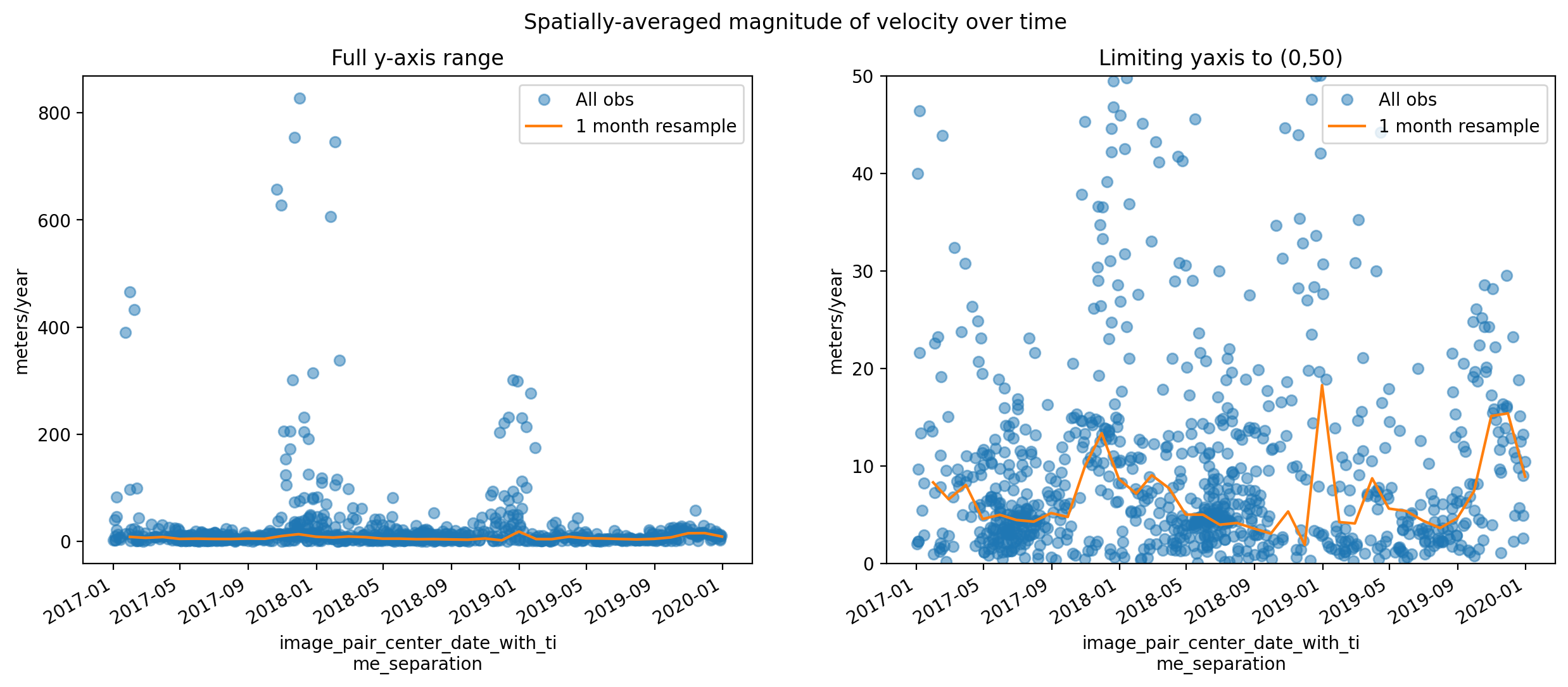
This is interesting - despite what looks to be a pretty noisy signal looking at the full time series, we can start to pick out a seasonal signal and sub-annual velocity variability looking at the velocity data resampled into 1-month bins.
Calculating velocity anomalies#
To do this, we will use xarray .groupby() and .map()
following example from xarray tutorial
We first define a function that subtracts the long-term mean from a single observation.
def remove_time_mean(x):
    return x-x.mean(dim='mid_date')
We then group the dataset by month and apply the function to calculate the anomaly on each group. Because we are using the anomalies of the velocity component vectors we will calculate the mean:
glacier_anom = sample_glacier_raster.groupby('mid_date.month').map(remove_time_mean)
We can visualize the anomalies of the x and y-components of velocity averaged over the glacier surface over time (below). Note that if we tried to compute the magnitude of velocity anomalies, they would all be positive because magnitude is a scalar quantity. Thus, this would show us the magnitude of the anomaly’s deviation from the mean but not the direction. To discern whether a magnitude of velocity anomaly is positive or negative, we would need to examine the signs of the velocity component anomalies. For simplicity, this demonstration will focus on the component anomalies.
fig, ax = plt.subplots(ncols=2, figsize=(18,5))
glacier_anom.mean(dim=['x','y']).vx.plot(ax=ax[0], marker='o', linewidth=0, markersize=5, alpha=0.5)
glacier_anom.mean(dim=['x','y']).vy.plot(ax=ax[1], marker='o', linewidth=0, markersize=5, alpha=0.5)

ax[0].set_title('x-component')
ax[1].set_title('y-component')
ax[0].set_ylabel('m/y')
ax[1].set_ylabel('m/y')
ax[0].set_xlabel('Time')
ax[1].set_xlabel('Time')

fig.suptitle('Spatially-averaged velocity component anomalies');
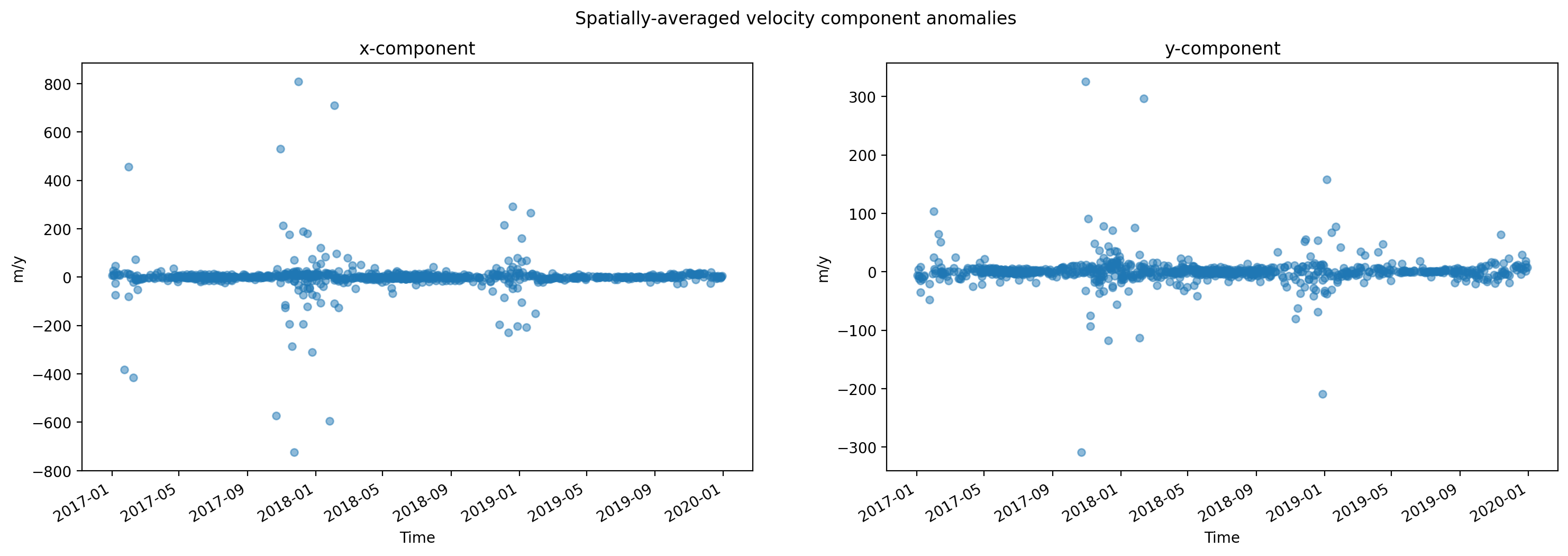
Grouped analysis by season#
We have a dense time series of surface velocity data for a single glacier. We can use xarray’s .groupby() to examine velocity variability further. We will start with using .groupby() to break the velocity time series into seasonal means.
seasons_gb = sample_glacier_raster.groupby(sample_glacier_raster.mid_date.dt.season).mean()
#add attrs to gb object
seasons_gb.attrs = sample_glacier_raster.attrs
seasons_gb
<xarray.Dataset>
Dimensions:                     (season: 4, y: 37, x: 40)
Coordinates:
  * x                           (x) float64 7.843e+05 7.844e+05 ... 7.889e+05
  * y                           (y) float64 3.316e+06 3.316e+06 ... 3.311e+06
    mapping                     int64 0
  * season                      (season) object 'DJF' 'JJA' 'MAM' 'SON'
Data variables: (12/49)
    M11                         (season, y, x) float32 nan nan nan ... nan nan
    M11_dr_to_vr_factor         (season) float32 nan nan nan nan
    M12                         (season, y, x) float32 nan nan nan ... nan nan
    M12_dr_to_vr_factor         (season) float32 nan nan nan nan
    chip_size_height            (season, y, x) float32 nan nan nan ... nan nan
    chip_size_width             (season, y, x) float32 nan nan nan ... nan nan
    ...                          ...
    vy_error_slow               (season) float32 17.09 9.745 12.29 20.32
    vy_error_stationary         (season) float32 17.1 9.746 12.29 20.32
    vy_stable_shift             (season) float32 3.759 -4.472 0.4827 3.443
    vy_stable_shift_slow        (season) float32 3.767 -4.477 0.4903 3.428
    vy_stable_shift_stationary  (season) float32 3.759 -4.472 0.4827 3.443
    cov                         (season) float64 0.1257 0.1471 0.08793 0.1125
Attributes: (12/19)
    Conventions:                CF-1.8
    GDAL_AREA_OR_POINT:         Area
    author:                     ITS_LIVE, a NASA MEaSUREs project (its-live.j...
    autoRIFT_parameter_file:    http://its-live-data.s3.amazonaws.com/autorif...
    datacube_software_version:  1.0
    date_created:               25-Sep-2023 22:00:23
    ...                         ...
    s3:                         s3://its-live-data/datacubes/v2/N30E090/ITS_L...
    skipped_granules:           s3://its-live-data/datacubes/v2/N30E090/ITS_L...
    time_standard_img1:         UTC
    time_standard_img2:         UTC
    title:                      ITS_LIVE datacube of image pair velocities
url: https://its-live-data.s3.amazonaws.com/datacu...- season: 4
- y: 37
- x: 40
- x(x)float647.843e+05 7.844e+05 ... 7.889e+05
- description :
- x coordinate of projection
- standard_name :
- projection_x_coordinate
- axis :
- X
- long_name :
- x coordinate of projection
- units :
- metre
array([784252.5, 784372.5, 784492.5, 784612.5, 784732.5, 784852.5, 784972.5, 785092.5, 785212.5, 785332.5, 785452.5, 785572.5, 785692.5, 785812.5, 785932.5, 786052.5, 786172.5, 786292.5, 786412.5, 786532.5, 786652.5, 786772.5, 786892.5, 787012.5, 787132.5, 787252.5, 787372.5, 787492.5, 787612.5, 787732.5, 787852.5, 787972.5, 788092.5, 788212.5, 788332.5, 788452.5, 788572.5, 788692.5, 788812.5, 788932.5]) - y(y)float643.316e+06 3.316e+06 ... 3.311e+06
- description :
- y coordinate of projection
- standard_name :
- projection_y_coordinate
- axis :
- Y
- long_name :
- y coordinate of projection
- units :
- metre
array([3315787.5, 3315667.5, 3315547.5, 3315427.5, 3315307.5, 3315187.5, 3315067.5, 3314947.5, 3314827.5, 3314707.5, 3314587.5, 3314467.5, 3314347.5, 3314227.5, 3314107.5, 3313987.5, 3313867.5, 3313747.5, 3313627.5, 3313507.5, 3313387.5, 3313267.5, 3313147.5, 3313027.5, 3312907.5, 3312787.5, 3312667.5, 3312547.5, 3312427.5, 3312307.5, 3312187.5, 3312067.5, 3311947.5, 3311827.5, 3311707.5, 3311587.5, 3311467.5]) - mapping()int640
- crs_wkt :
- PROJCS["WGS 84 / UTM zone 46N",GEOGCS["WGS 84",DATUM["WGS_1984",SPHEROID["WGS 84",6378137,298.257223563,AUTHORITY["EPSG","7030"]],AUTHORITY["EPSG","6326"]],PRIMEM["Greenwich",0,AUTHORITY["EPSG","8901"]],UNIT["degree",0.0174532925199433,AUTHORITY["EPSG","9122"]],AUTHORITY["EPSG","4326"]],PROJECTION["Transverse_Mercator"],PARAMETER["latitude_of_origin",0],PARAMETER["central_meridian",93],PARAMETER["scale_factor",0.9996],PARAMETER["false_easting",500000],PARAMETER["false_northing",0],UNIT["metre",1,AUTHORITY["EPSG","9001"]],AXIS["Easting",EAST],AXIS["Northing",NORTH],AUTHORITY["EPSG","32646"]]
- semi_major_axis :
- 6378137.0
- semi_minor_axis :
- 6356752.314245179
- inverse_flattening :
- 298.257223563
- reference_ellipsoid_name :
- WGS 84
- longitude_of_prime_meridian :
- 0.0
- prime_meridian_name :
- Greenwich
- geographic_crs_name :
- WGS 84
- horizontal_datum_name :
- World Geodetic System 1984
- projected_crs_name :
- WGS 84 / UTM zone 46N
- grid_mapping_name :
- transverse_mercator
- latitude_of_projection_origin :
- 0.0
- longitude_of_central_meridian :
- 93.0
- false_easting :
- 500000.0
- false_northing :
- 0.0
- scale_factor_at_central_meridian :
- 0.9996
- spatial_ref :
- PROJCS["WGS 84 / UTM zone 46N",GEOGCS["WGS 84",DATUM["WGS_1984",SPHEROID["WGS 84",6378137,298.257223563,AUTHORITY["EPSG","7030"]],AUTHORITY["EPSG","6326"]],PRIMEM["Greenwich",0,AUTHORITY["EPSG","8901"]],UNIT["degree",0.0174532925199433,AUTHORITY["EPSG","9122"]],AUTHORITY["EPSG","4326"]],PROJECTION["Transverse_Mercator"],PARAMETER["latitude_of_origin",0],PARAMETER["central_meridian",93],PARAMETER["scale_factor",0.9996],PARAMETER["false_easting",500000],PARAMETER["false_northing",0],UNIT["metre",1,AUTHORITY["EPSG","9001"]],AXIS["Easting",EAST],AXIS["Northing",NORTH],AUTHORITY["EPSG","32646"]]
- GeoTransform :
- 784192.5 120.0 0.0 3315847.5 0.0 -120.0
array(0)
- season(season)object'DJF' 'JJA' 'MAM' 'SON'
- description :
- midpoint of image 1 and image 2 acquisition date and time with granule's centroid longitude and latitude as microseconds
- standard_name :
- image_pair_center_date_with_time_separation
array(['DJF', 'JJA', 'MAM', 'SON'], dtype=object)
- M11(season, y, x)float32nan nan nan nan ... nan nan nan nan
- description :
- conversion matrix element (1st row, 1st column) that can be multiplied with vx to give range pixel displacement dr (see Eq. A18 in https://www.mdpi.com/2072-4292/13/4/749)
- grid_mapping :
- mapping
- standard_name :
- conversion_matrix_element_11
- units :
- pixel/(meter/year)
array([[[nan, nan, nan, ..., 0., nan, nan], [nan, nan, nan, ..., 0., 0., nan], [nan, nan, nan, ..., 0., 0., nan], ..., [nan, nan, nan, ..., nan, nan, nan], [nan, nan, nan, ..., nan, nan, nan], [nan, nan, nan, ..., nan, nan, nan]], [[nan, nan, nan, ..., 0., nan, nan], [nan, nan, nan, ..., 0., 0., nan], [nan, nan, nan, ..., 0., 0., nan], ..., [nan, nan, nan, ..., nan, nan, nan], [nan, nan, nan, ..., nan, nan, nan], [nan, nan, nan, ..., nan, nan, nan]], [[nan, nan, nan, ..., 0., nan, nan], [nan, nan, nan, ..., 0., 0., nan], [nan, nan, nan, ..., 0., 0., nan], ..., [nan, nan, nan, ..., nan, nan, nan], [nan, nan, nan, ..., nan, nan, nan], [nan, nan, nan, ..., nan, nan, nan]], [[nan, nan, nan, ..., 0., nan, nan], [nan, nan, nan, ..., 0., 0., nan], [nan, nan, nan, ..., 0., 0., nan], ..., [nan, nan, nan, ..., nan, nan, nan], [nan, nan, nan, ..., nan, nan, nan], [nan, nan, nan, ..., nan, nan, nan]]], dtype=float32) - M11_dr_to_vr_factor(season)float32nan nan nan nan
- description :
- multiplicative factor that converts slant range pixel displacement dr to slant range velocity vr
- standard_name :
- M11_dr_to_vr_factor
- units :
- meter/(year*pixel)
array([nan, nan, nan, nan], dtype=float32)
- M12(season, y, x)float32nan nan nan nan ... nan nan nan nan
- description :
- conversion matrix element (1st row, 2nd column) that can be multiplied with vy to give range pixel displacement dr (see Eq. A18 in https://www.mdpi.com/2072-4292/13/4/749)
- grid_mapping :
- mapping
- standard_name :
- conversion_matrix_element_12
- units :
- pixel/(meter/year)
array([[[nan, nan, nan, ..., 0., nan, nan], [nan, nan, nan, ..., 0., 0., nan], [nan, nan, nan, ..., 0., 0., nan], ..., [nan, nan, nan, ..., nan, nan, nan], [nan, nan, nan, ..., nan, nan, nan], [nan, nan, nan, ..., nan, nan, nan]], [[nan, nan, nan, ..., 0., nan, nan], [nan, nan, nan, ..., 0., 0., nan], [nan, nan, nan, ..., 0., 0., nan], ..., [nan, nan, nan, ..., nan, nan, nan], [nan, nan, nan, ..., nan, nan, nan], [nan, nan, nan, ..., nan, nan, nan]], [[nan, nan, nan, ..., 0., nan, nan], [nan, nan, nan, ..., 0., 0., nan], [nan, nan, nan, ..., 0., 0., nan], ..., [nan, nan, nan, ..., nan, nan, nan], [nan, nan, nan, ..., nan, nan, nan], [nan, nan, nan, ..., nan, nan, nan]], [[nan, nan, nan, ..., 0., nan, nan], [nan, nan, nan, ..., 0., 0., nan], [nan, nan, nan, ..., 0., 0., nan], ..., [nan, nan, nan, ..., nan, nan, nan], [nan, nan, nan, ..., nan, nan, nan], [nan, nan, nan, ..., nan, nan, nan]]], dtype=float32) - M12_dr_to_vr_factor(season)float32nan nan nan nan
- description :
- multiplicative factor that converts slant range pixel displacement dr to slant range velocity vr
- standard_name :
- M12_dr_to_vr_factor
- units :
- meter/(year*pixel)
array([nan, nan, nan, nan], dtype=float32)
- chip_size_height(season, y, x)float32nan nan nan nan ... nan nan nan nan
- chip_size_coordinates :
- Optical data: chip_size_coordinates = 'image projection geometry: width = x, height = y'. Radar data: chip_size_coordinates = 'radar geometry: width = range, height = azimuth'
- description :
- height of search template (chip)
- grid_mapping :
- mapping
- standard_name :
- chip_size_height
- units :
- m
- y_pixel_size :
- 10.0
array([[[ nan, nan, nan, ..., 290.62576, nan, nan], [ nan, nan, nan, ..., 318.7436 , 308.60947, nan], [ nan, nan, nan, ..., 353.2789 , 339.06024, nan], ..., [ nan, nan, nan, ..., nan, nan, nan], [ nan, nan, nan, ..., nan, nan, nan], [ nan, nan, nan, ..., nan, nan, nan]], [[ nan, nan, nan, ..., 296.33032, nan, nan], [ nan, nan, nan, ..., 295.7979 , 297.58963, nan], [ nan, nan, nan, ..., 326.88828, 321.45932, nan], ... [ nan, nan, nan, ..., nan, nan, nan], [ nan, nan, nan, ..., nan, nan, nan], [ nan, nan, nan, ..., nan, nan, nan]], [[ nan, nan, nan, ..., 277.09677, nan, nan], [ nan, nan, nan, ..., 281.8819 , 289.18896, nan], [ nan, nan, nan, ..., 324.19168, 306.8492 , nan], ..., [ nan, nan, nan, ..., nan, nan, nan], [ nan, nan, nan, ..., nan, nan, nan], [ nan, nan, nan, ..., nan, nan, nan]]], dtype=float32) - chip_size_width(season, y, x)float32nan nan nan nan ... nan nan nan nan
- chip_size_coordinates :
- Optical data: chip_size_coordinates = 'image projection geometry: width = x, height = y'. Radar data: chip_size_coordinates = 'radar geometry: width = range, height = azimuth'
- description :
- width of search template (chip)
- grid_mapping :
- mapping
- standard_name :
- chip_size_width
- units :
- m
- x_pixel_size :
- 10.0
array([[[ nan, nan, nan, ..., 294. , nan, nan], [ nan, nan, nan, ..., 322.71155, 312. , nan], [ nan, nan, nan, ..., 357.0136 , 342.09036, nan], ..., [ nan, nan, nan, ..., nan, nan, nan], [ nan, nan, nan, ..., nan, nan, nan], [ nan, nan, nan, ..., nan, nan, nan]], [[ nan, nan, nan, ..., 298.06787, nan, nan], [ nan, nan, nan, ..., 297.78757, 299.40094, nan], [ nan, nan, nan, ..., 329.16202, 323.1866 , nan], ... [ nan, nan, nan, ..., nan, nan, nan], [ nan, nan, nan, ..., nan, nan, nan], [ nan, nan, nan, ..., nan, nan, nan]], [[ nan, nan, nan, ..., 282.12097, nan, nan], [ nan, nan, nan, ..., 286.7953 , 294.46457, nan], [ nan, nan, nan, ..., 329.58334, 311.98413, nan], ..., [ nan, nan, nan, ..., nan, nan, nan], [ nan, nan, nan, ..., nan, nan, nan], [ nan, nan, nan, ..., nan, nan, nan]]], dtype=float32) - date_dt(season)timedelta64[ns]244 days 00:20:03.316565312 ... ...
- description :
- time separation between acquisition of image 1 and image 2
- standard_name :
- image_pair_time_separation
array([21082803316565312, 22032858554670912, 25525755439126120, 16002058932655838], dtype='timedelta64[ns]') - floatingice(y, x, season)float32nan nan nan nan ... nan nan nan nan
- description :
- floating ice mask, 0 = non-floating-ice, 1 = floating-ice
- flag_meanings :
- non-ice ice
- flag_values :
- [0, 1]
- grid_mapping :
- mapping
- standard_name :
- floating ice mask
- url :
- https://its-live-data.s3.amazonaws.com/autorift_parameters/v001/N46_0120m_floatingice.tif
array([[[nan, nan, nan, nan], [nan, nan, nan, nan], [nan, nan, nan, nan], ..., [ 0., 0., 0., 0.], [nan, nan, nan, nan], [nan, nan, nan, nan]], [[nan, nan, nan, nan], [nan, nan, nan, nan], [nan, nan, nan, nan], ..., [ 0., 0., 0., 0.], [ 0., 0., 0., 0.], [nan, nan, nan, nan]], [[nan, nan, nan, nan], [nan, nan, nan, nan], [nan, nan, nan, nan], ..., ... ..., [nan, nan, nan, nan], [nan, nan, nan, nan], [nan, nan, nan, nan]], [[nan, nan, nan, nan], [nan, nan, nan, nan], [nan, nan, nan, nan], ..., [nan, nan, nan, nan], [nan, nan, nan, nan], [nan, nan, nan, nan]], [[nan, nan, nan, nan], [nan, nan, nan, nan], [nan, nan, nan, nan], ..., [nan, nan, nan, nan], [nan, nan, nan, nan], [nan, nan, nan, nan]]], dtype=float32) - interp_mask(season, y, x)float32nan nan nan nan ... nan nan nan nan
- description :
- light interpolation mask
- flag_meanings :
- measured interpolated
- flag_values :
- [0, 1]
- grid_mapping :
- mapping
- standard_name :
- interpolated_value_mask
array([[[nan, nan, nan, ..., 1., nan, nan], [nan, nan, nan, ..., 1., 1., nan], [nan, nan, nan, ..., 1., 1., nan], ..., [nan, nan, nan, ..., nan, nan, nan], [nan, nan, nan, ..., nan, nan, nan], [nan, nan, nan, ..., nan, nan, nan]], [[nan, nan, nan, ..., 1., nan, nan], [nan, nan, nan, ..., 1., 1., nan], [nan, nan, nan, ..., 1., 1., nan], ..., [nan, nan, nan, ..., nan, nan, nan], [nan, nan, nan, ..., nan, nan, nan], [nan, nan, nan, ..., nan, nan, nan]], [[nan, nan, nan, ..., 1., nan, nan], [nan, nan, nan, ..., 1., 1., nan], [nan, nan, nan, ..., 1., 1., nan], ..., [nan, nan, nan, ..., nan, nan, nan], [nan, nan, nan, ..., nan, nan, nan], [nan, nan, nan, ..., nan, nan, nan]], [[nan, nan, nan, ..., 1., nan, nan], [nan, nan, nan, ..., 1., 1., nan], [nan, nan, nan, ..., 1., 1., nan], ..., [nan, nan, nan, ..., nan, nan, nan], [nan, nan, nan, ..., nan, nan, nan], [nan, nan, nan, ..., nan, nan, nan]]], dtype=float32) - landice(y, x, season)float32nan nan nan nan ... nan nan nan nan
- description :
- land ice mask, 0 = non-land-ice, 1 = land-ice
- flag_meanings :
- non-ice ice
- flag_values :
- [0, 1]
- grid_mapping :
- mapping
- standard_name :
- land ice mask
- url :
- https://its-live-data.s3.amazonaws.com/autorift_parameters/v001/N46_0120m_landice.tif
array([[[nan, nan, nan, nan], [nan, nan, nan, nan], [nan, nan, nan, nan], ..., [ 1., 1., 1., 1.], [nan, nan, nan, nan], [nan, nan, nan, nan]], [[nan, nan, nan, nan], [nan, nan, nan, nan], [nan, nan, nan, nan], ..., [ 1., 1., 1., 1.], [ 1., 1., 1., 1.], [nan, nan, nan, nan]], [[nan, nan, nan, nan], [nan, nan, nan, nan], [nan, nan, nan, nan], ..., ... ..., [nan, nan, nan, nan], [nan, nan, nan, nan], [nan, nan, nan, nan]], [[nan, nan, nan, nan], [nan, nan, nan, nan], [nan, nan, nan, nan], ..., [nan, nan, nan, nan], [nan, nan, nan, nan], [nan, nan, nan, nan]], [[nan, nan, nan, nan], [nan, nan, nan, nan], [nan, nan, nan, nan], ..., [nan, nan, nan, nan], [nan, nan, nan, nan], [nan, nan, nan, nan]]], dtype=float32) - roi_valid_percentage(season)float3246.71 49.4 41.65 44.1
- description :
- percentage of pixels with a valid velocity estimate determined for the intersection of the full image pair footprint and the region of interest (roi) that defines where autoRIFT tried to estimate a velocity
- standard_name :
- region_of_interest_valid_pixel_percentage
array([46.708183, 49.4047 , 41.647144, 44.102425], dtype=float32)
- stable_count_slow(season)float643.17e+04 3.284e+04 ... 3.314e+04
- description :
- number of valid pixels over slowest 25% of ice
- standard_name :
- stable_count_slow
- units :
- count
array([31697.75451951, 32841.94078947, 33318.0338819 , 33139.65375303])
- stable_count_stationary(season)float643.144e+04 3.177e+04 ... 3.344e+04
- description :
- number of valid pixels over stationary or slow-flowing surfaces
- standard_name :
- stable_count_stationary
- units :
- count
array([31439.91627022, 31770.96052632, 33490.57792836, 33437.72154964])
- stable_shift_flag(season)float641.0 1.0 1.0 1.0
- description :
- flag for applying velocity bias correction: 0 = no correction; 1 = correction from overlapping stable surface mask (stationary or slow-flowing surfaces with velocity < 15 m/yr)(top priority); 2 = correction from slowest 25% of overlapping velocities (second priority)
- standard_name :
- stable_shift_flag
array([1., 1., 1., 1.])
- v(season, y, x)float32nan nan nan nan ... nan nan nan nan
- description :
- velocity magnitude
- grid_mapping :
- mapping
- standard_name :
- land_ice_surface_velocity
- units :
- meter/year
array([[[ nan, nan, nan, ..., 51.625767 , nan, nan], [ nan, nan, nan, ..., 58.48718 , 67.8284 , nan], [ nan, nan, nan, ..., 67.353745 , 68.22891 , nan], ..., [ nan, nan, nan, ..., nan, nan, nan], [ nan, nan, nan, ..., nan, nan, nan], [ nan, nan, nan, ..., nan, nan, nan]], [[ nan, nan, nan, ..., 8.072398 , nan, nan], [ nan, nan, nan, ..., 10.056994 , 7.9528303, nan], [ nan, nan, nan, ..., 10.860335 , 9.521531 , nan], ... [ nan, nan, nan, ..., nan, nan, nan], [ nan, nan, nan, ..., nan, nan, nan], [ nan, nan, nan, ..., nan, nan, nan]], [[ nan, nan, nan, ..., 37.862904 , nan, nan], [ nan, nan, nan, ..., 37.02362 , 36.047245 , nan], [ nan, nan, nan, ..., 44.075 , 37.714287 , nan], ..., [ nan, nan, nan, ..., nan, nan, nan], [ nan, nan, nan, ..., nan, nan, nan], [ nan, nan, nan, ..., nan, nan, nan]]], dtype=float32) - v_error(season, y, x)float32nan nan nan nan ... nan nan nan nan
- description :
- velocity magnitude error
- grid_mapping :
- mapping
- standard_name :
- velocity_error
- units :
- meter/year
array([[[ nan, nan, nan, ..., 50.668713 , nan, nan], [ nan, nan, nan, ..., 54.346153 , 59.952663 , nan], [ nan, nan, nan, ..., 58.55102 , 59.963856 , nan], ..., [ nan, nan, nan, ..., nan, nan, nan], [ nan, nan, nan, ..., nan, nan, nan], [ nan, nan, nan, ..., nan, nan, nan]], [[ nan, nan, nan, ..., 9.773756 , nan, nan], [ nan, nan, nan, ..., 10.1088085, 9.669811 , nan], [ nan, nan, nan, ..., 10.581006 , 9.971292 , nan], ... [ nan, nan, nan, ..., nan, nan, nan], [ nan, nan, nan, ..., nan, nan, nan], [ nan, nan, nan, ..., nan, nan, nan]], [[ nan, nan, nan, ..., 41.225807 , nan, nan], [ nan, nan, nan, ..., 41.614174 , 41.76378 , nan], [ nan, nan, nan, ..., 43.616665 , 42.253967 , nan], ..., [ nan, nan, nan, ..., nan, nan, nan], [ nan, nan, nan, ..., nan, nan, nan], [ nan, nan, nan, ..., nan, nan, nan]]], dtype=float32) - va(season, y, x)float32nan nan nan nan ... nan nan nan nan
- description :
- velocity in radar azimuth direction
- grid_mapping :
- mapping
array([[[ nan, nan, nan, ..., -5.4 , nan, nan], [ nan, nan, nan, ..., 26.3 , -24.190475 , nan], [ nan, nan, nan, ..., 7.9 , -6.35 , nan], ..., [ nan, nan, nan, ..., nan, nan, nan], [ nan, nan, nan, ..., nan, nan, nan], [ nan, nan, nan, ..., nan, nan, nan]], [[ nan, nan, nan, ..., 14.533334 , nan, nan], [ nan, nan, nan, ..., 4.6 , -15.066667 , nan], [ nan, nan, nan, ..., -23.266666 , 5.3333335, nan], ... [ nan, nan, nan, ..., nan, nan, nan], [ nan, nan, nan, ..., nan, nan, nan], [ nan, nan, nan, ..., nan, nan, nan]], [[ nan, nan, nan, ..., -7.4583335, nan, nan], [ nan, nan, nan, ..., -20.16 , -29.4 , nan], [ nan, nan, nan, ..., -24.64 , -17.24 , nan], ..., [ nan, nan, nan, ..., nan, nan, nan], [ nan, nan, nan, ..., nan, nan, nan], [ nan, nan, nan, ..., nan, nan, nan]]], dtype=float32) - va_error(season)float3260.83 49.28 69.89 57.73
- description :
- error for velocity in radar azimuth direction
- standard_name :
- va_error
- units :
- meter/year
array([60.82564 , 49.280003, 69.88913 , 57.734043], dtype=float32)
- va_error_modeled(season)float3264.4 64.4 64.4 64.4
- description :
- 1-sigma error calculated using a modeled error-dt relationship
- standard_name :
- va_error_modeled
- units :
- meter/year
array([64.4, 64.4, 64.4, 64.4], dtype=float32)
- va_error_slow(season)float3260.82 49.28 69.88 57.73
- description :
- RMSE over slowest 25% of retrieved velocities
- standard_name :
- va_error_slow
- units :
- meter/year
array([60.82308, 49.27714, 69.88478, 57.72979], dtype=float32)
- va_error_stationary(season)float3260.83 49.28 69.89 57.73
- description :
- RMSE over stable surfaces, stationary or slow-flowing surfaces with velocity < 15 m/yr identified from an external mask
- standard_name :
- va_error_stationary
- units :
- meter/year
array([60.82564 , 49.280003, 69.88913 , 57.734043], dtype=float32)
- va_stable_shift(season)float320.0 0.0 -0.1304 0.0
- description :
- applied va shift calibrated using pixels over stable or slow surfaces
- standard_name :
- va_stable_shift
- units :
- meter/year
array([ 0. , 0. , -0.13043478, 0. ], dtype=float32)
- va_stable_shift_slow(season)float320.0 0.0 -0.1304 0.0
- description :
- va shift calibrated using valid pixels over slowest 25% of retrieved velocities
- standard_name :
- va_stable_shift_slow
- units :
- meter/year
array([ 0. , 0. , -0.13043478, 0. ], dtype=float32)
- va_stable_shift_stationary(season)float320.0 0.0 -0.1304 0.0
- description :
- va shift calibrated using valid pixels over stable surfaces, stationary or slow-flowing surfaces with velocity < 15 m/yr identified from an external mask
- standard_name :
- va_stable_shift_stationary
- units :
- meter/year
array([ 0. , 0. , -0.13043478, 0. ], dtype=float32)
- vr(season, y, x)float32nan nan nan nan ... nan nan nan nan
- description :
- velocity in radar range direction
- grid_mapping :
- mapping
array([[[ nan, nan, nan, ..., 4.75 , nan, nan], [ nan, nan, nan, ..., 2.9 , 0.95238096, nan], [ nan, nan, nan, ..., -3.2 , 5.85 , nan], ..., [ nan, nan, nan, ..., nan, nan, nan], [ nan, nan, nan, ..., nan, nan, nan], [ nan, nan, nan, ..., nan, nan, nan]], [[ nan, nan, nan, ..., -1.5333333 , nan, nan], [ nan, nan, nan, ..., -3.6 , -0.8666667 , nan], [ nan, nan, nan, ..., -5.5333333 , -2.8 , nan], ... [ nan, nan, nan, ..., nan, nan, nan], [ nan, nan, nan, ..., nan, nan, nan], [ nan, nan, nan, ..., nan, nan, nan]], [[ nan, nan, nan, ..., -1.9583334 , nan, nan], [ nan, nan, nan, ..., 3.88 , 8.6 , nan], [ nan, nan, nan, ..., 0.68 , 7.16 , nan], ..., [ nan, nan, nan, ..., nan, nan, nan], [ nan, nan, nan, ..., nan, nan, nan], [ nan, nan, nan, ..., nan, nan, nan]]], dtype=float32) - vr_error(season)float3217.84 12.84 20.63 16.29
- description :
- error for velocity in radar range direction
- standard_name :
- vr_error
- units :
- meter/year
array([17.835897, 12.842857, 20.630434, 16.287233], dtype=float32)
- vr_error_modeled(season)float3219.8 19.8 19.8 19.8
- description :
- 1-sigma error calculated using a modeled error-dt relationship
- standard_name :
- vr_error_modeled
- units :
- meter/year
array([19.8, 19.8, 19.8, 19.8], dtype=float32)
- vr_error_slow(season)float3217.83 12.84 20.63 16.29
- description :
- RMSE over slowest 25% of retrieved velocities
- standard_name :
- vr_error_slow
- units :
- meter/year
array([17.833334, 12.842857, 20.630434, 16.287233], dtype=float32)
- vr_error_stationary(season)float3217.84 12.84 20.63 16.29
- description :
- RMSE over stable surfaces, stationary or slow-flowing surfaces with velocity < 15 m/yr identified from an external mask
- standard_name :
- vr_error_stationary
- units :
- meter/year
array([17.835897, 12.842857, 20.630434, 16.287233], dtype=float32)
- vr_stable_shift(season)float320.2231 0.1086 0.3652 -0.4617
- description :
- applied vr shift calibrated using pixels over stable or slow surfaces
- standard_name :
- vr_stable_shift
- units :
- meter/year
array([ 0.22307692, 0.10857143, 0.3652174 , -0.46170214], dtype=float32)
- vr_stable_shift_slow(season)float320.2231 0.1057 0.3652 -0.4617
- description :
- vr shift calibrated using valid pixels over slowest 25% of retrieved velocities
- standard_name :
- vr_stable_shift_slow
- units :
- meter/year
array([ 0.22307692, 0.10571428, 0.3652174 , -0.46170214], dtype=float32)
- vr_stable_shift_stationary(season)float320.2231 0.1086 0.3652 -0.4617
- description :
- vr shift calibrated using valid pixels over stable surfaces, stationary or slow-flowing surfaces with velocity < 15 m/yr identified from an external mask
- standard_name :
- vr_stable_shift_stationary
- units :
- meter/year
array([ 0.22307692, 0.10857143, 0.3652174 , -0.46170214], dtype=float32)
- vx(season, y, x)float32nan nan nan nan ... nan nan nan nan
- description :
- velocity component in x direction
- grid_mapping :
- mapping
- standard_name :
- land_ice_surface_x_velocity
- units :
- meter/year
array([[[ nan, nan, nan, ..., 5.595092 , nan, nan], [ nan, nan, nan, ..., -0.21794872, 2.6923077 , nan], [ nan, nan, nan, ..., 2.6734693 , -4.4879518 , nan], ..., [ nan, nan, nan, ..., nan, nan, nan], [ nan, nan, nan, ..., nan, nan, nan], [ nan, nan, nan, ..., nan, nan, nan]], [[ nan, nan, nan, ..., -0.24886878, nan, nan], [ nan, nan, nan, ..., 0.81865287, -1. , nan], [ nan, nan, nan, ..., -0.38547486, -0.8755981 , nan], ... [ nan, nan, nan, ..., nan, nan, nan], [ nan, nan, nan, ..., nan, nan, nan], [ nan, nan, nan, ..., nan, nan, nan]], [[ nan, nan, nan, ..., -4.532258 , nan, nan], [ nan, nan, nan, ..., -6.7322836 , -8.433071 , nan], [ nan, nan, nan, ..., -14.825 , -11.484127 , nan], ..., [ nan, nan, nan, ..., nan, nan, nan], [ nan, nan, nan, ..., nan, nan, nan], [ nan, nan, nan, ..., nan, nan, nan]]], dtype=float32) - vx_error(season)float3224.77 10.66 16.18 21.48
- description :
- best estimate of x_velocity error: vx_error is populated according to the approach used for the velocity bias correction as indicated in "stable_shift_flag"
- standard_name :
- vx_error
- units :
- meter/year
array([24.774311, 10.657801, 16.176477, 21.47942 ], dtype=float32)
- vx_error_modeled(season)float32112.9 95.76 59.36 174.6
- description :
- 1-sigma error calculated using a modeled error-dt relationship
- standard_name :
- vx_error_modeled
- units :
- meter/year
array([112.9018 , 95.76128 , 59.358665, 174.642 ], dtype=float32)
- vx_error_slow(season)float3224.75 10.65 16.17 21.47
- description :
- RMSE over slowest 25% of retrieved velocities
- standard_name :
- vx_error_slow
- units :
- meter/year
array([24.75471 , 10.654982, 16.16825 , 21.47155 ], dtype=float32)
- vx_error_stationary(season)float3224.77 10.66 16.18 21.48
- description :
- RMSE over stable surfaces, stationary or slow-flowing surfaces with velocity < 15 meter/year identified from an external mask
- standard_name :
- vx_error_stationary
- units :
- meter/year
array([24.774311, 10.657801, 16.176477, 21.47942 ], dtype=float32)
- vx_stable_shift(season)float321.537 -0.6031 0.03514 -1.11
- description :
- applied vx shift calibrated using pixels over stable or slow surfaces
- standard_name :
- vx_stable_shift
- units :
- meter/year
array([ 1.5371075 , -0.60310155, 0.03514039, -1.1096853 ], dtype=float32)
- vx_stable_shift_slow(season)float321.53 -0.6039 0.03456 -1.104
- description :
- vx shift calibrated using valid pixels over slowest 25% of retrieved velocities
- standard_name :
- vx_stable_shift_slow
- units :
- meter/year
array([ 1.5301617 , -0.60385346, 0.03455955, -1.1044794 ], dtype=float32)
- vx_stable_shift_stationary(season)float321.537 -0.6031 0.03514 -1.11
- description :
- vx shift calibrated using valid pixels over stable surfaces, stationary or slow-flowing surfaces with velocity < 15 m/yr identified from an external mask
- standard_name :
- vx_stable_shift_stationary
- units :
- meter/year
array([ 1.5371075 , -0.60310155, 0.03514039, -1.1096853 ], dtype=float32)
- vy(season, y, x)float32nan nan nan nan ... nan nan nan nan
- description :
- velocity component in y direction
- grid_mapping :
- mapping
- standard_name :
- land_ice_surface_y_velocity
- units :
- meter/year
array([[[ nan, nan, nan, ..., 13.171779 , nan, nan], [ nan, nan, nan, ..., 8.211538 , 9.804733 , nan], [ nan, nan, nan, ..., 11.278912 , 11.271085 , nan], ..., [ nan, nan, nan, ..., nan, nan, nan], [ nan, nan, nan, ..., nan, nan, nan], [ nan, nan, nan, ..., nan, nan, nan]], [[ nan, nan, nan, ..., -0.1719457 , nan, nan], [ nan, nan, nan, ..., -1.5854923 , 0.15566038, nan], [ nan, nan, nan, ..., -0.89385474, -1.8947369 , nan], ... [ nan, nan, nan, ..., nan, nan, nan], [ nan, nan, nan, ..., nan, nan, nan], [ nan, nan, nan, ..., nan, nan, nan]], [[ nan, nan, nan, ..., 0.66129035, nan, nan], [ nan, nan, nan, ..., -2.2913387 , -0.96850395, nan], [ nan, nan, nan, ..., -0.45 , -4.9761906 , nan], ..., [ nan, nan, nan, ..., nan, nan, nan], [ nan, nan, nan, ..., nan, nan, nan], [ nan, nan, nan, ..., nan, nan, nan]]], dtype=float32) - vy_error(season)float3217.1 9.746 12.29 20.32
- description :
- best estimate of y_velocity error: vy_error is populated according to the approach used for the velocity bias correction as indicated in "stable_shift_flag"
- standard_name :
- vy_error
- units :
- meter/year
array([17.09667 , 9.746147, 12.290707, 20.323486], dtype=float32)
- vy_error_modeled(season)float32113.8 96.58 60.47 176.1
- description :
- 1-sigma error calculated using a modeled error-dt relationship
- standard_name :
- vy_error_modeled
- units :
- meter/year
array([113.82578 , 96.58036 , 60.467472, 176.05882 ], dtype=float32)
- vy_error_slow(season)float3217.09 9.745 12.29 20.32
- description :
- RMSE over slowest 25% of retrieved velocities
- standard_name :
- vy_error_slow
- units :
- meter/year
array([17.09277 , 9.745019, 12.288964, 20.318886], dtype=float32)
- vy_error_stationary(season)float3217.1 9.746 12.29 20.32
- description :
- RMSE over stable surfaces, stationary or slow-flowing surfaces with velocity < 15 meter/year identified from an external mask
- standard_name :
- vy_error_stationary
- units :
- meter/year
array([17.09667 , 9.746147, 12.290707, 20.323486], dtype=float32)
- vy_stable_shift(season)float323.759 -4.472 0.4827 3.443
- description :
- applied vy shift calibrated using pixels over stable or slow surfaces
- standard_name :
- vy_stable_shift
- units :
- meter/year
array([ 3.759372 , -4.4722743 , 0.48267183, 3.4428573 ], dtype=float32)
- vy_stable_shift_slow(season)float323.767 -4.477 0.4903 3.428
- description :
- vy shift calibrated using valid pixels over slowest 25% of retrieved velocities
- standard_name :
- vy_stable_shift_slow
- units :
- meter/year
array([ 3.7667935 , -4.4774437 , 0.49031946, 3.4277241 ], dtype=float32)
- vy_stable_shift_stationary(season)float323.759 -4.472 0.4827 3.443
- description :
- vy shift calibrated using valid pixels over stable surfaces, stationary or slow-flowing surfaces with velocity < 15 m/yr identified from an external mask
- standard_name :
- vy_stable_shift_stationary
- units :
- meter/year
array([ 3.759372 , -4.4722743 , 0.48267183, 3.4428573 ], dtype=float32)
- cov(season)float640.1257 0.1471 0.08793 0.1125
array([0.12568215, 0.14714961, 0.08793273, 0.11250689])
- xPandasIndex
PandasIndex(Index([784252.5, 784372.5, 784492.5, 784612.5, 784732.5, 784852.5, 784972.5, 785092.5, 785212.5, 785332.5, 785452.5, 785572.5, 785692.5, 785812.5, 785932.5, 786052.5, 786172.5, 786292.5, 786412.5, 786532.5, 786652.5, 786772.5, 786892.5, 787012.5, 787132.5, 787252.5, 787372.5, 787492.5, 787612.5, 787732.5, 787852.5, 787972.5, 788092.5, 788212.5, 788332.5, 788452.5, 788572.5, 788692.5, 788812.5, 788932.5], dtype='float64', name='x')) - yPandasIndex
PandasIndex(Index([3315787.5, 3315667.5, 3315547.5, 3315427.5, 3315307.5, 3315187.5, 3315067.5, 3314947.5, 3314827.5, 3314707.5, 3314587.5, 3314467.5, 3314347.5, 3314227.5, 3314107.5, 3313987.5, 3313867.5, 3313747.5, 3313627.5, 3313507.5, 3313387.5, 3313267.5, 3313147.5, 3313027.5, 3312907.5, 3312787.5, 3312667.5, 3312547.5, 3312427.5, 3312307.5, 3312187.5, 3312067.5, 3311947.5, 3311827.5, 3311707.5, 3311587.5, 3311467.5], dtype='float64', name='y')) - seasonPandasIndex
PandasIndex(Index(['DJF', 'JJA', 'MAM', 'SON'], dtype='object', name='season'))
- Conventions :
- CF-1.8
- GDAL_AREA_OR_POINT :
- Area
- author :
- ITS_LIVE, a NASA MEaSUREs project (its-live.jpl.nasa.gov)
- autoRIFT_parameter_file :
- http://its-live-data.s3.amazonaws.com/autorift_parameters/v001/autorift_landice_0120m.shp
- datacube_software_version :
- 1.0
- date_created :
- 25-Sep-2023 22:00:23
- date_updated :
- 25-Sep-2023 22:00:23
- geo_polygon :
- [[95.06959008486952, 29.814255053135895], [95.32812062059084, 29.809951334550703], [95.58659184122865, 29.80514261876954], [95.84499718862224, 29.7998293459177], [96.10333011481168, 29.79401200205343], [96.11032804508507, 30.019297601073085], [96.11740568350054, 30.244573983323825], [96.12456379063154, 30.469841094022847], [96.1318031397002, 30.695098878594504], [95.87110827645229, 30.70112924501256], [95.61033817656023, 30.7066371044805], [95.34949964126946, 30.711621947056347], [95.08859948278467, 30.716083310981194], [95.08376623410525, 30.49063893600811], [95.07898726183609, 30.26518607254204], [95.0742620484426, 30.039724763743482], [95.06959008486952, 29.814255053135895]]
- institution :
- NASA Jet Propulsion Laboratory (JPL), California Institute of Technology
- latitude :
- 30.26
- longitude :
- 95.6
- proj_polygon :
- [[700000, 3300000], [725000.0, 3300000.0], [750000.0, 3300000.0], [775000.0, 3300000.0], [800000, 3300000], [800000.0, 3325000.0], [800000.0, 3350000.0], [800000.0, 3375000.0], [800000, 3400000], [775000.0, 3400000.0], [750000.0, 3400000.0], [725000.0, 3400000.0], [700000, 3400000], [700000.0, 3375000.0], [700000.0, 3350000.0], [700000.0, 3325000.0], [700000, 3300000]]
- projection :
- 32646
- s3 :
- s3://its-live-data/datacubes/v2/N30E090/ITS_LIVE_vel_EPSG32646_G0120_X750000_Y3350000.zarr
- skipped_granules :
- s3://its-live-data/datacubes/v2/N30E090/ITS_LIVE_vel_EPSG32646_G0120_X750000_Y3350000.json
- time_standard_img1 :
- UTC
- time_standard_img2 :
- UTC
- title :
- ITS_LIVE datacube of image pair velocities
- url :
- https://its-live-data.s3.amazonaws.com/datacubes/v2/N30E090/ITS_LIVE_vel_EPSG32646_G0120_X750000_Y3350000.zarr
Breaking down the above cell, we defined how we wanted to group our data (sample_glacier_raster.mid_date.dt.season) and the reduction we wanted to apply to each group (mean()). After the apply step, xarray automatically combines the groups into a single object. We can see that the seasons_gb object is an xarray.Dataset with the same dimensions and coordinates as the sample_glacier_raster object but that the seasons_gb object has a seasons dimension as well.
If you’d like to see another example of this with more detailed explanations, go here.
We can no longer use the function for calculating magnitude that we defined above because we have the season dimension instead of mid_date. Because the temporal reduction has already occurred, we just need to calculate the magnitude of the displacement vector.
seasons_gb['v_mag'] = np.sqrt(seasons_gb.vx**2 + seasons_gb.vy**2)
seasons_gb
<xarray.Dataset>
Dimensions:                     (season: 4, y: 37, x: 40)
Coordinates:
  * x                           (x) float64 7.843e+05 7.844e+05 ... 7.889e+05
  * y                           (y) float64 3.316e+06 3.316e+06 ... 3.311e+06
    mapping                     int64 0
  * season                      (season) object 'DJF' 'JJA' 'MAM' 'SON'
Data variables: (12/50)
    M11                         (season, y, x) float32 nan nan nan ... nan nan
    M11_dr_to_vr_factor         (season) float32 nan nan nan nan
    M12                         (season, y, x) float32 nan nan nan ... nan nan
    M12_dr_to_vr_factor         (season) float32 nan nan nan nan
    chip_size_height            (season, y, x) float32 nan nan nan ... nan nan
    chip_size_width             (season, y, x) float32 nan nan nan ... nan nan
    ...                          ...
    vy_error_stationary         (season) float32 17.1 9.746 12.29 20.32
    vy_stable_shift             (season) float32 3.759 -4.472 0.4827 3.443
    vy_stable_shift_slow        (season) float32 3.767 -4.477 0.4903 3.428
    vy_stable_shift_stationary  (season) float32 3.759 -4.472 0.4827 3.443
    cov                         (season) float64 0.1257 0.1471 0.08793 0.1125
    v_mag                       (season, y, x) float32 nan nan nan ... nan nan
Attributes: (12/19)
    Conventions:                CF-1.8
    GDAL_AREA_OR_POINT:         Area
    author:                     ITS_LIVE, a NASA MEaSUREs project (its-live.j...
    autoRIFT_parameter_file:    http://its-live-data.s3.amazonaws.com/autorif...
    datacube_software_version:  1.0
    date_created:               25-Sep-2023 22:00:23
    ...                         ...
    s3:                         s3://its-live-data/datacubes/v2/N30E090/ITS_L...
    skipped_granules:           s3://its-live-data/datacubes/v2/N30E090/ITS_L...
    time_standard_img1:         UTC
    time_standard_img2:         UTC
    title:                      ITS_LIVE datacube of image pair velocities
url: https://its-live-data.s3.amazonaws.com/datacu...- season: 4
- y: 37
- x: 40
- x(x)float647.843e+05 7.844e+05 ... 7.889e+05
- description :
- x coordinate of projection
- standard_name :
- projection_x_coordinate
- axis :
- X
- long_name :
- x coordinate of projection
- units :
- metre
array([784252.5, 784372.5, 784492.5, 784612.5, 784732.5, 784852.5, 784972.5, 785092.5, 785212.5, 785332.5, 785452.5, 785572.5, 785692.5, 785812.5, 785932.5, 786052.5, 786172.5, 786292.5, 786412.5, 786532.5, 786652.5, 786772.5, 786892.5, 787012.5, 787132.5, 787252.5, 787372.5, 787492.5, 787612.5, 787732.5, 787852.5, 787972.5, 788092.5, 788212.5, 788332.5, 788452.5, 788572.5, 788692.5, 788812.5, 788932.5]) - y(y)float643.316e+06 3.316e+06 ... 3.311e+06
- description :
- y coordinate of projection
- standard_name :
- projection_y_coordinate
- axis :
- Y
- long_name :
- y coordinate of projection
- units :
- metre
array([3315787.5, 3315667.5, 3315547.5, 3315427.5, 3315307.5, 3315187.5, 3315067.5, 3314947.5, 3314827.5, 3314707.5, 3314587.5, 3314467.5, 3314347.5, 3314227.5, 3314107.5, 3313987.5, 3313867.5, 3313747.5, 3313627.5, 3313507.5, 3313387.5, 3313267.5, 3313147.5, 3313027.5, 3312907.5, 3312787.5, 3312667.5, 3312547.5, 3312427.5, 3312307.5, 3312187.5, 3312067.5, 3311947.5, 3311827.5, 3311707.5, 3311587.5, 3311467.5]) - mapping()int640
- crs_wkt :
- PROJCS["WGS 84 / UTM zone 46N",GEOGCS["WGS 84",DATUM["WGS_1984",SPHEROID["WGS 84",6378137,298.257223563,AUTHORITY["EPSG","7030"]],AUTHORITY["EPSG","6326"]],PRIMEM["Greenwich",0,AUTHORITY["EPSG","8901"]],UNIT["degree",0.0174532925199433,AUTHORITY["EPSG","9122"]],AUTHORITY["EPSG","4326"]],PROJECTION["Transverse_Mercator"],PARAMETER["latitude_of_origin",0],PARAMETER["central_meridian",93],PARAMETER["scale_factor",0.9996],PARAMETER["false_easting",500000],PARAMETER["false_northing",0],UNIT["metre",1,AUTHORITY["EPSG","9001"]],AXIS["Easting",EAST],AXIS["Northing",NORTH],AUTHORITY["EPSG","32646"]]
- semi_major_axis :
- 6378137.0
- semi_minor_axis :
- 6356752.314245179
- inverse_flattening :
- 298.257223563
- reference_ellipsoid_name :
- WGS 84
- longitude_of_prime_meridian :
- 0.0
- prime_meridian_name :
- Greenwich
- geographic_crs_name :
- WGS 84
- horizontal_datum_name :
- World Geodetic System 1984
- projected_crs_name :
- WGS 84 / UTM zone 46N
- grid_mapping_name :
- transverse_mercator
- latitude_of_projection_origin :
- 0.0
- longitude_of_central_meridian :
- 93.0
- false_easting :
- 500000.0
- false_northing :
- 0.0
- scale_factor_at_central_meridian :
- 0.9996
- spatial_ref :
- PROJCS["WGS 84 / UTM zone 46N",GEOGCS["WGS 84",DATUM["WGS_1984",SPHEROID["WGS 84",6378137,298.257223563,AUTHORITY["EPSG","7030"]],AUTHORITY["EPSG","6326"]],PRIMEM["Greenwich",0,AUTHORITY["EPSG","8901"]],UNIT["degree",0.0174532925199433,AUTHORITY["EPSG","9122"]],AUTHORITY["EPSG","4326"]],PROJECTION["Transverse_Mercator"],PARAMETER["latitude_of_origin",0],PARAMETER["central_meridian",93],PARAMETER["scale_factor",0.9996],PARAMETER["false_easting",500000],PARAMETER["false_northing",0],UNIT["metre",1,AUTHORITY["EPSG","9001"]],AXIS["Easting",EAST],AXIS["Northing",NORTH],AUTHORITY["EPSG","32646"]]
- GeoTransform :
- 784192.5 120.0 0.0 3315847.5 0.0 -120.0
array(0)
- season(season)object'DJF' 'JJA' 'MAM' 'SON'
- description :
- midpoint of image 1 and image 2 acquisition date and time with granule's centroid longitude and latitude as microseconds
- standard_name :
- image_pair_center_date_with_time_separation
array(['DJF', 'JJA', 'MAM', 'SON'], dtype=object)
- M11(season, y, x)float32nan nan nan nan ... nan nan nan nan
- description :
- conversion matrix element (1st row, 1st column) that can be multiplied with vx to give range pixel displacement dr (see Eq. A18 in https://www.mdpi.com/2072-4292/13/4/749)
- grid_mapping :
- mapping
- standard_name :
- conversion_matrix_element_11
- units :
- pixel/(meter/year)
array([[[nan, nan, nan, ..., 0., nan, nan], [nan, nan, nan, ..., 0., 0., nan], [nan, nan, nan, ..., 0., 0., nan], ..., [nan, nan, nan, ..., nan, nan, nan], [nan, nan, nan, ..., nan, nan, nan], [nan, nan, nan, ..., nan, nan, nan]], [[nan, nan, nan, ..., 0., nan, nan], [nan, nan, nan, ..., 0., 0., nan], [nan, nan, nan, ..., 0., 0., nan], ..., [nan, nan, nan, ..., nan, nan, nan], [nan, nan, nan, ..., nan, nan, nan], [nan, nan, nan, ..., nan, nan, nan]], [[nan, nan, nan, ..., 0., nan, nan], [nan, nan, nan, ..., 0., 0., nan], [nan, nan, nan, ..., 0., 0., nan], ..., [nan, nan, nan, ..., nan, nan, nan], [nan, nan, nan, ..., nan, nan, nan], [nan, nan, nan, ..., nan, nan, nan]], [[nan, nan, nan, ..., 0., nan, nan], [nan, nan, nan, ..., 0., 0., nan], [nan, nan, nan, ..., 0., 0., nan], ..., [nan, nan, nan, ..., nan, nan, nan], [nan, nan, nan, ..., nan, nan, nan], [nan, nan, nan, ..., nan, nan, nan]]], dtype=float32) - M11_dr_to_vr_factor(season)float32nan nan nan nan
- description :
- multiplicative factor that converts slant range pixel displacement dr to slant range velocity vr
- standard_name :
- M11_dr_to_vr_factor
- units :
- meter/(year*pixel)
array([nan, nan, nan, nan], dtype=float32)
- M12(season, y, x)float32nan nan nan nan ... nan nan nan nan
- description :
- conversion matrix element (1st row, 2nd column) that can be multiplied with vy to give range pixel displacement dr (see Eq. A18 in https://www.mdpi.com/2072-4292/13/4/749)
- grid_mapping :
- mapping
- standard_name :
- conversion_matrix_element_12
- units :
- pixel/(meter/year)
array([[[nan, nan, nan, ..., 0., nan, nan], [nan, nan, nan, ..., 0., 0., nan], [nan, nan, nan, ..., 0., 0., nan], ..., [nan, nan, nan, ..., nan, nan, nan], [nan, nan, nan, ..., nan, nan, nan], [nan, nan, nan, ..., nan, nan, nan]], [[nan, nan, nan, ..., 0., nan, nan], [nan, nan, nan, ..., 0., 0., nan], [nan, nan, nan, ..., 0., 0., nan], ..., [nan, nan, nan, ..., nan, nan, nan], [nan, nan, nan, ..., nan, nan, nan], [nan, nan, nan, ..., nan, nan, nan]], [[nan, nan, nan, ..., 0., nan, nan], [nan, nan, nan, ..., 0., 0., nan], [nan, nan, nan, ..., 0., 0., nan], ..., [nan, nan, nan, ..., nan, nan, nan], [nan, nan, nan, ..., nan, nan, nan], [nan, nan, nan, ..., nan, nan, nan]], [[nan, nan, nan, ..., 0., nan, nan], [nan, nan, nan, ..., 0., 0., nan], [nan, nan, nan, ..., 0., 0., nan], ..., [nan, nan, nan, ..., nan, nan, nan], [nan, nan, nan, ..., nan, nan, nan], [nan, nan, nan, ..., nan, nan, nan]]], dtype=float32) - M12_dr_to_vr_factor(season)float32nan nan nan nan
- description :
- multiplicative factor that converts slant range pixel displacement dr to slant range velocity vr
- standard_name :
- M12_dr_to_vr_factor
- units :
- meter/(year*pixel)
array([nan, nan, nan, nan], dtype=float32)
- chip_size_height(season, y, x)float32nan nan nan nan ... nan nan nan nan
- chip_size_coordinates :
- Optical data: chip_size_coordinates = 'image projection geometry: width = x, height = y'. Radar data: chip_size_coordinates = 'radar geometry: width = range, height = azimuth'
- description :
- height of search template (chip)
- grid_mapping :
- mapping
- standard_name :
- chip_size_height
- units :
- m
- y_pixel_size :
- 10.0
array([[[ nan, nan, nan, ..., 290.62576, nan, nan], [ nan, nan, nan, ..., 318.7436 , 308.60947, nan], [ nan, nan, nan, ..., 353.2789 , 339.06024, nan], ..., [ nan, nan, nan, ..., nan, nan, nan], [ nan, nan, nan, ..., nan, nan, nan], [ nan, nan, nan, ..., nan, nan, nan]], [[ nan, nan, nan, ..., 296.33032, nan, nan], [ nan, nan, nan, ..., 295.7979 , 297.58963, nan], [ nan, nan, nan, ..., 326.88828, 321.45932, nan], ... [ nan, nan, nan, ..., nan, nan, nan], [ nan, nan, nan, ..., nan, nan, nan], [ nan, nan, nan, ..., nan, nan, nan]], [[ nan, nan, nan, ..., 277.09677, nan, nan], [ nan, nan, nan, ..., 281.8819 , 289.18896, nan], [ nan, nan, nan, ..., 324.19168, 306.8492 , nan], ..., [ nan, nan, nan, ..., nan, nan, nan], [ nan, nan, nan, ..., nan, nan, nan], [ nan, nan, nan, ..., nan, nan, nan]]], dtype=float32) - chip_size_width(season, y, x)float32nan nan nan nan ... nan nan nan nan
- chip_size_coordinates :
- Optical data: chip_size_coordinates = 'image projection geometry: width = x, height = y'. Radar data: chip_size_coordinates = 'radar geometry: width = range, height = azimuth'
- description :
- width of search template (chip)
- grid_mapping :
- mapping
- standard_name :
- chip_size_width
- units :
- m
- x_pixel_size :
- 10.0
array([[[ nan, nan, nan, ..., 294. , nan, nan], [ nan, nan, nan, ..., 322.71155, 312. , nan], [ nan, nan, nan, ..., 357.0136 , 342.09036, nan], ..., [ nan, nan, nan, ..., nan, nan, nan], [ nan, nan, nan, ..., nan, nan, nan], [ nan, nan, nan, ..., nan, nan, nan]], [[ nan, nan, nan, ..., 298.06787, nan, nan], [ nan, nan, nan, ..., 297.78757, 299.40094, nan], [ nan, nan, nan, ..., 329.16202, 323.1866 , nan], ... [ nan, nan, nan, ..., nan, nan, nan], [ nan, nan, nan, ..., nan, nan, nan], [ nan, nan, nan, ..., nan, nan, nan]], [[ nan, nan, nan, ..., 282.12097, nan, nan], [ nan, nan, nan, ..., 286.7953 , 294.46457, nan], [ nan, nan, nan, ..., 329.58334, 311.98413, nan], ..., [ nan, nan, nan, ..., nan, nan, nan], [ nan, nan, nan, ..., nan, nan, nan], [ nan, nan, nan, ..., nan, nan, nan]]], dtype=float32) - date_dt(season)timedelta64[ns]244 days 00:20:03.316565312 ... ...
- description :
- time separation between acquisition of image 1 and image 2
- standard_name :
- image_pair_time_separation
array([21082803316565312, 22032858554670912, 25525755439126120, 16002058932655838], dtype='timedelta64[ns]') - floatingice(y, x, season)float32nan nan nan nan ... nan nan nan nan
- description :
- floating ice mask, 0 = non-floating-ice, 1 = floating-ice
- flag_meanings :
- non-ice ice
- flag_values :
- [0, 1]
- grid_mapping :
- mapping
- standard_name :
- floating ice mask
- url :
- https://its-live-data.s3.amazonaws.com/autorift_parameters/v001/N46_0120m_floatingice.tif
array([[[nan, nan, nan, nan], [nan, nan, nan, nan], [nan, nan, nan, nan], ..., [ 0., 0., 0., 0.], [nan, nan, nan, nan], [nan, nan, nan, nan]], [[nan, nan, nan, nan], [nan, nan, nan, nan], [nan, nan, nan, nan], ..., [ 0., 0., 0., 0.], [ 0., 0., 0., 0.], [nan, nan, nan, nan]], [[nan, nan, nan, nan], [nan, nan, nan, nan], [nan, nan, nan, nan], ..., ... ..., [nan, nan, nan, nan], [nan, nan, nan, nan], [nan, nan, nan, nan]], [[nan, nan, nan, nan], [nan, nan, nan, nan], [nan, nan, nan, nan], ..., [nan, nan, nan, nan], [nan, nan, nan, nan], [nan, nan, nan, nan]], [[nan, nan, nan, nan], [nan, nan, nan, nan], [nan, nan, nan, nan], ..., [nan, nan, nan, nan], [nan, nan, nan, nan], [nan, nan, nan, nan]]], dtype=float32) - interp_mask(season, y, x)float32nan nan nan nan ... nan nan nan nan
- description :
- light interpolation mask
- flag_meanings :
- measured interpolated
- flag_values :
- [0, 1]
- grid_mapping :
- mapping
- standard_name :
- interpolated_value_mask
array([[[nan, nan, nan, ..., 1., nan, nan], [nan, nan, nan, ..., 1., 1., nan], [nan, nan, nan, ..., 1., 1., nan], ..., [nan, nan, nan, ..., nan, nan, nan], [nan, nan, nan, ..., nan, nan, nan], [nan, nan, nan, ..., nan, nan, nan]], [[nan, nan, nan, ..., 1., nan, nan], [nan, nan, nan, ..., 1., 1., nan], [nan, nan, nan, ..., 1., 1., nan], ..., [nan, nan, nan, ..., nan, nan, nan], [nan, nan, nan, ..., nan, nan, nan], [nan, nan, nan, ..., nan, nan, nan]], [[nan, nan, nan, ..., 1., nan, nan], [nan, nan, nan, ..., 1., 1., nan], [nan, nan, nan, ..., 1., 1., nan], ..., [nan, nan, nan, ..., nan, nan, nan], [nan, nan, nan, ..., nan, nan, nan], [nan, nan, nan, ..., nan, nan, nan]], [[nan, nan, nan, ..., 1., nan, nan], [nan, nan, nan, ..., 1., 1., nan], [nan, nan, nan, ..., 1., 1., nan], ..., [nan, nan, nan, ..., nan, nan, nan], [nan, nan, nan, ..., nan, nan, nan], [nan, nan, nan, ..., nan, nan, nan]]], dtype=float32) - landice(y, x, season)float32nan nan nan nan ... nan nan nan nan
- description :
- land ice mask, 0 = non-land-ice, 1 = land-ice
- flag_meanings :
- non-ice ice
- flag_values :
- [0, 1]
- grid_mapping :
- mapping
- standard_name :
- land ice mask
- url :
- https://its-live-data.s3.amazonaws.com/autorift_parameters/v001/N46_0120m_landice.tif
array([[[nan, nan, nan, nan], [nan, nan, nan, nan], [nan, nan, nan, nan], ..., [ 1., 1., 1., 1.], [nan, nan, nan, nan], [nan, nan, nan, nan]], [[nan, nan, nan, nan], [nan, nan, nan, nan], [nan, nan, nan, nan], ..., [ 1., 1., 1., 1.], [ 1., 1., 1., 1.], [nan, nan, nan, nan]], [[nan, nan, nan, nan], [nan, nan, nan, nan], [nan, nan, nan, nan], ..., ... ..., [nan, nan, nan, nan], [nan, nan, nan, nan], [nan, nan, nan, nan]], [[nan, nan, nan, nan], [nan, nan, nan, nan], [nan, nan, nan, nan], ..., [nan, nan, nan, nan], [nan, nan, nan, nan], [nan, nan, nan, nan]], [[nan, nan, nan, nan], [nan, nan, nan, nan], [nan, nan, nan, nan], ..., [nan, nan, nan, nan], [nan, nan, nan, nan], [nan, nan, nan, nan]]], dtype=float32) - roi_valid_percentage(season)float3246.71 49.4 41.65 44.1
- description :
- percentage of pixels with a valid velocity estimate determined for the intersection of the full image pair footprint and the region of interest (roi) that defines where autoRIFT tried to estimate a velocity
- standard_name :
- region_of_interest_valid_pixel_percentage
array([46.708183, 49.4047 , 41.647144, 44.102425], dtype=float32)
- stable_count_slow(season)float643.17e+04 3.284e+04 ... 3.314e+04
- description :
- number of valid pixels over slowest 25% of ice
- standard_name :
- stable_count_slow
- units :
- count
array([31697.75451951, 32841.94078947, 33318.0338819 , 33139.65375303])
- stable_count_stationary(season)float643.144e+04 3.177e+04 ... 3.344e+04
- description :
- number of valid pixels over stationary or slow-flowing surfaces
- standard_name :
- stable_count_stationary
- units :
- count
array([31439.91627022, 31770.96052632, 33490.57792836, 33437.72154964])
- stable_shift_flag(season)float641.0 1.0 1.0 1.0
- description :
- flag for applying velocity bias correction: 0 = no correction; 1 = correction from overlapping stable surface mask (stationary or slow-flowing surfaces with velocity < 15 m/yr)(top priority); 2 = correction from slowest 25% of overlapping velocities (second priority)
- standard_name :
- stable_shift_flag
array([1., 1., 1., 1.])
- v(season, y, x)float32nan nan nan nan ... nan nan nan nan
- description :
- velocity magnitude
- grid_mapping :
- mapping
- standard_name :
- land_ice_surface_velocity
- units :
- meter/year
array([[[ nan, nan, nan, ..., 51.625767 , nan, nan], [ nan, nan, nan, ..., 58.48718 , 67.8284 , nan], [ nan, nan, nan, ..., 67.353745 , 68.22891 , nan], ..., [ nan, nan, nan, ..., nan, nan, nan], [ nan, nan, nan, ..., nan, nan, nan], [ nan, nan, nan, ..., nan, nan, nan]], [[ nan, nan, nan, ..., 8.072398 , nan, nan], [ nan, nan, nan, ..., 10.056994 , 7.9528303, nan], [ nan, nan, nan, ..., 10.860335 , 9.521531 , nan], ... [ nan, nan, nan, ..., nan, nan, nan], [ nan, nan, nan, ..., nan, nan, nan], [ nan, nan, nan, ..., nan, nan, nan]], [[ nan, nan, nan, ..., 37.862904 , nan, nan], [ nan, nan, nan, ..., 37.02362 , 36.047245 , nan], [ nan, nan, nan, ..., 44.075 , 37.714287 , nan], ..., [ nan, nan, nan, ..., nan, nan, nan], [ nan, nan, nan, ..., nan, nan, nan], [ nan, nan, nan, ..., nan, nan, nan]]], dtype=float32) - v_error(season, y, x)float32nan nan nan nan ... nan nan nan nan
- description :
- velocity magnitude error
- grid_mapping :
- mapping
- standard_name :
- velocity_error
- units :
- meter/year
array([[[ nan, nan, nan, ..., 50.668713 , nan, nan], [ nan, nan, nan, ..., 54.346153 , 59.952663 , nan], [ nan, nan, nan, ..., 58.55102 , 59.963856 , nan], ..., [ nan, nan, nan, ..., nan, nan, nan], [ nan, nan, nan, ..., nan, nan, nan], [ nan, nan, nan, ..., nan, nan, nan]], [[ nan, nan, nan, ..., 9.773756 , nan, nan], [ nan, nan, nan, ..., 10.1088085, 9.669811 , nan], [ nan, nan, nan, ..., 10.581006 , 9.971292 , nan], ... [ nan, nan, nan, ..., nan, nan, nan], [ nan, nan, nan, ..., nan, nan, nan], [ nan, nan, nan, ..., nan, nan, nan]], [[ nan, nan, nan, ..., 41.225807 , nan, nan], [ nan, nan, nan, ..., 41.614174 , 41.76378 , nan], [ nan, nan, nan, ..., 43.616665 , 42.253967 , nan], ..., [ nan, nan, nan, ..., nan, nan, nan], [ nan, nan, nan, ..., nan, nan, nan], [ nan, nan, nan, ..., nan, nan, nan]]], dtype=float32) - va(season, y, x)float32nan nan nan nan ... nan nan nan nan
- description :
- velocity in radar azimuth direction
- grid_mapping :
- mapping
array([[[ nan, nan, nan, ..., -5.4 , nan, nan], [ nan, nan, nan, ..., 26.3 , -24.190475 , nan], [ nan, nan, nan, ..., 7.9 , -6.35 , nan], ..., [ nan, nan, nan, ..., nan, nan, nan], [ nan, nan, nan, ..., nan, nan, nan], [ nan, nan, nan, ..., nan, nan, nan]], [[ nan, nan, nan, ..., 14.533334 , nan, nan], [ nan, nan, nan, ..., 4.6 , -15.066667 , nan], [ nan, nan, nan, ..., -23.266666 , 5.3333335, nan], ... [ nan, nan, nan, ..., nan, nan, nan], [ nan, nan, nan, ..., nan, nan, nan], [ nan, nan, nan, ..., nan, nan, nan]], [[ nan, nan, nan, ..., -7.4583335, nan, nan], [ nan, nan, nan, ..., -20.16 , -29.4 , nan], [ nan, nan, nan, ..., -24.64 , -17.24 , nan], ..., [ nan, nan, nan, ..., nan, nan, nan], [ nan, nan, nan, ..., nan, nan, nan], [ nan, nan, nan, ..., nan, nan, nan]]], dtype=float32) - va_error(season)float3260.83 49.28 69.89 57.73
- description :
- error for velocity in radar azimuth direction
- standard_name :
- va_error
- units :
- meter/year
array([60.82564 , 49.280003, 69.88913 , 57.734043], dtype=float32)
- va_error_modeled(season)float3264.4 64.4 64.4 64.4
- description :
- 1-sigma error calculated using a modeled error-dt relationship
- standard_name :
- va_error_modeled
- units :
- meter/year
array([64.4, 64.4, 64.4, 64.4], dtype=float32)
- va_error_slow(season)float3260.82 49.28 69.88 57.73
- description :
- RMSE over slowest 25% of retrieved velocities
- standard_name :
- va_error_slow
- units :
- meter/year
array([60.82308, 49.27714, 69.88478, 57.72979], dtype=float32)
- va_error_stationary(season)float3260.83 49.28 69.89 57.73
- description :
- RMSE over stable surfaces, stationary or slow-flowing surfaces with velocity < 15 m/yr identified from an external mask
- standard_name :
- va_error_stationary
- units :
- meter/year
array([60.82564 , 49.280003, 69.88913 , 57.734043], dtype=float32)
- va_stable_shift(season)float320.0 0.0 -0.1304 0.0
- description :
- applied va shift calibrated using pixels over stable or slow surfaces
- standard_name :
- va_stable_shift
- units :
- meter/year
array([ 0. , 0. , -0.13043478, 0. ], dtype=float32)
- va_stable_shift_slow(season)float320.0 0.0 -0.1304 0.0
- description :
- va shift calibrated using valid pixels over slowest 25% of retrieved velocities
- standard_name :
- va_stable_shift_slow
- units :
- meter/year
array([ 0. , 0. , -0.13043478, 0. ], dtype=float32)
- va_stable_shift_stationary(season)float320.0 0.0 -0.1304 0.0
- description :
- va shift calibrated using valid pixels over stable surfaces, stationary or slow-flowing surfaces with velocity < 15 m/yr identified from an external mask
- standard_name :
- va_stable_shift_stationary
- units :
- meter/year
array([ 0. , 0. , -0.13043478, 0. ], dtype=float32)
- vr(season, y, x)float32nan nan nan nan ... nan nan nan nan
- description :
- velocity in radar range direction
- grid_mapping :
- mapping
array([[[ nan, nan, nan, ..., 4.75 , nan, nan], [ nan, nan, nan, ..., 2.9 , 0.95238096, nan], [ nan, nan, nan, ..., -3.2 , 5.85 , nan], ..., [ nan, nan, nan, ..., nan, nan, nan], [ nan, nan, nan, ..., nan, nan, nan], [ nan, nan, nan, ..., nan, nan, nan]], [[ nan, nan, nan, ..., -1.5333333 , nan, nan], [ nan, nan, nan, ..., -3.6 , -0.8666667 , nan], [ nan, nan, nan, ..., -5.5333333 , -2.8 , nan], ... [ nan, nan, nan, ..., nan, nan, nan], [ nan, nan, nan, ..., nan, nan, nan], [ nan, nan, nan, ..., nan, nan, nan]], [[ nan, nan, nan, ..., -1.9583334 , nan, nan], [ nan, nan, nan, ..., 3.88 , 8.6 , nan], [ nan, nan, nan, ..., 0.68 , 7.16 , nan], ..., [ nan, nan, nan, ..., nan, nan, nan], [ nan, nan, nan, ..., nan, nan, nan], [ nan, nan, nan, ..., nan, nan, nan]]], dtype=float32) - vr_error(season)float3217.84 12.84 20.63 16.29
- description :
- error for velocity in radar range direction
- standard_name :
- vr_error
- units :
- meter/year
array([17.835897, 12.842857, 20.630434, 16.287233], dtype=float32)
- vr_error_modeled(season)float3219.8 19.8 19.8 19.8
- description :
- 1-sigma error calculated using a modeled error-dt relationship
- standard_name :
- vr_error_modeled
- units :
- meter/year
array([19.8, 19.8, 19.8, 19.8], dtype=float32)
- vr_error_slow(season)float3217.83 12.84 20.63 16.29
- description :
- RMSE over slowest 25% of retrieved velocities
- standard_name :
- vr_error_slow
- units :
- meter/year
array([17.833334, 12.842857, 20.630434, 16.287233], dtype=float32)
- vr_error_stationary(season)float3217.84 12.84 20.63 16.29
- description :
- RMSE over stable surfaces, stationary or slow-flowing surfaces with velocity < 15 m/yr identified from an external mask
- standard_name :
- vr_error_stationary
- units :
- meter/year
array([17.835897, 12.842857, 20.630434, 16.287233], dtype=float32)
- vr_stable_shift(season)float320.2231 0.1086 0.3652 -0.4617
- description :
- applied vr shift calibrated using pixels over stable or slow surfaces
- standard_name :
- vr_stable_shift
- units :
- meter/year
array([ 0.22307692, 0.10857143, 0.3652174 , -0.46170214], dtype=float32)
- vr_stable_shift_slow(season)float320.2231 0.1057 0.3652 -0.4617
- description :
- vr shift calibrated using valid pixels over slowest 25% of retrieved velocities
- standard_name :
- vr_stable_shift_slow
- units :
- meter/year
array([ 0.22307692, 0.10571428, 0.3652174 , -0.46170214], dtype=float32)
- vr_stable_shift_stationary(season)float320.2231 0.1086 0.3652 -0.4617
- description :
- vr shift calibrated using valid pixels over stable surfaces, stationary or slow-flowing surfaces with velocity < 15 m/yr identified from an external mask
- standard_name :
- vr_stable_shift_stationary
- units :
- meter/year
array([ 0.22307692, 0.10857143, 0.3652174 , -0.46170214], dtype=float32)
- vx(season, y, x)float32nan nan nan nan ... nan nan nan nan
- description :
- velocity component in x direction
- grid_mapping :
- mapping
- standard_name :
- land_ice_surface_x_velocity
- units :
- meter/year
array([[[ nan, nan, nan, ..., 5.595092 , nan, nan], [ nan, nan, nan, ..., -0.21794872, 2.6923077 , nan], [ nan, nan, nan, ..., 2.6734693 , -4.4879518 , nan], ..., [ nan, nan, nan, ..., nan, nan, nan], [ nan, nan, nan, ..., nan, nan, nan], [ nan, nan, nan, ..., nan, nan, nan]], [[ nan, nan, nan, ..., -0.24886878, nan, nan], [ nan, nan, nan, ..., 0.81865287, -1. , nan], [ nan, nan, nan, ..., -0.38547486, -0.8755981 , nan], ... [ nan, nan, nan, ..., nan, nan, nan], [ nan, nan, nan, ..., nan, nan, nan], [ nan, nan, nan, ..., nan, nan, nan]], [[ nan, nan, nan, ..., -4.532258 , nan, nan], [ nan, nan, nan, ..., -6.7322836 , -8.433071 , nan], [ nan, nan, nan, ..., -14.825 , -11.484127 , nan], ..., [ nan, nan, nan, ..., nan, nan, nan], [ nan, nan, nan, ..., nan, nan, nan], [ nan, nan, nan, ..., nan, nan, nan]]], dtype=float32) - vx_error(season)float3224.77 10.66 16.18 21.48
- description :
- best estimate of x_velocity error: vx_error is populated according to the approach used for the velocity bias correction as indicated in "stable_shift_flag"
- standard_name :
- vx_error
- units :
- meter/year
array([24.774311, 10.657801, 16.176477, 21.47942 ], dtype=float32)
- vx_error_modeled(season)float32112.9 95.76 59.36 174.6
- description :
- 1-sigma error calculated using a modeled error-dt relationship
- standard_name :
- vx_error_modeled
- units :
- meter/year
array([112.9018 , 95.76128 , 59.358665, 174.642 ], dtype=float32)
- vx_error_slow(season)float3224.75 10.65 16.17 21.47
- description :
- RMSE over slowest 25% of retrieved velocities
- standard_name :
- vx_error_slow
- units :
- meter/year
array([24.75471 , 10.654982, 16.16825 , 21.47155 ], dtype=float32)
- vx_error_stationary(season)float3224.77 10.66 16.18 21.48
- description :
- RMSE over stable surfaces, stationary or slow-flowing surfaces with velocity < 15 meter/year identified from an external mask
- standard_name :
- vx_error_stationary
- units :
- meter/year
array([24.774311, 10.657801, 16.176477, 21.47942 ], dtype=float32)
- vx_stable_shift(season)float321.537 -0.6031 0.03514 -1.11
- description :
- applied vx shift calibrated using pixels over stable or slow surfaces
- standard_name :
- vx_stable_shift
- units :
- meter/year
array([ 1.5371075 , -0.60310155, 0.03514039, -1.1096853 ], dtype=float32)
- vx_stable_shift_slow(season)float321.53 -0.6039 0.03456 -1.104
- description :
- vx shift calibrated using valid pixels over slowest 25% of retrieved velocities
- standard_name :
- vx_stable_shift_slow
- units :
- meter/year
array([ 1.5301617 , -0.60385346, 0.03455955, -1.1044794 ], dtype=float32)
- vx_stable_shift_stationary(season)float321.537 -0.6031 0.03514 -1.11
- description :
- vx shift calibrated using valid pixels over stable surfaces, stationary or slow-flowing surfaces with velocity < 15 m/yr identified from an external mask
- standard_name :
- vx_stable_shift_stationary
- units :
- meter/year
array([ 1.5371075 , -0.60310155, 0.03514039, -1.1096853 ], dtype=float32)
- vy(season, y, x)float32nan nan nan nan ... nan nan nan nan
- description :
- velocity component in y direction
- grid_mapping :
- mapping
- standard_name :
- land_ice_surface_y_velocity
- units :
- meter/year
array([[[ nan, nan, nan, ..., 13.171779 , nan, nan], [ nan, nan, nan, ..., 8.211538 , 9.804733 , nan], [ nan, nan, nan, ..., 11.278912 , 11.271085 , nan], ..., [ nan, nan, nan, ..., nan, nan, nan], [ nan, nan, nan, ..., nan, nan, nan], [ nan, nan, nan, ..., nan, nan, nan]], [[ nan, nan, nan, ..., -0.1719457 , nan, nan], [ nan, nan, nan, ..., -1.5854923 , 0.15566038, nan], [ nan, nan, nan, ..., -0.89385474, -1.8947369 , nan], ... [ nan, nan, nan, ..., nan, nan, nan], [ nan, nan, nan, ..., nan, nan, nan], [ nan, nan, nan, ..., nan, nan, nan]], [[ nan, nan, nan, ..., 0.66129035, nan, nan], [ nan, nan, nan, ..., -2.2913387 , -0.96850395, nan], [ nan, nan, nan, ..., -0.45 , -4.9761906 , nan], ..., [ nan, nan, nan, ..., nan, nan, nan], [ nan, nan, nan, ..., nan, nan, nan], [ nan, nan, nan, ..., nan, nan, nan]]], dtype=float32) - vy_error(season)float3217.1 9.746 12.29 20.32
- description :
- best estimate of y_velocity error: vy_error is populated according to the approach used for the velocity bias correction as indicated in "stable_shift_flag"
- standard_name :
- vy_error
- units :
- meter/year
array([17.09667 , 9.746147, 12.290707, 20.323486], dtype=float32)
- vy_error_modeled(season)float32113.8 96.58 60.47 176.1
- description :
- 1-sigma error calculated using a modeled error-dt relationship
- standard_name :
- vy_error_modeled
- units :
- meter/year
array([113.82578 , 96.58036 , 60.467472, 176.05882 ], dtype=float32)
- vy_error_slow(season)float3217.09 9.745 12.29 20.32
- description :
- RMSE over slowest 25% of retrieved velocities
- standard_name :
- vy_error_slow
- units :
- meter/year
array([17.09277 , 9.745019, 12.288964, 20.318886], dtype=float32)
- vy_error_stationary(season)float3217.1 9.746 12.29 20.32
- description :
- RMSE over stable surfaces, stationary or slow-flowing surfaces with velocity < 15 meter/year identified from an external mask
- standard_name :
- vy_error_stationary
- units :
- meter/year
array([17.09667 , 9.746147, 12.290707, 20.323486], dtype=float32)
- vy_stable_shift(season)float323.759 -4.472 0.4827 3.443
- description :
- applied vy shift calibrated using pixels over stable or slow surfaces
- standard_name :
- vy_stable_shift
- units :
- meter/year
array([ 3.759372 , -4.4722743 , 0.48267183, 3.4428573 ], dtype=float32)
- vy_stable_shift_slow(season)float323.767 -4.477 0.4903 3.428
- description :
- vy shift calibrated using valid pixels over slowest 25% of retrieved velocities
- standard_name :
- vy_stable_shift_slow
- units :
- meter/year
array([ 3.7667935 , -4.4774437 , 0.49031946, 3.4277241 ], dtype=float32)
- vy_stable_shift_stationary(season)float323.759 -4.472 0.4827 3.443
- description :
- vy shift calibrated using valid pixels over stable surfaces, stationary or slow-flowing surfaces with velocity < 15 m/yr identified from an external mask
- standard_name :
- vy_stable_shift_stationary
- units :
- meter/year
array([ 3.759372 , -4.4722743 , 0.48267183, 3.4428573 ], dtype=float32)
- cov(season)float640.1257 0.1471 0.08793 0.1125
array([0.12568215, 0.14714961, 0.08793273, 0.11250689])
- v_mag(season, y, x)float32nan nan nan nan ... nan nan nan nan
array([[[        nan,         nan,         nan, ..., 14.3108635 ,
                 nan,         nan],
        [        nan,         nan,         nan, ...,  8.21443   ,
         10.167661  ,         nan],
        [        nan,         nan,         nan, ..., 11.591432  ,
         12.131738  ,         nan],
        ...,
        [        nan,         nan,         nan, ...,         nan,
                 nan,         nan],
        [        nan,         nan,         nan, ...,         nan,
                 nan,         nan],
        [        nan,         nan,         nan, ...,         nan,
                 nan,         nan]],

       [[        nan,         nan,         nan, ...,  0.3024913 ,
                 nan,         nan],
        [        nan,         nan,         nan, ...,  1.7843705 ,
          1.0120425 ,         nan],
        [        nan,         nan,         nan, ...,  0.97343063,
          2.087271  ,         nan],
...
        [        nan,         nan,         nan, ...,         nan,
                 nan,         nan],
        [        nan,         nan,         nan, ...,         nan,
                 nan,         nan],
        [        nan,         nan,         nan, ...,         nan,
                 nan,         nan]],

       [[        nan,         nan,         nan, ...,  4.5802474 ,
                 nan,         nan],
        [        nan,         nan,         nan, ...,  7.1115313 ,
          8.488503  ,         nan],
        [        nan,         nan,         nan, ..., 14.831828  ,
         12.515896  ,         nan],
        ...,
        [        nan,         nan,         nan, ...,         nan,
                 nan,         nan],
        [        nan,         nan,         nan, ...,         nan,
                 nan,         nan],
        [        nan,         nan,         nan, ...,         nan,
                 nan,         nan]]], dtype=float32)
- xPandasIndex
PandasIndex(Index([784252.5, 784372.5, 784492.5, 784612.5, 784732.5, 784852.5, 784972.5, 785092.5, 785212.5, 785332.5, 785452.5, 785572.5, 785692.5, 785812.5, 785932.5, 786052.5, 786172.5, 786292.5, 786412.5, 786532.5, 786652.5, 786772.5, 786892.5, 787012.5, 787132.5, 787252.5, 787372.5, 787492.5, 787612.5, 787732.5, 787852.5, 787972.5, 788092.5, 788212.5, 788332.5, 788452.5, 788572.5, 788692.5, 788812.5, 788932.5], dtype='float64', name='x')) - yPandasIndex
PandasIndex(Index([3315787.5, 3315667.5, 3315547.5, 3315427.5, 3315307.5, 3315187.5, 3315067.5, 3314947.5, 3314827.5, 3314707.5, 3314587.5, 3314467.5, 3314347.5, 3314227.5, 3314107.5, 3313987.5, 3313867.5, 3313747.5, 3313627.5, 3313507.5, 3313387.5, 3313267.5, 3313147.5, 3313027.5, 3312907.5, 3312787.5, 3312667.5, 3312547.5, 3312427.5, 3312307.5, 3312187.5, 3312067.5, 3311947.5, 3311827.5, 3311707.5, 3311587.5, 3311467.5], dtype='float64', name='y')) - seasonPandasIndex
PandasIndex(Index(['DJF', 'JJA', 'MAM', 'SON'], dtype='object', name='season'))
- Conventions :
- CF-1.8
- GDAL_AREA_OR_POINT :
- Area
- author :
- ITS_LIVE, a NASA MEaSUREs project (its-live.jpl.nasa.gov)
- autoRIFT_parameter_file :
- http://its-live-data.s3.amazonaws.com/autorift_parameters/v001/autorift_landice_0120m.shp
- datacube_software_version :
- 1.0
- date_created :
- 25-Sep-2023 22:00:23
- date_updated :
- 25-Sep-2023 22:00:23
- geo_polygon :
- [[95.06959008486952, 29.814255053135895], [95.32812062059084, 29.809951334550703], [95.58659184122865, 29.80514261876954], [95.84499718862224, 29.7998293459177], [96.10333011481168, 29.79401200205343], [96.11032804508507, 30.019297601073085], [96.11740568350054, 30.244573983323825], [96.12456379063154, 30.469841094022847], [96.1318031397002, 30.695098878594504], [95.87110827645229, 30.70112924501256], [95.61033817656023, 30.7066371044805], [95.34949964126946, 30.711621947056347], [95.08859948278467, 30.716083310981194], [95.08376623410525, 30.49063893600811], [95.07898726183609, 30.26518607254204], [95.0742620484426, 30.039724763743482], [95.06959008486952, 29.814255053135895]]
- institution :
- NASA Jet Propulsion Laboratory (JPL), California Institute of Technology
- latitude :
- 30.26
- longitude :
- 95.6
- proj_polygon :
- [[700000, 3300000], [725000.0, 3300000.0], [750000.0, 3300000.0], [775000.0, 3300000.0], [800000, 3300000], [800000.0, 3325000.0], [800000.0, 3350000.0], [800000.0, 3375000.0], [800000, 3400000], [775000.0, 3400000.0], [750000.0, 3400000.0], [725000.0, 3400000.0], [700000, 3400000], [700000.0, 3375000.0], [700000.0, 3350000.0], [700000.0, 3325000.0], [700000, 3300000]]
- projection :
- 32646
- s3 :
- s3://its-live-data/datacubes/v2/N30E090/ITS_LIVE_vel_EPSG32646_G0120_X750000_Y3350000.zarr
- skipped_granules :
- s3://its-live-data/datacubes/v2/N30E090/ITS_LIVE_vel_EPSG32646_G0120_X750000_Y3350000.json
- time_standard_img1 :
- UTC
- time_standard_img2 :
- UTC
- title :
- ITS_LIVE datacube of image pair velocities
- url :
- https://its-live-data.s3.amazonaws.com/datacubes/v2/N30E090/ITS_LIVE_vel_EPSG32646_G0120_X750000_Y3350000.zarr
Reorder the seasons:
seasons_gb=seasons_gb.reindex({'season':['DJF','MAM','JJA','SON']})
To visualize velocity data across the seasonal groups we just defined, we can use xarray’s FacetGrid functionality. Faceting is a great way to visualize your data in ‘small multiples’ format.
fg = seasons_gb.v_mag.plot(
    col='season',
);
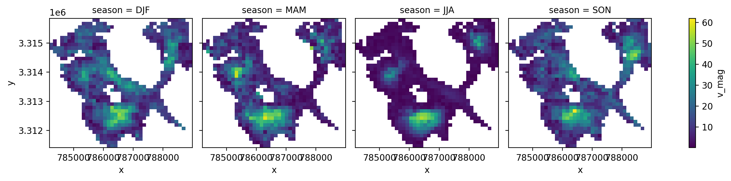
What if we wanted to do the same grouping over years?
years_gb = sample_glacier_raster.groupby(sample_glacier_raster.mid_date.dt.year).mean()
years_gb.attrs = sample_glacier_raster.attrs
years_gb['v_mag'] = np.sqrt(years_gb.vx**2 + years_gb.vy**2)
fg_years = years_gb.v_mag.plot(col='year');
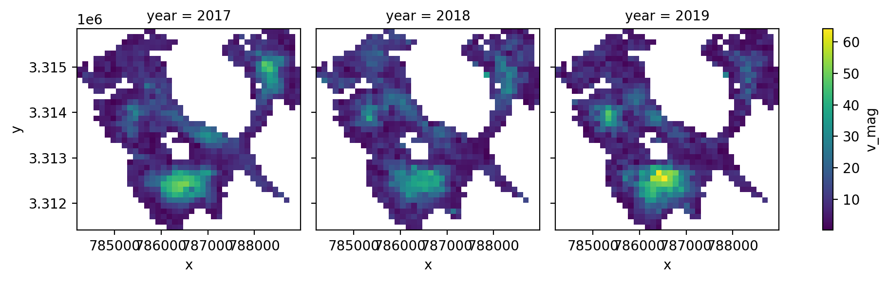
We can also reduce the grouped object over space:
seasons_gb['v_mag_season'] = np.sqrt(seasons_gb.vx.mean(dim=['x','y'])**2 + seasons_gb.vy.mean(dim=['x','y'])**2)
Let’s plot the mean magnitude of velocity for each season:
fig, ax = plt.subplots()
ax.bar(height = seasons_gb['v_mag_season'].data, x = seasons_gb['v_mag_season'].season.data)
ax.set_ylabel('m/yr')
ax.set_title('Mean seasonal velocity');
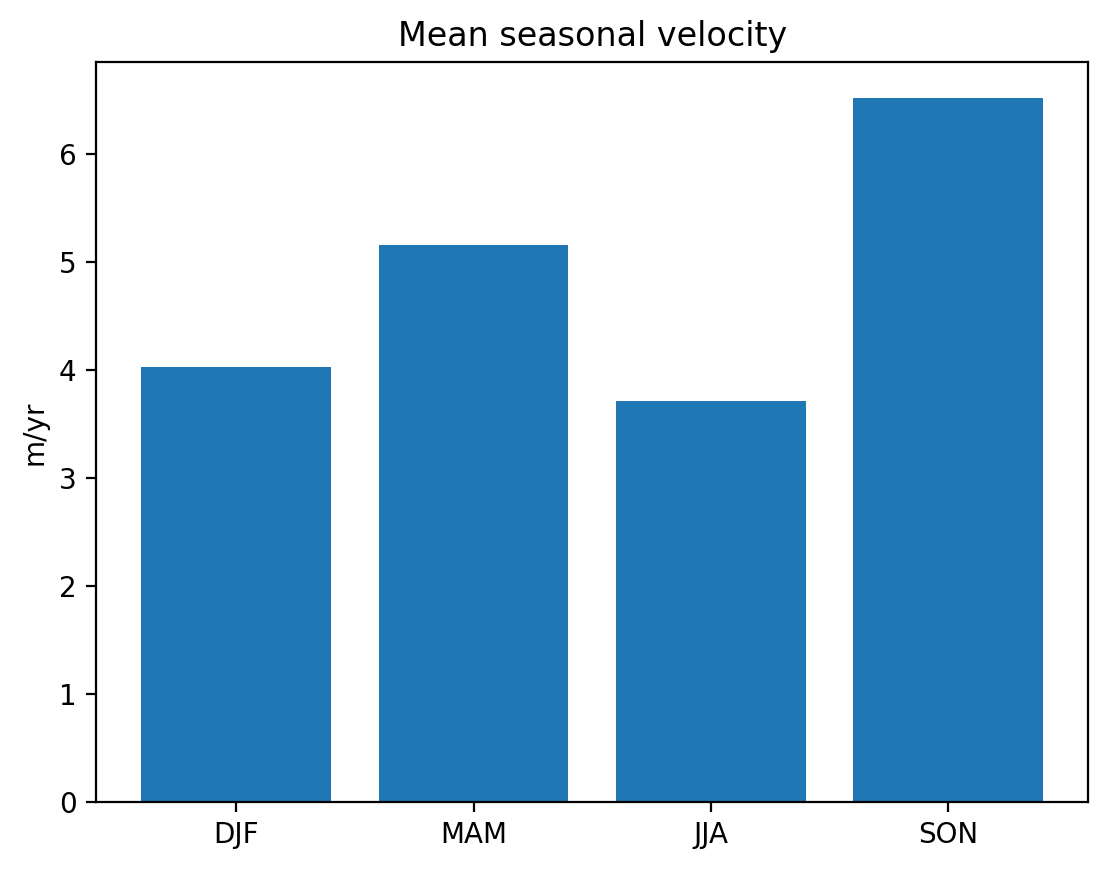
Extracting and visualizing data at a single point#
We can use xarray’s .sel() to extract velocity data at a single point or within a subset along given dimensions. In this example, we use .sel() to compare the magnitude of velocity of ice flow at a point in the glacier’s accumulation zone to the mean magnitude of velocit of the entire glacier.
#choose coordinates for a point
y = 3.3125e6
x = 786500
point_v_resample = np.sqrt(glacier_resample_1mo.sel(x=x,y=y,method='nearest').vx**2 + glacier_resample_1mo.sel(x=x,y=y,method='nearest').vy**2)
point_v = np.sqrt(sample_glacier_raster.sel(x=x,y=y,method='nearest').vx**2 + sample_glacier_raster.sel(x=x,y=y,method='nearest').vy**2)
# ax1:
fig,axs=plt.subplots(ncols=3, figsize=(20,5))
#plot raw (not resampled data)
calc_velocity_magnitude(sample_glacier_raster).v_mag_time.plot(ax=axs[0])
point_v.plot(ax=axs[0])
#plot temporal mean and point location
b = calc_velocity_magnitude(glacier_resample_1mo).v_mag_space.plot(ax=axs[1])
axs[1].axvline(x=x, c= 'red')
axs[1].axhline(y=y, c='red')

# spatial mean average velocity over time
calc_velocity_magnitude(glacier_resample_1mo).v_mag_time.plot(ax=axs[2])
# point velocity over time
point_v_resample.plot(ax=axs[2])

fig.suptitle('Comparing velocity at point on glacier (orange) v. spatial average across glacier (blue)')
axs[0].set_title('Raw observations')
axs[1].set_title('Temporal average velocity with point location highlighted')
axs[2].set_title('Monthly resampled observations')

axs[0].set_ylabel('m/yr')
axs[2].set_ylabel('m/yr')
axs[0].set_xlabel('Time')
axs[2].set_xlabel('Time')
b.colorbar.set_label('m/yr');
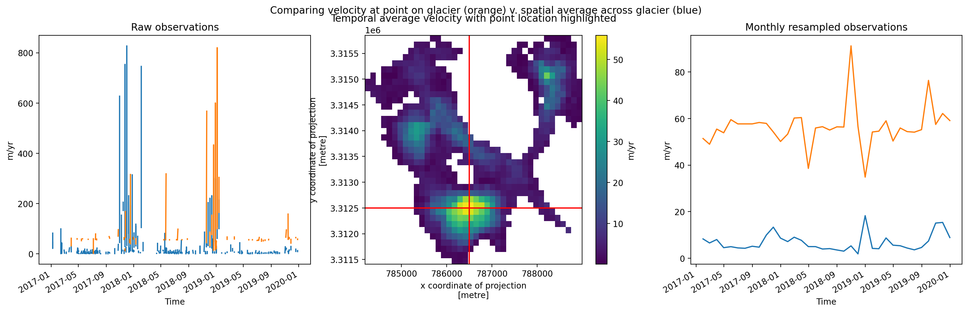
Conclusion#
This notebook demonstrated trimming a full ITS_LIVE granule down to the spatial extent of a single glacier outline. We then worked through some statistical investigation of the data and preliminary data visualization steps. The next notebook will look at grouped analysis of multiple glaciers.